
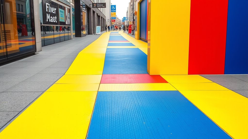
To define safe walkways using color-blocking techniques, you should choose high-contrast colors like yellow and black or vivid orange paired with navy blue to guarantee maximum visibility. Use bold borders and distinctive patterns that repeat along the pathway, making it easy for pedestrians and drivers to recognize. Incorporate reflective materials for nighttime safety, and consider textured surfaces for added tactile guidance. By applying these strategies, you can create clear, effective walkway cues that catch attention—learn more about designing safe, visually impactful pathways.
Key Takeaways
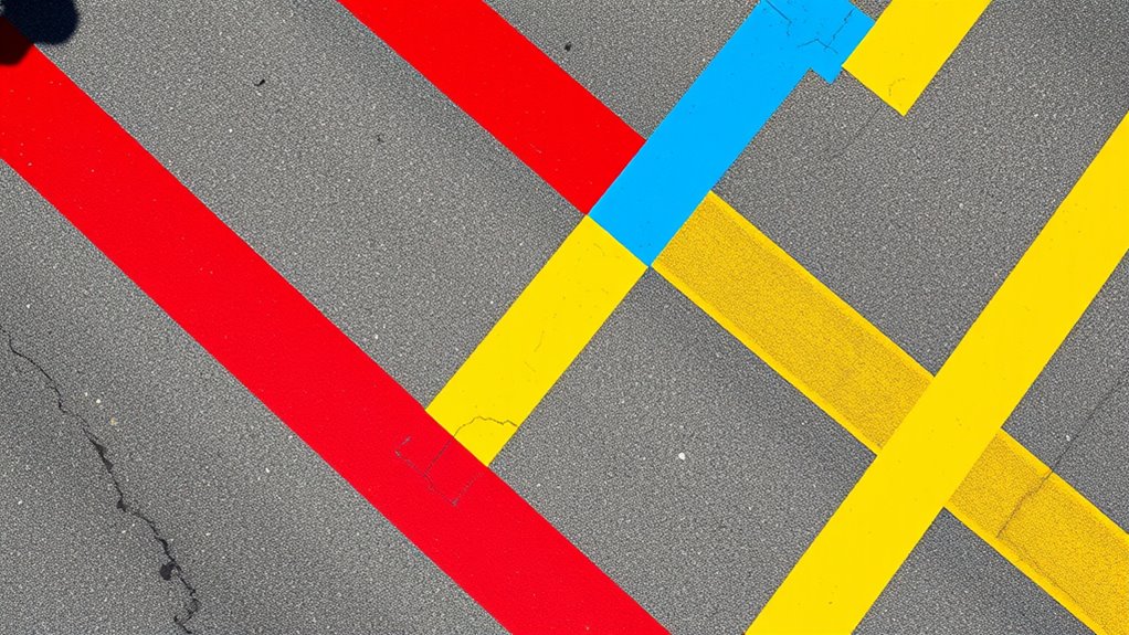
- Use contrasting, bold color blocks (e.g., yellow and black) to clearly delineate walkway boundaries from surrounding surfaces.
- Apply uniform color blocking patterns across the entire pathway to create consistent visual cues for pedestrians and drivers.
- Incorporate color blocks at intersections and crossings to enhance visibility and signal designated pedestrian zones.
- Utilize reflective paint or tape within color blocks to improve nighttime visibility and safety.
- Combine color blocking with borders or edging to reinforce pathway boundaries and prevent encroachment.
Understanding the Importance of Visual Cues in Pedestrian Safety
Visual cues play a vital role in pedestrian safety because they help both pedestrians and drivers quickly recognize and respond to potential hazards. Understanding pedestrian psychology is key here—you need to contemplate how people perceive and process visual information in busy environments. Urban lighting design enhances these cues by illuminating crosswalks, signs, and walkways, making them more noticeable at night or in poor weather. Proper lighting and clear visual signals reduce confusion and hesitation, encouraging safer behavior. When visual cues are strategically placed and well-lit, they guide pedestrians smoothly across streets and alert drivers to pedestrian zones, minimizing accidents. Recognizing the importance of visual cues in shaping behavior can make your pedestrian infrastructure safer and more effective. Additionally, incorporating visual contrast techniques can further improve the visibility of walkways and crossings, especially for individuals with visual impairments. Using contrast enhancement can significantly improve overall visibility and immediate recognition of pedestrian pathways. Understanding the emotional response of pedestrians to visual signals can also improve compliance and safety measures.
Choosing the Right Color Combinations for High Visibility
To maximize visibility, you should focus on high-contrast color pairings that catch the eye quickly. Using industry-standard colors guarantees your signals are easily recognized and understood by everyone. Selecting the right combinations makes your design both effective and compliant with safety standards. Additionally, choosing appropriate color categories ensures your markings adhere to safety regulations and improve overall site safety. Incorporating vetted dog safety gear can further enhance walkway safety, especially in areas frequented by pets and their owners. Employing consistent color schemes also helps reinforce safety protocols and minimizes confusion among users. Implementing evidence-based color strategies can optimize safety outcomes by leveraging research on visual perception and recognition.
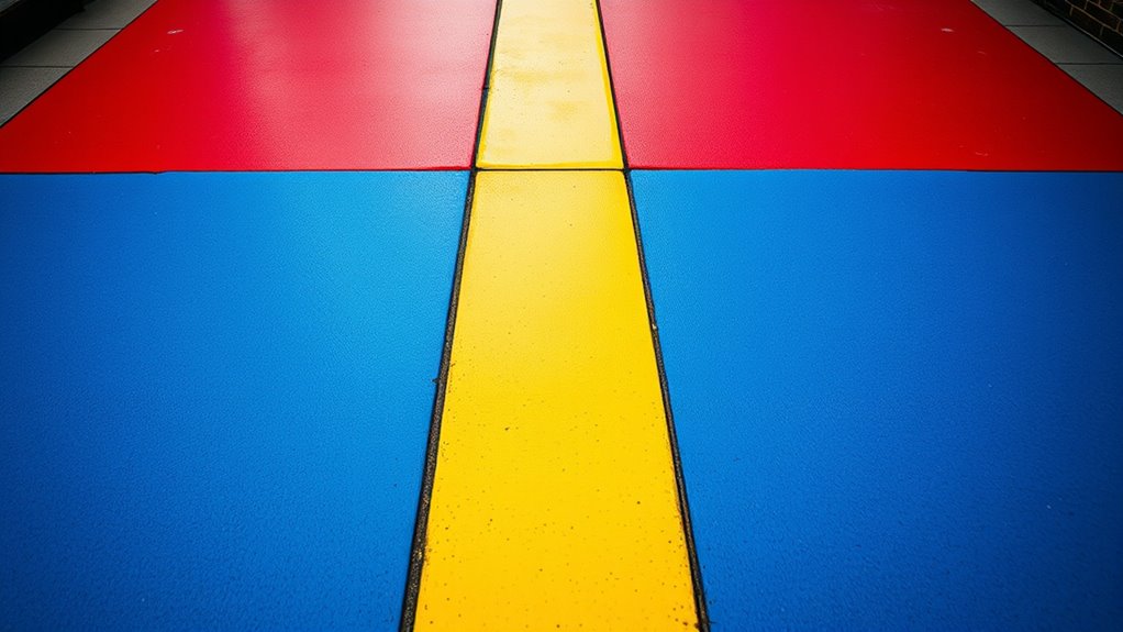
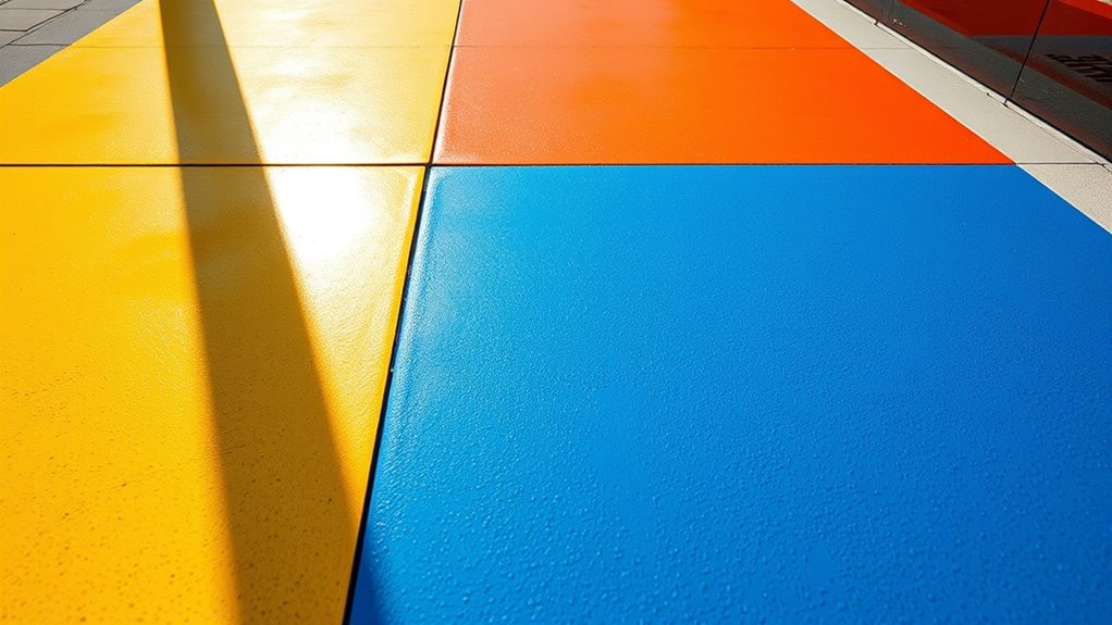
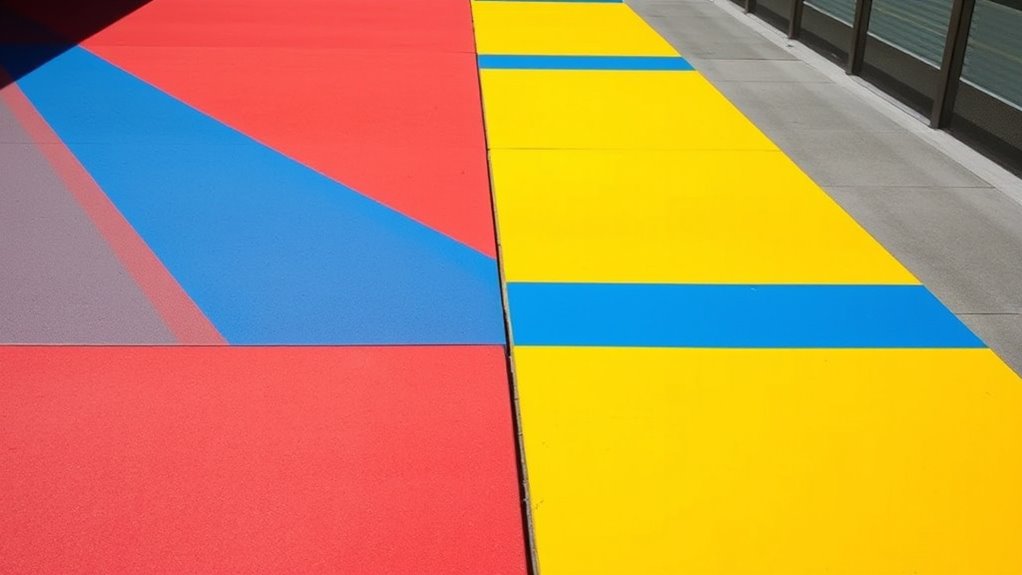
High-Contrast Pairings
When aiming for high visibility, selecting color combinations with strong contrast is essential. High-contrast pairings help your walkway stand out clearly, even from a distance. Focus on color harmony to ensure the combinations are visually effective without clashing. Bright yellow against deep black or vivid orange paired with navy blue creates striking contrast that captures attention immediately. These combinations evoke specific emotions—yellow and orange inspire caution and alertness, while dark hues provide a grounding effect. By choosing high-contrast pairings thoughtfully, you make your walkways safer and more intuitive for pedestrians. Remember, the goal isn’t just visibility but also creating a visual cue that prompts awareness and careful navigation. This strategic approach ensures your safety markings are both effective and visually appealing. Additionally, understanding regional legal resources can help inform standards for signage and markings in public spaces to ensure compliance and safety, as well as considering color contrast guidelines to optimize visibility in various environments. Proper implementation of visual contrast principles can further enhance the effectiveness of walkway markings in diverse lighting and environmental conditions, especially when considering remote hackathons as opportunities for collaboration on safety technology projects.
Industry Standard Colors
Choosing the right color combinations for high visibility involves sticking to industry-standard hues that are universally recognized for safety. Bright yellow and white are common choices because they evoke alertness through color psychology, signaling caution without causing confusion. Red is used to indicate danger or stop zones, reinforcing regulatory compliance. Green often marks safe pathways, providing a calming contrast. Using these standardized colors ensures consistency across different environments, making it easier for workers to interpret safety cues quickly. Incorporating color psychology principles ensures that the chosen colors effectively attract attention and convey the appropriate safety messages. Additionally, understanding the visual perception impact of colors can help in selecting shades that are distinguishable under various lighting conditions. Considering color contrast is essential for maximizing visibility and ensuring that walkways remain clearly defined in diverse settings. Moreover, applying knowledge of cost and budgeting can assist in selecting durable and affordable paints that meet safety standards without exceeding budget constraints. By selecting appropriate colors based on their psychological impact and regulatory guidelines, you can create walkways that are both highly visible and compliant with safety regulations. Furthermore, being aware of personality traits can help in designing signage and markings that resonate well with diverse user groups, enhancing overall safety awareness.
Utilizing Patterns to Differentiate Walkways From Surroundings
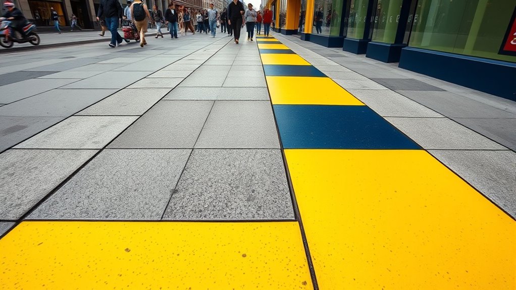
Choosing the right patterns helps your walkways stand out clearly from their surroundings. Focus on contrast and visibility to make sure they are easily recognizable. Consistently applying these patterns creates a cohesive look that guides foot traffic safely and effectively. Incorporating extending hours can also improve accessibility and visibility during different times of the day. Additionally, understanding skin hydration and its role in the effectiveness of eye patches can inform skincare routines to ensure long-term safety and security.
Pattern Selection Strategies
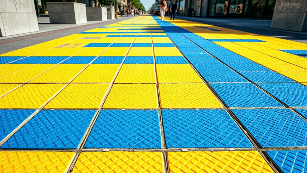
Utilizing patterns to differentiate walkways from their surroundings is a key strategy in color-blocking techniques. Your choice of pattern complexity plays a vital role; simple, repetitive patterns are easier to recognize from a distance, while more intricate designs can add visual interest. When selecting a color palette, aim for high contrast between the pattern and the surrounding environment to enhance visibility. Avoid overly complex patterns that may cause confusion or visual clutter, especially in busy areas. Instead, opt for bold, consistent designs that clearly define the walkway boundaries. This balance ensures the walkway remains noticeable without overwhelming the overall aesthetic. By carefully considering pattern complexity and color palette selection, you can create effective, visually appealing walkways that promote safety and clarity. Incorporating visual cues such as patterns and colors can also help in fostering mindfulness and awareness in shared spaces.
Contrast and Visibility
Effective contrast between walkway patterns and their surroundings enhances visibility and guides pedestrians safely. To achieve this, incorporate lighting enhancements that highlight the patterned areas, especially in low-light conditions. Bright, well-placed lighting ensures the walkway remains noticeable, reducing accidents. Additionally, select materials with high durability to maintain pattern clarity over time, even with foot traffic and weather exposure. Strong contrast in patterns helps pedestrians quickly distinguish safe walking zones from adjacent surfaces, such as roadways or landscaping. Consistent use of bold colors and distinctive patterns reinforces visibility, making walkways more intuitive to navigate. By combining effective lighting enhancements with durable materials, you create a clear, vibrant boundary that promotes safety and accessibility for all users.
Consistent Pattern Application
To clearly distinguish walkways from their surroundings, applying consistent patterns plays a essential role. Using monochrome simplicity ensures the walkway stands out without overwhelming the environment. Subtle shading adds depth and clarity, making the pattern easy to recognize from a distance. Repeating the same pattern consistently across the entire walkway reinforces visual cues, helping pedestrians and vehicles identify safe paths quickly. Avoid mixing multiple complex designs, which can cause confusion. Instead, stick to a uniform pattern that’s simple yet effective. This consistency helps create a clear boundary, reducing accidents and enhancing safety. By maintaining a steady pattern and subtle shading, you guarantee the walkway remains visible and easily identifiable, promoting safer movement within the space.
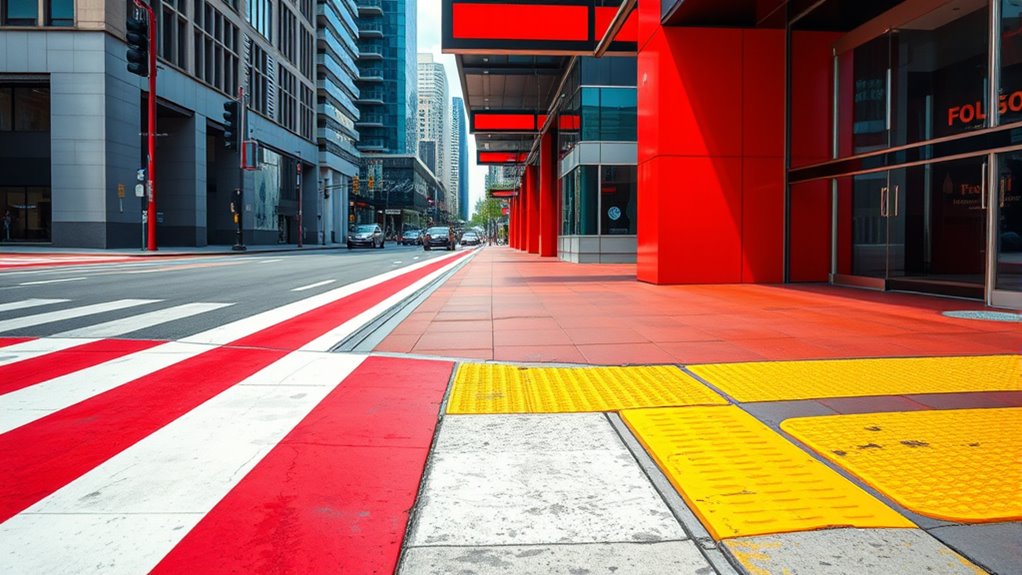
Implementing Contrasting Borders to Define Path Boundaries
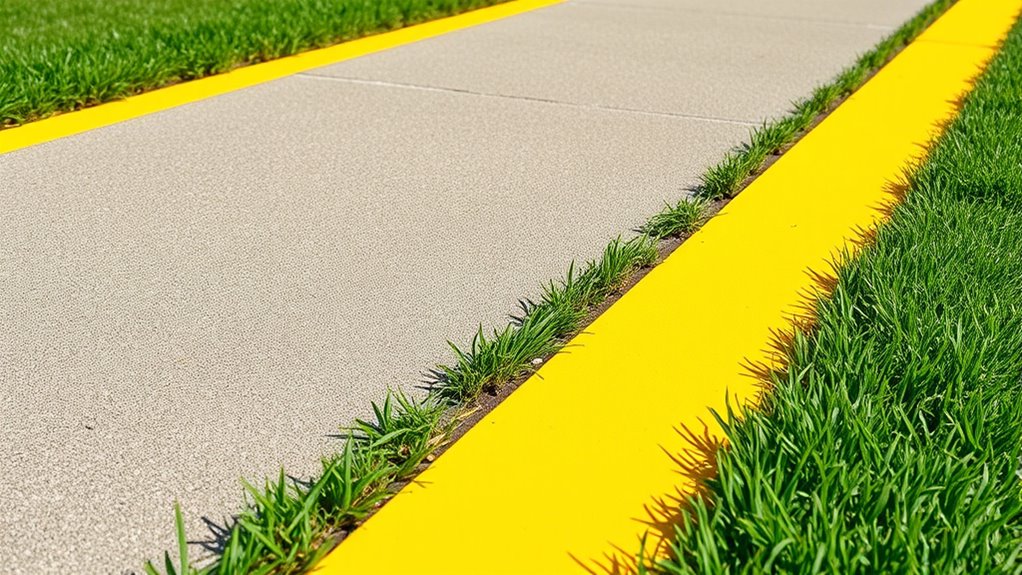
Contrasting borders are essential for clearly defining path boundaries in color-blocking designs. They guide pedestrians safely by creating visual separation. When implementing borders, consider the border thickness; thicker borders stand out more and withstand foot traffic. Use durable materials like concrete, rubber, or weather-resistant paint to guarantee longevity. Visualize a sidewalk with a bold red stripe edged by a crisp white border—this contrast draws attention and delineates the walkway. Think of these four elements:
- Wide, prominent borders for high visibility
- Durable, weather-resistant materials to resist wear
- Sharp color contrast to catch the eye
- Consistent border thickness along the entire pathway
Incorporating Reflective Materials for Nighttime Visibility
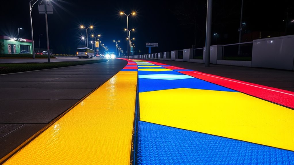
Incorporating reflective materials into your color-blocking designs substantially enhances nighttime safety by making pathways more visible in low-light conditions. Reflective signage, such as painted strips or embedded decals, catches headlights and streetlights, increasing pathway visibility. Using reflective paint or tape along the edges and centerlines ensures that pedestrians and drivers can easily see walkways at night. These materials work in tandem with existing nighttime illumination, boosting overall safety. When strategically placed, reflective elements highlight boundaries and guide users safely through dark areas. By integrating reflective signage into your color-blocking techniques, you create high-visibility pathways that reduce accidents and improve safety for all users after sunset. This approach offers a simple yet effective way to enhance nighttime visibility without extensive lighting installations.
Designing Clear Crosswalks With Bold Color Blocks
Designing clear crosswalks with bold color blocks instantly improves pedestrian safety by making crossing areas highly visible. In urban planning, using bright, contrasting colors captures attention and guides pedestrians through complex environments. Consider these elements to create effective crosswalks:
- Large, solid color patches that stand out against surrounding pavement.
- High-contrast borders that clearly delineate crossing zones.
- Consistent color schemes across city streets for familiarity.
- Strategic placement at busy intersections to influence pedestrian psychology.
These techniques help pedestrians recognize safe crossing points quickly and feel confident traversing urban spaces. Bold color blocks serve as visual cues, reducing hesitation and enhancing overall safety. When designed thoughtfully, they foster seamless pedestrian movement and improve urban flow.
Using Textured Surfaces to Enhance Tactile Guidance
Have you ever noticed how textured surfaces can guide pedestrians beyond visual cues? Using textured surfaces enhances tactile guidance, offering a reliable way for visually impaired individuals to navigate safely. Incorporate tactile guidance by designing walkways with specific textures that signal different zones or hazards. For example, rougher textures can indicate crossings or edges, while smoother surfaces mark safe walking paths. These textured surfaces should be strategically placed along the walkway to provide continuous, intuitive feedback. Keep in mind that the tactile experience must be consistent and distinguishable from surrounding areas, ensuring pedestrians can easily interpret the cues. By integrating textured surfaces into your design, you create an inclusive environment that promotes independence and safety for all users.
Combining Color-Blocking With Signage for Maximum Effect
Combining color-blocking with signage creates a powerful visual and contextual cue system that enhances wayfinding and safety. By integrating signage with carefully chosen colors, you reinforce messages through color harmony and psychology, making signs more noticeable and intuitive. For example, you might use:
- Bright yellow signs against a calming blue background to evoke alertness and trust.
- Red warning signs paired with contrasting white text to grab immediate attention.
- Green directional arrows that promote a sense of safety and guidance.
- Bold black symbols on vibrant color blocks to ensure clarity and quick recognition.
This synergy between color blocking and signage guides users seamlessly, reducing confusion and increasing safety. When colors are thoughtfully combined, they create an environment that’s both visually appealing and highly functional.
Maintenance and Longevity of Color-Blocked Walkways
Maintaining the vibrancy and integrity of color-blocked walkways requires regular upkeep and proactive care. To guarantee paint durability, you should perform routine inspections and touch up any chips or fading spots promptly. Implement proper maintenance practices, such as cleaning the surface regularly to prevent dirt buildup that can degrade the paint over time. Use high-quality, weather-resistant paints designed for high-traffic areas to extend longevity. Applying a protective sealant can further shield the surface from moisture, UV rays, and wear. Avoid harsh cleaning agents that might strip the color, and schedule periodic reapplications as needed. By following these maintenance practices, you’ll preserve the walkway’s clear, vibrant appearance and maximize its lifespan, keeping it safe and visually appealing.
Frequently Asked Questions
How Do Weather Conditions Affect the Effectiveness of Color-Blocked Walkways?
Weather impact can substantially reduce the effectiveness of color-blocked walkways. Rain, snow, or fog create visibility issues, making it harder for you to see the designated safe zones clearly. This can lead to accidents or confusion. To counter this, guarantee your markings are highly reflective or use additional signage. Regular maintenance and weather-resistant paints help keep the walkways visible, even in adverse weather conditions, ensuring your safety.
What Are the Best Practices for Installing Color-Blocking in Busy Urban Areas?
Think of your busy urban area as a bustling river, with pedestrian flow like currents. To keep everyone safe, you install color-blocking like guiding stones that stand out. Use vivid, high-contrast colors to create clear visual contrast, directing foot traffic effortlessly. Guarantee the installation is durable, visible from afar, and well-maintained. These best practices help keep pedestrian flow smooth and safe, much like well-placed stones guiding a river.
Can Color-Blocking Techniques Be Adapted for Different Age Groups or Disabilities?
You can modify color-blocking techniques for different age groups or disabilities by incorporating specific adaptation strategies and accessibility considerations. For younger children, use bright, high-contrast colors and simple patterns to enhance visibility. For people with visual impairments, add tactile cues or textured surfaces alongside visual signals. Considering these strategies ensures your walkways are inclusive, safe, and easy to navigate for everyone, regardless of age or ability.
How Often Should Color-Blocked Walkways Be Inspected for Maintenance?
Did you know that poorly maintained walkways cause over 10% of pedestrian accidents? You should inspect your color-blocked walkways every 3 to 6 months, depending on foot traffic and weather. Regular maintenance schedules guarantee the color durability stays intact, which keeps walkways clearly visible and safe. Don’t wait until signs fade; routine checks help catch issues early, maintaining safe, vibrant paths for everyone.
Are There Any Legal Standards or Regulations Governing Walkway Color Schemes?
When considering walkway color schemes, you should know that legal compliance and regulatory standards vary by location. You need to verify local building codes and safety regulations, which often specify color requirements for safe walkways. These standards help prevent accidents and ensure visibility. Always stay updated on any changes to regulations, and follow best practices for color-blocking to meet legal standards and keep everyone safe.
Conclusion
By mastering color-blocking techniques, you transform walkways into vibrant arteries guiding pedestrians safely through the urban landscape. Think of your designs as beacons of clarity, cutting through the chaos like a lighthouse piercing fog. When you choose bold colors, contrasting borders, and reflective materials, you’re painting a pathway that beckons and protects. With each thoughtful touch, you create a tapestry of safety that turns everyday crossings into clear, welcoming routes—bright threads woven into the fabric of secure city life.