
To assist low-vision navigation, use contrasting color palettes that provide high luminance differences and clear visual separation. Select bold, complementary hues for signs, pathways, and key features to guarantee they stand out in various lighting conditions. Incorporate familiar colors that evoke recognition and guide attention naturally. Balancing brightness and harmony helps create effective visual cues. For more tips on designing these palettes, explore how innovative solutions can enhance accessibility everywhere.
Key Takeaways
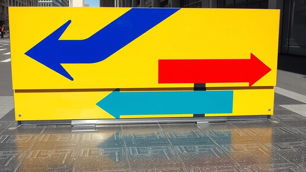
- Use high luminance contrast between background and foreground colors, such as black on white or yellow on dark blue.
- Incorporate complementary color pairs to create vibrant, easily distinguishable visual cues for navigation.
- Follow accessibility standards like WCAG guidelines to ensure sufficient contrast ratios for low-vision users.
- Avoid similar or low-contrast shades; opt for bold, distinct colors to improve visibility and reduce confusion.
- Test color palettes under different lighting conditions to ensure consistent contrast effectiveness in real-world environments.
Understanding the Needs of Individuals With Low Vision

Understanding the needs of individuals with low vision is essential for creating effective color palettes. You need to take into account how color symbolism influences perception—certain colors may carry different meanings depending on cultural perceptions. For example, red can symbolize danger or passion, but its significance varies across cultures. Recognizing these differences helps you select colors that communicate clearly and avoid confusion. Additionally, some individuals with low vision rely heavily on contrast and familiar color cues to navigate spaces. By understanding how cultural perceptions shape color understanding, you can design palettes that are intuitive and accessible. Moreover, considering attention and focus ensures that visual information remains distinguishable for low-vision users, further enhancing navigational safety. Incorporating color contrast guidelines rooted in standards can help optimize visibility and readability across diverse user groups. Being aware of regional differences in color perception can further refine your approach to creating universally effective color schemes. Incorporating cultural context into your design process ensures that color choices are respectful and comprehensible across different communities. Tailoring your choices to these needs ensures that your design not only looks appealing but also supports safe and effective wayfinding for everyone.
Principles of Effective Color Contrast in Design
To create effective color contrast, you need to contemplate brightness and luminance, ensuring enough difference for visibility. Choosing harmonious color combinations can enhance readability without causing strain. By balancing these principles, you’ll make your designs more accessible and visually appealing. Incorporating visual accessibility considerations, such as color palettes used in hackathons or collaborative digital platforms, can further improve user experience for all audiences. Additionally, understanding how vehicle tuning concepts optimize performance can inspire innovative approaches to visual design, emphasizing the importance of precise adjustments for optimal results.
Furthermore, applying color contrast standards ensures that your designs meet accessibility guidelines and maximize readability across diverse visual capabilities.
Brightness and Luminance
Have you ever wondered why some color combinations immediately grab your attention while others fade into the background? Brightness and luminance play an essential role in creating effective contrast, especially for low-vision navigation. Higher luminance differences make elements stand out clearly, guiding users effortlessly. Understanding color psychology helps you choose shades that evoke the right responses, while cultural associations influence how certain brightness levels are perceived. For example, bright, luminous colors often signal caution or importance, aligning with cultural meanings. By adjusting brightness and luminance thoughtfully, you guarantee your design is accessible and intuitive. Recognizing how contrast sensitivity utilized in visual design can inspire similarly effective color choices in accessibility design. Additionally, using suitable color palettes enhances overall visibility and user engagement. Incorporating professional color contrast guidelines ensures that your color choices meet established standards for accessibility and effectiveness. Being aware of perception differences among users also helps in creating more inclusive visual experiences. Remember, the goal is to maximize visibility without overwhelming, so users can easily distinguish important information regardless of their vision limitations.
Color Combinations and Harmony
Effective color combinations create visual harmony and guarantee that your design communicates clearly. By applying principles of color theory, you can craft palettes that enhance visual perception, especially for low-vision users. Harmonious color schemes evoke feelings of safety, confidence, and ease of navigation. To achieve this, consider the following:
- Use complementary colors to create vibrant contrast that grabs attention.
- Balance warm and cool tones for visual comfort and clarity.
- Prioritize high contrast while maintaining harmony to support easy recognition. Understanding how color perception influences user experience ensures your design guides users intuitively.
- Incorporating visual hierarchy through thoughtful color choices helps users distinguish between different elements efficiently. Recognizing the impact of astrological signs on perceived beauty can also inspire color palette choices that boost confidence and appeal.
Thoughtful color combinations foster emotional responses, making navigation safer and more accessible. When harmony and contrast align, your design becomes both functional and visually appealing.
Selecting Optimal Color Combinations for Visibility
Choosing the right color combinations can make your design more visible and effective. High contrast between colors guarantees your message stands out clearly. Using strategic pairing methods helps you create visually striking and accessible palettes. Additionally, understanding visual perception principles can further enhance the effectiveness of your color choices. Incorporating color contrast guidelines can help optimize visibility for low-vision users, especially when considering air purifier features that utilize high-contrast displays to improve user interaction. Recognizing color accessibility standards ensures your designs meet diverse user needs and improve overall usability.
High Contrast Importance
When selecting color combinations for maximum visibility, high contrast plays a crucial role in ensuring that elements stand out clearly to viewers. High contrast enhances visual perception, making it easier for low-vision individuals to distinguish important features. By understanding color psychology, you can choose colors that evoke specific emotions and improve clarity. Remember, the right contrast can transform a dull scene into a vibrant, accessible environment. Consider these impactful tips:
- Use bold, opposite hues like black and white to maximize clarity.
- Avoid subtle shades that blend together, reducing visibility.
- Prioritize contrast over color complexity to ensure quick recognition.
Your goal is to create a visual experience that is both functional and emotionally engaging, empowering those with low vision to navigate confidently.
Color Pairing Strategies
Selecting the right color combinations is essential for maximizing visibility and ensuring your designs are accessible. Effective color pairing enhances contrast while maintaining visual harmony, making it easier for low-vision users to distinguish elements. Focus on pairing high-contrast colors, like dark text on a light background, but also consider complementary hues that stand out without clashing. Avoid combinations that cause visual confusion, such as similar shades or low-contrast pairings. Using color pairing strategies, you can create clear, legible designs that guide users naturally. Aim for a balanced approach that emphasizes contrast while maintaining aesthetic coherence. By thoughtfully selecting color combinations, you improve both functionality and user experience, helping low-vision individuals navigate more comfortably and confidently.
Using Contrasting Colors in Indoor Environments
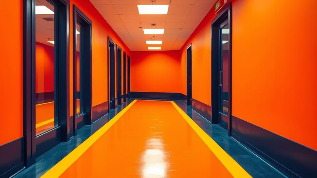
Using contrasting colors in indoor environments can instantly energize a space and create visual interest. These bold choices leverage color psychology to influence mood and perception, making navigation easier. By selecting high-contrast combinations, you enhance aesthetic appeal while supporting low-vision individuals. Here are three ways to make the most of contrasting colors:
Contrasting colors energize spaces, improve visibility, and guide navigation effortlessly indoors.
- Highlight key features: Use bright, contrasting hues for doorframes, handrails, or signage to draw attention.
- Define zones clearly: Differentiate areas with distinct color contrasts to guide movement intuitively.
- Create visual anchors: Place contrasting colors at focal points to improve orientation and confidence indoors.
This approach not only improves functionality but also adds vibrancy, making spaces more inviting and accessible.
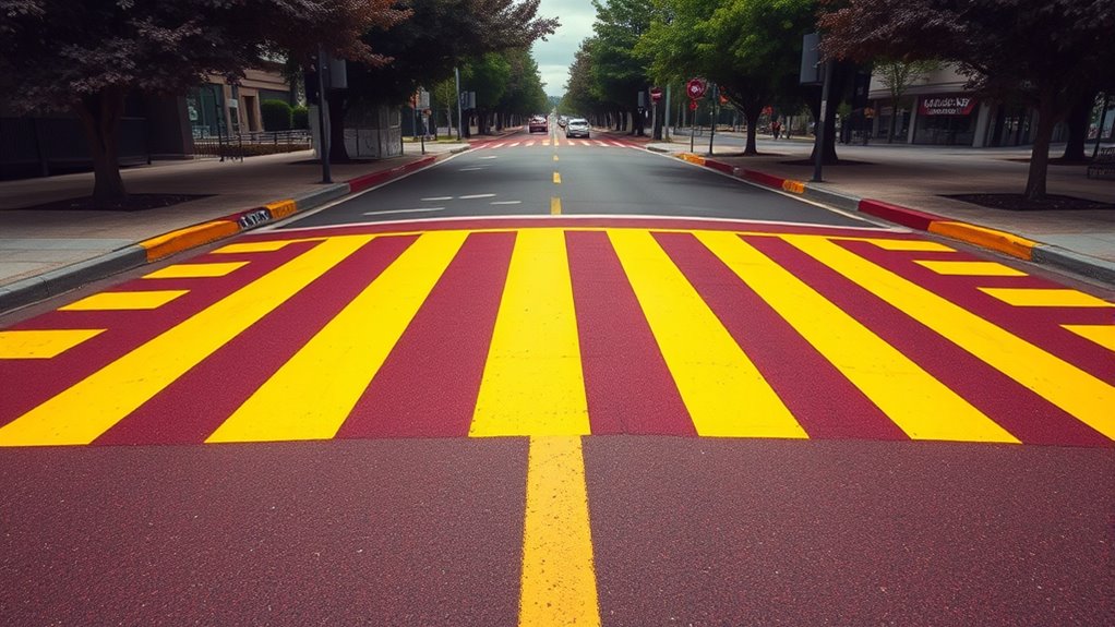
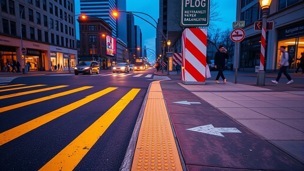
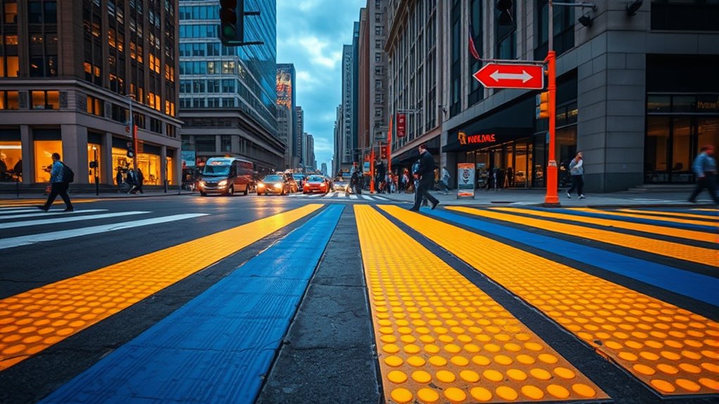
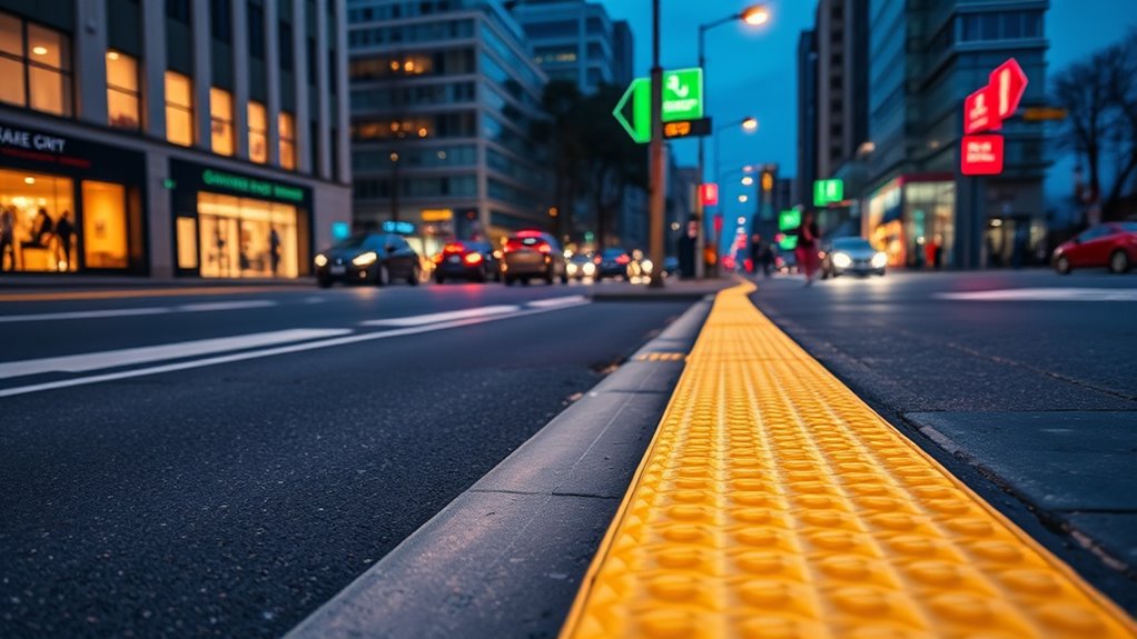
Enhancing Outdoor Navigation With Color Differentiation

You can make outdoor navigation easier by using high-contrast signage that catches your eye from a distance. Distinctive path markings help you stay on track, even in busy or unfamiliar areas. These color differences make sure you quickly recognize routes and important landmarks.
High-Contrast Signage
High-contrast signage plays a crucial role in outdoor navigation by making signs easily visible from a distance and in various lighting conditions. You’ll find that using bold color combinations enhances readability and guides your way effectively. When designing signs, consider color psychology—reds evoke urgency, while blues suggest calmness—helping you interpret messages quickly. Additionally, cultural color meanings influence how signs are perceived; for example, green often signals safety, and yellow indicates caution. To maximize impact, focus on these key elements:
- Use bright, contrasting colors like black and white or yellow and navy to catch your eye immediately.
- Incorporate familiar color cues rooted in cultural meanings to convey messages instantly.
- Ensure signs are placed at eye level and in well-lit areas for ideal visibility.
This approach guarantees you navigate confidently, regardless of lighting or environmental challenges.
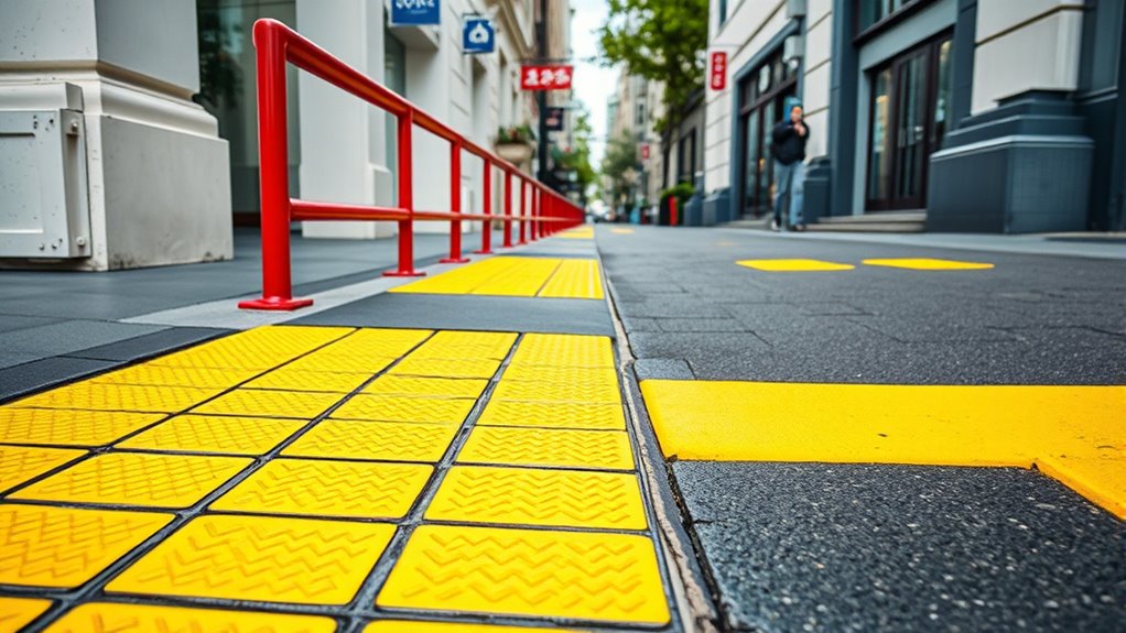
Distinctive Path Markings
Distinctive path markings leverage color differentiation to guide outdoor navigation effectively. Bright, contrasting colors help you identify safe routes from a distance. Adding tactile textures, like raised surfaces or embedded patterns, allows you to feel the path’s boundaries underfoot or with a cane. These textures, combined with visible cues, make it easier to stay on course. Auditory cues, such as subtle sounds embedded along the route, provide additional navigation support, alerting you to turns or intersections. By integrating color, tactile feedback, and sound, these path markings create a multisensory system that enhances your awareness of surroundings. This approach reduces confusion and promotes independent outdoor travel, especially in complex environments. The combination of visual contrast, tactile textures, and auditory cues ensures you can navigate more confidently and safely.
Implementing Contrast in Signage and Wayfinding Aids
Have you ever struggled to read a sign from a distance or in poor lighting? Implementing contrast in signage and wayfinding aids is vital for low-vision users. First, consider color psychology—using high-contrast, emotionally resonant colors can draw attention and improve readability. Second, embrace artistic expression by choosing bold, simple designs that stand out without overwhelming the senses. Third, test your signage in real-world conditions to verify visibility under various lighting scenarios. Remember, effective contrast isn’t just about aesthetics; it’s about accessibility. By thoughtfully applying contrasting colors, you help users navigate confidently, reducing frustration and enhancing independence. Your goal is to create signs that communicate clearly and evoke confidence through strategic use of color and design.
Tools and Technologies for Color Testing and Selection
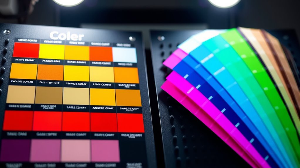
Choosing the right colors for signage and wayfinding requires precise tools and technologies to guarantee accessibility and visibility. Using a color wheel helps you identify complementary and analogous colors, ensuring effective contrast. Color testing tools, like digital simulators, allow you to preview how designs appear to those with low vision. Palette harmony tools assist in creating balanced color schemes, making signs easier to distinguish. Here’s a quick overview:
| Tool | Function | Benefit |
|---|---|---|
| Color Wheel | Visualize color relationships | Facilitates contrast and harmony choices |
| Digital Simulators | Test visibility for low vision users | Ensures accessibility before implementation |
| Palette Harmony Apps | Generate balanced color schemes | Achieves effective contrast and appeal |
These technologies help you craft accessible, visually distinct signage.
Case Studies of Successful Color Contrast Applications

Real-world examples demonstrate how effective color contrast enhances signage visibility and accessibility. One inspiring case is a hospital redesign that used bold, contrasting colors based on color psychology, making wayfinding intuitive for visitors with low vision. Another involves a public transit system that tailored color schemes to cultural perceptions, ensuring universal comprehension and comfort.
Here are three impactful lessons:
- Strategic color choices can evoke trust and calm, improving navigation experiences.
- Understanding cultural perceptions ensures colors resonate and avoid confusion.
- Consistent contrast application across environments maximizes safety and independence for low-vision users.
Challenges and Limitations of Color-Based Navigation Aids
While color-based navigation aids can substantially improve wayfinding, they also face notable challenges that can limit their effectiveness. Color psychology influences how people interpret colors, but individual perceptions vary widely. For example, a color meant to signal safety might evoke anxiety in some users. Cultural symbolism further complicates matters; colors can have different meanings across cultures, leading to confusion or misinterpretation. Low-vision users may also struggle with subtle contrasts or color distinctions, reducing aid reliability. Additionally, lighting conditions and environmental factors can distort color perception, undermining the intended purpose. These limitations highlight that relying solely on color can be insufficient for all users. To guarantee accessibility, it’s vital to contemplate these challenges when designing navigation aids, integrating multiple cues beyond just color.
Future Innovations in Color Contrast Solutions for Low Vision
Advancements in technology are paving the way for innovative solutions that enhance color contrast for low-vision users. Future innovations will leverage insights from color psychology and cultural interpretations to create more intuitive navigation aids. Imagine systems that adapt to your emotional responses, using hues that evoke confidence and calm. These developments could include smart displays that change contrast settings based on individual preferences or cultural backgrounds, making environments more accessible worldwide.
- Personalized color schemes that align with your emotional comfort.
- Culturally aware contrast tools that respect diverse interpretations of color.
- AI-driven solutions that dynamically optimize contrast for clarity and safety.
These innovations promise a future where low-vision navigation feels more natural, inclusive, and empowering.
Frequently Asked Questions
How Do Cultural Differences Affect Color Perception for Low-Vision Navigation?
Cultural differences markedly impact how you perceive colors, which affects low-vision navigation. Cultural color associations shape your perception variability, making certain hues more recognizable or meaningful depending on your background. For example, red may symbolize luck in one culture but danger in another. Being aware of these differences helps designers create more effective, culturally sensitive color cues, ensuring better navigation support for users from diverse backgrounds.
What Are Cost-Effective Methods for Implementing High-Contrast Colors?
Imagine a vibrant road sign guiding you safely—now, think of affordable color schemes that make navigation easier. You can use cost-effective solutions like high-contrast paint, bold decals, or simple colored tapes to create clear visual cues. These methods are budget-friendly and easy to implement, ensuring everyone benefits. By choosing striking, contrasting colors, you make environments more accessible without breaking the bank, turning everyday spaces into safer, more navigable places.
How Can Color Contrast Be Integrated With Tactile or Auditory Cues?
You can integrate color contrast with tactile feedback and auditory signals by designing objects that combine visual cues with textured surfaces or vibrations. For example, use high-contrast colors on tactile markers that also emit distinct sounds when touched or approached. This multi-sensory approach helps you navigate more confidently, as visual contrast guides you while tactile feedback and auditory signals reinforce spatial awareness, creating an inclusive environment for low-vision navigation.
Are There Specific Color Palettes Recommended for Different Types of Visual Impairments?
You can enhance navigation by using adaptive color schemes tailored to specific visual impairments. Personalized palettes consider individual needs, such as high contrast for low vision or specific color sensitivities. Consult with specialists to select the best options, ensuring accessibility. Implementing these schemes helps users distinguish objects more easily, reducing confusion and increasing confidence. Adaptive color schemes make environments more inclusive, supporting diverse visual abilities effectively.
How Do Lighting Conditions Influence the Effectiveness of Color Contrast?
Lighting conditions critically impact how effective color contrast appears. Adaptive lighting adjusts the brightness based on your environment, helping maintain clear contrast. Without it, color fading can occur, making colors less distinguishable, especially in low or overly bright settings. You should guarantee proper lighting to maximize contrast visibility and support navigation. Proper lighting helps you see color differences more vividly, reducing confusion and enhancing safety during movement.
Conclusion
By understanding low-vision needs and applying effective color contrasts, you can create environments that are as clear as a sunny day. Choosing the right colors isn’t just about aesthetics—it’s about making navigation easier and safer. With the right tools and innovations, you can transform spaces into accessible places for everyone. Think of color contrast like a lighthouse guiding ships safely to shore—you’ll help those with low vision navigate confidently and comfortably.