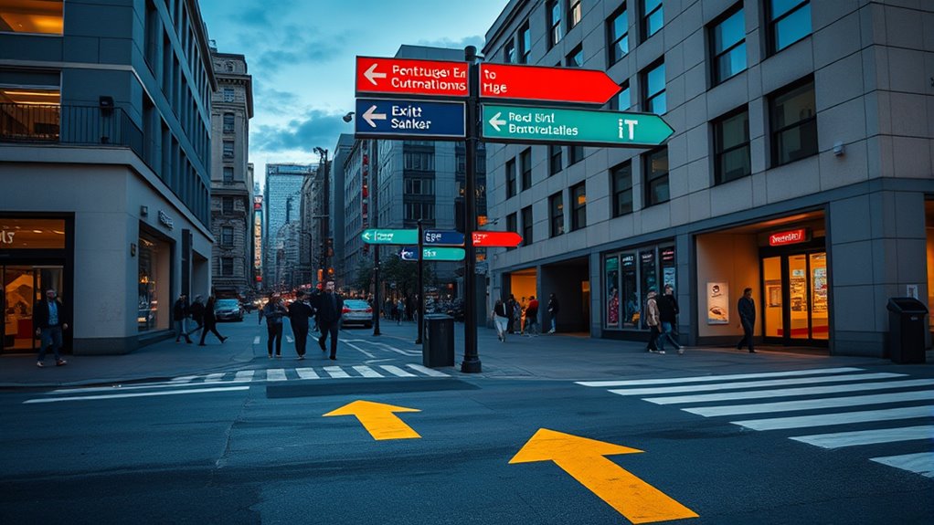

Using contrasting colors for wayfinding helps you navigate spaces more easily by making signs and pathways stand out clearly. Bright, high-contrast combinations like yellow with purple or black with white catch your eye and guide your focus. They improve visibility and guarantee critical information is noticed quickly, especially in busy or complex environments. When designed thoughtfully, these colors create an intuitive flow and enhance overall accessibility. Keep exploring to discover how effective color strategies can boost your wayfinding experience.
Key Takeaways
- Use high-contrast color combinations, such as black on white or yellow on purple, to enhance visibility and attract attention.
- Place contrasting signs and markers at eye level and ensure they are large enough for easy reading from a distance.
- Apply consistent color coding for specific navigation functions, like red for warnings and blue for informational signs.
- Incorporate contrasting floor or wall colors to delineate zones and guide movement intuitively.
- Ensure all signage meets accessibility standards by maximizing contrast for clarity and accommodating visual impairments.

Effective wayfinding relies heavily on the strategic use of contrasting colors, which help guide your eye and make signs or pathways stand out. When designing navigational aids, understanding how color perception influences how people interpret their environment is essential. Bright, contrasting colors catch your attention, making it easier to identify important signs, pathways, or landmarks quickly. For example, pairing a vivid yellow with deep purple creates a stark contrast that naturally draws your gaze, guaranteeing you don’t miss critical information. By leveraging these color combinations, you help create an intuitive flow, especially in busy or complex spaces.
Contrasting colors guide the eye and enhance clarity in busy spaces for intuitive navigation.
In addition to enhancing visual clarity, contrasting colors are indispensable for meeting accessibility standards. These standards, such as those outlined by the Americans with Disabilities Act (ADA), emphasize the importance of making environments usable by everyone, including individuals with visual impairments or color vision deficiencies. To achieve this, you need to consider how different people perceive color. Certain color pairings, like black on white or white on dark backgrounds, provide high contrast and are easier for most to distinguish. Avoiding low-contrast combinations, such as light gray on white, guarantees your signage remains visible across various lighting conditions and for people with differing levels of color perception.
You should also be mindful of the placement and size of your contrasting elements. High-contrast colors work best when used for critical information, like directional arrows, exit signs, or hazard warnings. These should be prominently positioned at eye level and large enough to be read from a distance. When designing pathways, contrasting colors on flooring or walls can delineate different zones or guide movement seamlessly. For example, a bold red line against a neutral background clearly indicates a safe route or restricted area, reducing confusion and promoting a smooth flow of traffic.
Consistency plays a key role in effective wayfinding. Using a specific color scheme for particular functions—such as blue for informational signs or red for warnings—helps users develop mental associations and navigate instinctively. This consistency, combined with high-contrast color choices that adhere to accessibility standards, guarantees your environment is both functional and inclusive. Research shows that employing high-contrast color schemes improves the visibility and comprehension of signage for a diverse range of users. Remember, the goal is not just to make things look visually appealing, but to make them instantly recognizable and easy to interpret for everyone, regardless of their visual abilities. By thoughtfully applying contrasting colors, you create a more intuitive, accessible space that guides people confidently and efficiently through any environment.
Frequently Asked Questions
How Do Contrasting Colors Impact Individuals With Color Vision Deficiencies?
Contrasting colors help individuals with color vision deficiencies by making wayfinding signs and cues more distinguishable. You’ll notice that high contrast improves visibility, reducing confusion and enhancing accessibility considerations. When designing spaces, using bold, contrasting colors guarantees that everyone, regardless of color vision issues, can navigate safely and efficiently. This simple adjustment promotes inclusivity, making environments more accessible and user-friendly for people with diverse visual needs.
What Are the Best Color Combinations for Outdoor Signage?
You should choose high-contrast combinations like yellow on dark blue for outdoor signage. For example, a shopping mall used this combo, boosting visibility and ease of navigation. Consider color psychology; bright and bold colors attract attention, while durable materials guarantee longevity against weather. Selecting weather-resistant paint with vibrant hues helps your signs stand out and last, making wayfinding effective for everyone, no matter the weather conditions.
How Does Lighting Influence the Effectiveness of Contrasting Colors?
Lighting conditions greatly influence how well contrasting colors work for wayfinding. You’ll notice that in bright sunlight, high contrast levels make signs more visible, while low light or shadows can diminish their effectiveness. To guarantee ideal visibility, use lighting that enhances contrast, like backlighting or reflective surfaces, especially in dim conditions. Adjusting for different lighting conditions helps maintain clarity and quick recognition, guiding people safely and efficiently.
Are There Cultural Considerations When Choosing Contrasting Colors?
You should consider cultural symbolism and regional preferences when choosing contrasting colors for wayfinding. Different cultures associate colors with specific meanings—red may symbolize luck in China but danger elsewhere. Be mindful of these differences to guarantee your signage communicates clearly and respectfully. By understanding local perceptions, you create more effective wayfinding that resonates positively with diverse users, avoiding confusion or unintended offense.
How Frequently Should Wayfinding Signs Be Updated or Replaced?
You should update or replace wayfinding signs as part of regular signage maintenance, ideally every 3 to 5 years, to guarantee color consistency and visibility. Frequent inspections help identify fading or damage that could impair understanding. If signs become less contrasting or difficult to read, prioritize their replacement. Maintaining clear, contrasting signage ensures effective wayfinding, especially in high-traffic or complex environments, reducing confusion and enhancing overall safety.
Conclusion
Using contrasting colors for wayfinding isn’t just about aesthetics—it’s backed by research showing it helps your brain distinguish signs quickly. When you rely on bold, contrasting hues, you’re more likely to find your way efficiently and confidently. It’s like giving your eyes a clear signal in a sea of information. So, next time you’re designing a space, trust the science and choose colors that stand out. Your visitors will thank you for guiding them effortlessly.