
To make aging in place beautiful and bright, consider using soft neutrals for a welcoming atmosphere and vibrant jewel tones to uplift the space. Layered colors add depth, while high contrast helps with easy identification. Earthy tones create warmth in common areas, and warm hues encourage social interaction. Nature-inspired greens promote comfort, bright accents can enhance kitchens and dining areas, and cozy browns make living spaces inviting. Discover more stylish color schemes that transform your home.
Key Takeaways
- Use soft neutrals like ivories and beiges to create a calming and welcoming atmosphere that enhances visibility for seniors.
- Incorporate earthy tones in common areas, such as warm browns and muted greens, to transform spaces into inviting environments.
- Introduce vibrant jewel tones like emerald and sapphire in seasonal decor to uplift mood while maintaining visibility and safety.
- Pair warm hues, such as yellows and soft reds, in dining areas to stimulate appetite and promote social interaction among residents.
- Utilize high contrast color schemes with bold patterns to enhance visibility, ensuring clear navigation and reducing accident risks for seniors.
Embrace Soft Neutrals for a Welcoming Atmosphere

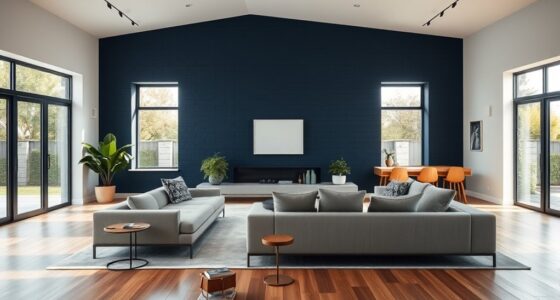
Creating a welcoming atmosphere is essential when designing spaces for seniors, and embracing soft neutrals is a fantastic way to achieve this.
Colors like ivories, beiges, and tans create warmth, making spaces feel inviting and comfortable. They enhance visibility and reduce glare, which is especially helpful for seniors with age-related vision changes.
By using soft neutrals, you promote calmness and tranquility, aiding relaxation and overall well-being. Additionally, incorporating essential oils for relaxation can further enhance the soothing environment.
It's also vital to maintain high contrast between these colors and your furniture or decor for easy navigation.
This thoughtful palette not only creates a timeless aesthetic but also feels sophisticated and rejuvenating for all ages, enhancing the ambiance of the space and ensuring it's enjoyable for everyone involved.
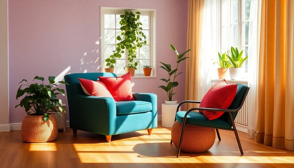
Vibrant Jewel Tones to Uplift the Space
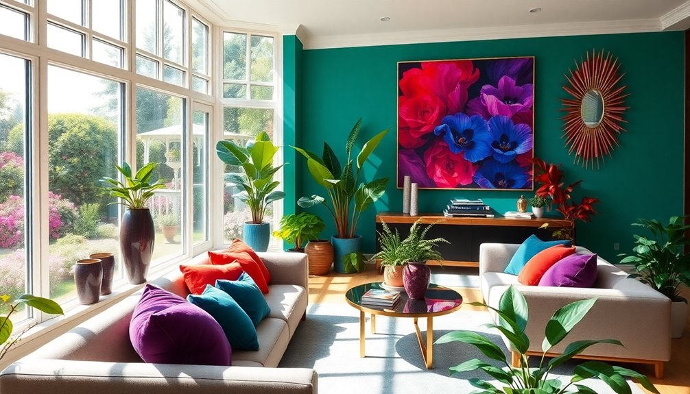
If you want to uplift a space, vibrant jewel tones like emerald green and sapphire blue can greatly enhance the mood. These colors not only create accessible combinations but also allow for seasonal adaptations that keep your environment fresh and lively. Additionally, incorporating natural elements into your decor can enhance the overall aesthetic and bring a sense of warmth to the space.
Enhancing Mood With Color
When you incorporate vibrant jewel tones like emerald green, sapphire blue, and ruby red into your space, you can instantly uplift the atmosphere and evoke positive emotions. These rich colors not only enhance the mood but also provide high contrast, aiding seniors in identifying features and maneuvering through their environment safely. To truly make the most of these calming colors, consider:
- Accent Walls: Paint one wall in a bold jewel tone to create a focal point.
- Decor Elements: Use cushions, throws, or artwork in vibrant hues to add warmth.
- Neutral Balancing: Pair jewel tones with calming neutral shades for a harmonious look.
Additionally, incorporating layered textiles can enhance comfort and warmth in the space, making it feel even more inviting.
Accessible Color Combinations
Incorporating accessible color combinations can considerably enhance the living environment for seniors, as vibrant jewel tones like emerald green and sapphire blue not only uplift the space but also improve visibility.
These high-contrast colors paired with neutral shades make it easier for seniors to identify features in their surroundings, promoting safety and navigation.
Rich hues like bright red and deep amethyst foster a welcoming atmosphere, encouraging social interaction and community bonds.
You can strategically use jewel tones in common areas to stimulate positive emotions while creating a calming ambiance in personal spaces like bedrooms and bathrooms. Additionally, incorporating natural materials like wood can further enhance the overall aesthetic and comfort of the environment.
Seasonal Jewel Tone Adaptations
While embracing seasonal jewel tones can transform a space, it also brings a rejuvenating connection to nature throughout the year.
These vibrant hues, like emerald green, sapphire blue, and amethyst purple, uplift and stimulate creativity, especially for seniors. You can easily adapt your environment with these tips:
- Fall: Introduce deep greens through plants or art to reflect the changing leaves.
- Winter: Use rich blues in throws or cushions, evoking a cozy, wintry feel.
- Spring/Summer: Brighten up with jewel-toned accessories like pillows or tableware for a revitalizing look.
Incorporating these jewel tones not only enhances aesthetics but also fosters warmth and community, making your space inviting and vibrant year-round. Additionally, consider upgrading the lighting to perfectly complement these colors, enhancing the overall ambiance of your home.
Layered Colors for Depth and Interest
Layered colors can greatly enhance visibility and comfort in your living space.
By incorporating textured fabrics and patterns, you create an inviting atmosphere that appeals to the senses.
Plus, seasonal color variations can keep the environment feeling fresh and engaging year-round. Additionally, using the right tip size for painting projects can ensure a smooth application that complements your layered color scheme.
Contrast for Visibility
A strong contrast between colors is essential for enhancing visibility in spaces designed for seniors. High contrast aids in easily identifying different features, which reduces the risk of accidents.
Layering colors effectively can create depth while improving navigation within the home. Here are some tips to achieve ideal contrast for visibility:
- Use darker furniture against lighter walls to make areas distinct.
- Avoid pastel colors, as they can blend into backgrounds, making it hard to see.
- Incorporate vibrant colors in common areas to promote social interaction and a welcoming atmosphere. Additionally, high contrast colors can enhance the overall functionality of a space, similar to how air purifiers improve indoor air quality.
Textured Fabrics and Patterns
Textured fabrics and bold patterns can transform a space, making it not only visually appealing but also more functional for seniors. Incorporating materials like velvet, chenille, and boucle adds depth to your color scheme, creating a warm and inviting atmosphere.
Layering colors through patterned textiles—think floral or geometric designs—helps differentiate features in a room, enhancing navigation and safety. Mixing smooth and rough textures engages the senses, making your environment more dynamic.
Soft, tactile fabrics in common areas encourage social interaction, fostering connections among residents. Additionally, high-contrast patterns with bolder colors assist seniors in identifying design elements, boosting their sense of ownership and comfort in their living space. Healthy eating habits from an early age can also contribute to a vibrant and active lifestyle for seniors.
Embrace textured fabrics to create a welcoming home!
Seasonal Color Variations
Incorporating seasonal color variations into your home can elevate the overall aesthetic and comfort level, much like the use of textured fabrics.
By layering colors, you create depth and interest, making your space visually stimulating. Here are three tips to enhance your environment:
- Fall: Use warm earthy tones, like deep browns and burnt oranges, to create a cozy atmosphere.
- Spring: Introduce soft pastels, such as light pinks and greens, for a revitalizing ambiance.
- Winter: Opt for cool blues and whites to evoke tranquility and comfort.
Utilizing contrasting colors, like warm neutrals paired with brighter accents, can improve visibility for seniors.
Seasonal color variations not only beautify your space but also positively influence mood and comfort throughout the year. Additionally, embracing the importance of harmony in your color choices can create a serene environment that caters to emotional well-being.
High Contrast for Easy Identification
When designing living spaces for seniors, using high contrast color schemes can greatly enhance visibility and safety. As we age, differentiating colors can become more challenging, making bold contrasts essential for navigation. Dark colors against lighter backgrounds create clear visual boundaries, helping seniors identify features like furniture and flooring. This clarity considerably reduces the risk of accidents, allowing for safer movement within the space.
In common areas, high contrast color schemes also facilitate social interactions by making seating arrangements and pathways more discernible. Additionally, improved air quality through the use of air purifiers can further support the overall well-being of seniors, creating a healthier living environment.
Studies show that environments designed with high contrast can improve comfort and safety, positively impacting overall well-being. By prioritizing these color schemes, you can create an inviting and secure environment for seniors, enhancing their quality of life.
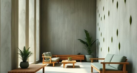
Earthy Tones in Common Areas
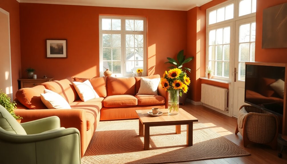
Creating common areas with earthy tones can transform a space into a warm and inviting environment for seniors.
These colors, like warm browns, soft greens, and muted terracotta, resonate with nature and enhance comfort. They help make communal spaces feel more homely and promote social interactions among residents.
Here are three ways to incorporate earthy tones effectively:
- Accent Walls: Use deeper earthy hues to create focal points in common areas.
- Natural Textiles: Choose cushions and curtains in soft greens and browns to add warmth.
- Decorative Elements: Incorporate terracotta pots and wooden furniture to maintain a cohesive look.
This natural palette not only comforts but also fosters a sense of calmness and connection to the outdoors.
Calming Blues for Restful Environments
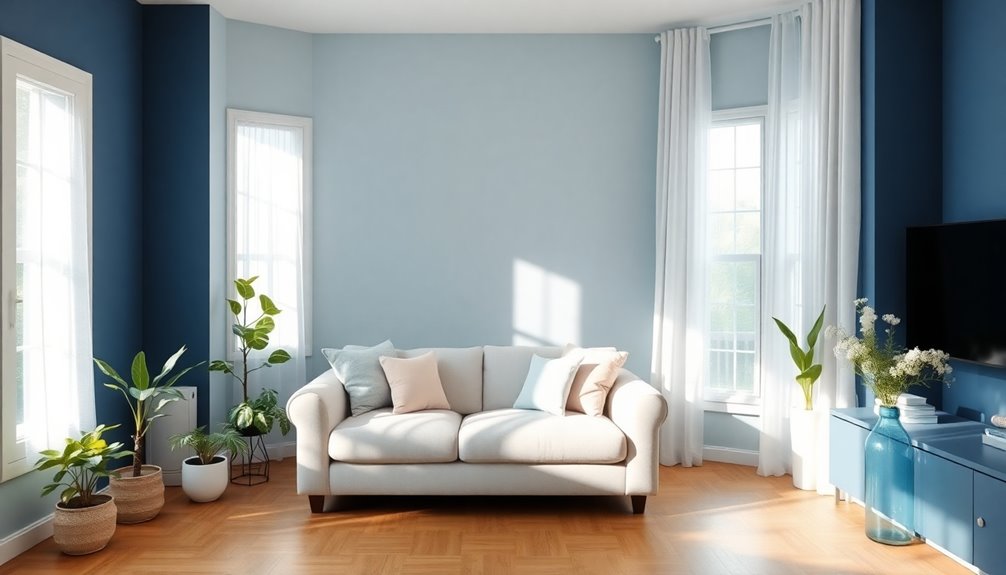
Soft shades of blue can transform spaces into restful retreats, providing a soothing backdrop that promotes relaxation for seniors. Calming blues evoke feelings of tranquility, making them perfect for bedrooms and bathrooms where you can unwind after a long day.
The serene imagery of the ocean associated with these tones helps reduce stress and anxiety, creating a peaceful atmosphere. To avoid a cold feel in winter, pair soft blues with warm lighting for added comfort.
You can also enhance leisure spaces with soft blue accents like throw blankets and cushions, encouraging enjoyable meals and social interactions. Using deeper blues in high contrast can further aid navigation, ensuring comfort and safety in your living areas.
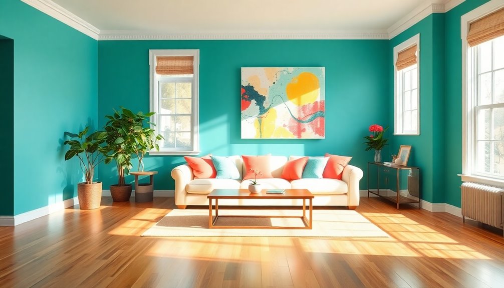
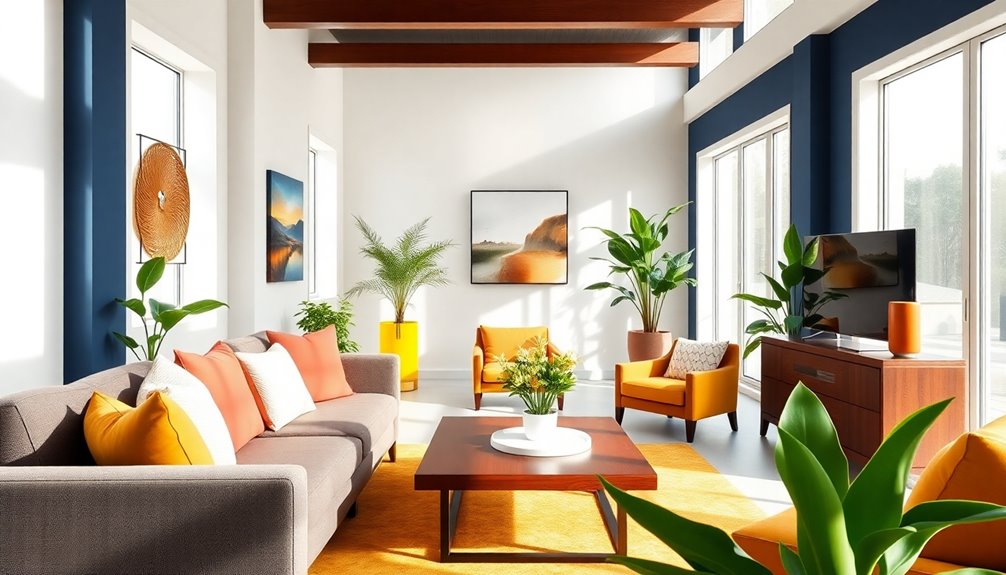
Warm Hues to Encourage Social Interaction
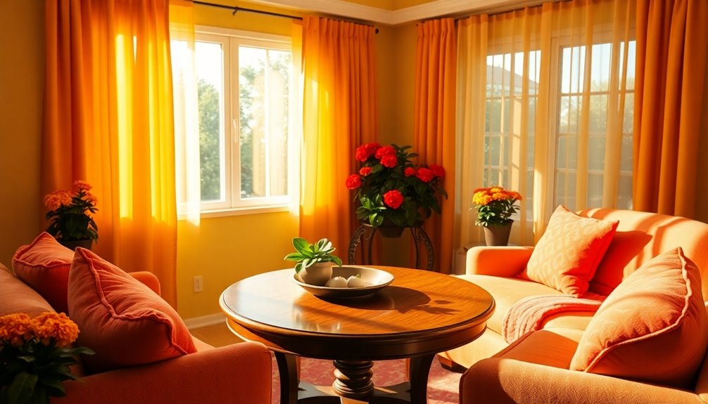
Using warm hues like yellow, orange, and soft reds can transform spaces into inviting environments that promote social interaction among seniors.
These colors not only evoke feelings of happiness but also encourage meaningful conversations in common areas.
Here's how you can use warm hues effectively:
- Dining Areas: Incorporate warm colors to stimulate appetite and enhance the communal dining experience.
- Common Spaces: Combine earthy tones with warm hues to create a harmonious atmosphere that fosters relaxation and social bonding.
- High-Contrast Decor: Use contrasting warm colors to improve visibility and recognition of features, aiding seniors with visual impairments.
Nature-Inspired Greens for Comfort
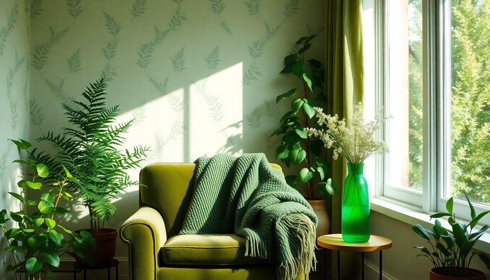
When you choose deep emerald shades for your space, you create a cozy atmosphere that fosters comfort and relaxation.
These nature-inspired greens not only connect you to the outdoors but also adapt beautifully with the changing seasons.
Deep Emerald Shades
Deep emerald shades bring a revitalizing sense of nature indoors, making them perfect for creating comfortable spaces for seniors.
These rich tones evoke a connection to nature, enhancing well-being, especially in urban settings.
Here are a few ways to incorporate deep emerald hues for ultimate comfort:
- Accent Pillows: Use deep emerald pillows to add a pop of color and coziness to your living space.
- Furniture: Consider emerald chairs or sofas that create a warm, inviting atmosphere for relaxation and socializing.
- Wall Color: Paint an accent wall in deep emerald to create a cocoon-like feeling, promoting safety and warmth.
Seasonal Versatility Benefits
Since nature-inspired greens effortlessly blend with various design elements, they offer remarkable seasonal versatility that enhances comfort in any space.
These deep or emerald tones create a calming atmosphere, connecting you to the natural world and promoting relaxation. You can use these shades year-round, making your home feel cozy in both warm and cool seasons.
Incorporating green accents like throw pillows or wall art refreshes your surroundings without overwhelming your senses, allowing for easier navigation. The use of color in communal areas encourages social interaction, fostering emotional health.
When combined with natural light, these greens evoke feelings of safety and security, essential for aging in place.
Embrace the seasonal versatility benefits of nature-inspired greens for a beautiful, inviting home.
Nature Connection Importance
Connecting with nature through the use of nature-inspired greens can greatly enhance your comfort and well-being at home.
These beautiful colors foster a connection to the natural world, promoting relaxation and emotional stability. Incorporating greens into your living spaces helps alleviate feelings of isolation, especially in urban settings.
Here are a few ways to embrace nature-inspired greens:
- Deep and Emerald Tones: Use these shades to create a calming atmosphere.
- Accent Pieces: Incorporate green pillows or throws to add warmth and comfort.
- Seasonal Adaptability: Enjoy the versatility of green hues throughout the year.
Bright Accents in Kitchens and Dining Spaces
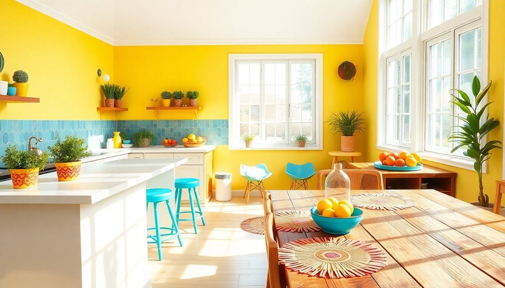
Bright accents in kitchens and dining spaces can transform the atmosphere, making it both inviting and functional.
Vibrant reds or sunny yellows stimulate appetite and encourage social interaction, creating a lively environment for gatherings. Incorporating colorful dishware or table runners alongside earthy tones enhances visibility, helping seniors easily identify features in the space.
Bright lighting paired with cheerful colors counters the yellowed lenses often associated with aging, improving overall visibility. Soft blues or pastels evoke calmness, while bright accents like orange or green energize the room, catering to different moods throughout the day.
High-contrast color schemes, such as pairing bright accents with darker cabinetry, guarantee easy navigation, helping seniors identify kitchen areas and items effectively.
Cozy Browns for Inviting Living Areas
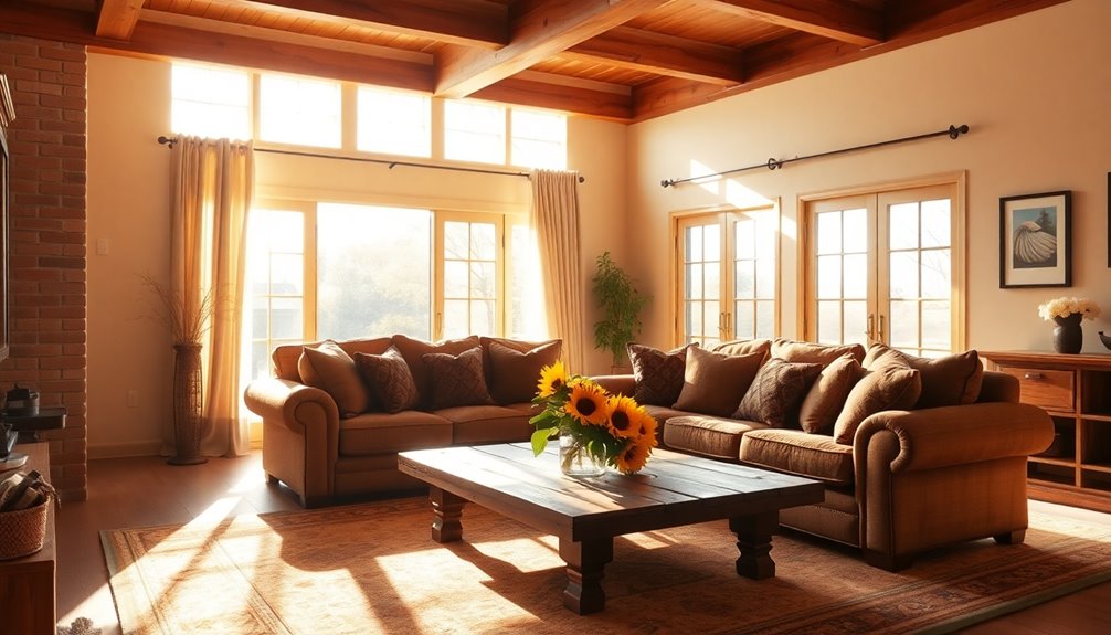
Although many colors can create inviting living spaces, cozy brown tones stand out for their ability to foster warmth and relaxation, making them ideal for seniors.
These shades promote a nurturing environment perfect for family gatherings and quiet moments alike. Here are three ways to incorporate cozy brown tones into your living area:
- Cocoa and Chocolate Accents: Use these rich shades on walls or furniture to enhance comfort and safety.
- Textured Decor Elements: Add shag rugs and accent pillows in varying brown tones to create a snug and stylish atmosphere.
- Natural Connections: Utilize earthy browns to bring a touch of nature indoors, alleviating feelings of isolation, especially in urban settings.
Embrace cozy brown tones for a beautiful, inviting living space!
Frequently Asked Questions
What Color Represents Aging?
When you think about colors that represent aging, gray often comes to mind. It symbolizes wisdom and experience, reflecting a lifetime of stories.
Soft, neutral tones like beige and taupe evoke calmness and sophistication, mirroring the grace that can accompany this stage of life. Pastel colors also resonate, highlighting tranquility and delicacy.
While darker shades might suggest challenges, vibrant hues can celebrate the energy and joy that still exist in the aging process.
What Is the Prettiest Color Scheme?
When you're choosing the prettiest color scheme, think about warm and inviting tones.
Soft blues and earthy greens can create a calming atmosphere, while cozy browns add comfort.
High contrast combinations, like deep jewel tones with lighter neutrals, enhance visibility and help you easily identify features around you.
Don't forget to sprinkle in some pastel shades for a touch of elegance, along with brighter accents to keep things lively and engaging!
What Colors Are Best for Aging Eyes?
When choosing colors for aging eyes, you'll want to focus on high-contrast schemes. Pair darker hues with lighter tones to enhance visibility.
Warm colors like soft yellows and light greens can create a welcoming atmosphere, while gentle blues and grays promote calm in sleeping areas. Avoid stark contrasts, as they can be confusing.
Instead, opt for earthy tones in common areas to foster comfort and social interaction. This approach makes navigation easier and more enjoyable.
What Colors Do Elderly Prefer?
You might think that all colors appeal equally, but elderly individuals often lean towards warm, inviting shades like yellows and earth tones.
These hues evoke comfort and happiness, making their spaces feel welcoming. They also appreciate soft blues and light purples for their calming effects.
High contrast combinations enhance visibility, helping them navigate easily, while cozy browns and beiges create a secure atmosphere.
Bright accents in shared areas can spark joy and connection among residents.
Conclusion
So, whether you're leaning towards soft neutrals or vibrant jewel tones, remember that aging in place doesn't have to mean settling for drab. Who said comfort can't be chic? With a splash of color or a cozy brown, you can transform your home into a vibrant oasis instead of a dull retirement home. After all, if you're going to grow old, you might as well do it surrounded by shades that scream "fabulous" rather than "fading away"!