
TL;DR

Get decor and gifts delivered free with Prime
- Fast, free delivery on millions of items
- Prime Video, Amazon Music and more included
- Member-only deals all year
A House Beautiful report gathered designers’ cautions about six kitchen paint colors: cool gray, black, bright yellow, stark white, red and lime green. Their concerns include a cold or overwhelming feel, and, for black cabinetry, visible dust, cooking residue and wear; the advice reflects professional opinion, not a universal rule.
A House Beautiful report has highlighted six kitchen paint colors that interior designers say homeowners may regret: cool gray, black, bright yellow, stark white, red and lime green. The designers cite concerns ranging from a cold or visually intense atmosphere to the practical upkeep of black cabinets, offering advice for people planning a kitchen repaint rather than a formal ranking or evidence that these colors are universally unsuitable.
Shannon Kadwell, kitchen and bath director at Anthony Wilder Design Build, says she avoids cool gray because it can make a kitchen feel cold or sterile. Her view is that the room should feel welcoming, though the report does not claim every gray paint or kitchen lighting scheme produces that effect.
Sharon L. Sherman of Thyme & Place Design says black can be demanding on cabinetry. She warns that dust and cooking oils may be visible, drawers can get dinged while heavy cookware is handled, and touch-ups can be difficult. For clients who want the dark look, she prefers a softly distressed finish. The article also includes warnings about stark white: Kelly Neely, founder of Kelly Neely Interiors, says too much white can feel cold despite white kitchens’ classic reputation.
The brighter shades draw concerns about intensity. Darla Bankston May of Bankston May Associates says school-bus yellow may work as a small accent but can become loud when used broadly. Marissa Stokes advises against highly saturated yellow or red, while Libby Baker says lime green could feel jarring and overstimulating at mealtimes. These are designers’ judgments, not measured findings about how people respond to particular colors.
How Color Affects Kitchen Living
Kitchen paint can shape how a room feels during daily use, and repainting or replacing finished cabinetry can take time and money. The designers’ comments give readers specific issues to weigh before committing: whether a shade feels welcoming in the home’s lighting, whether a strong color may dominate the room, and whether dark cabinets will show residue or damage.
The advice is not a rulebook. A color’s appearance depends on factors such as the amount of paint used, surrounding finishes, daylight and artificial lighting. The report itself allows for limited use of bold yellow as an accent and notes that Sherman likes black, even while cautioning about its upkeep. Readers can treat the list as prompts for testing a color and finish in their own kitchen, rather than as a directive to avoid entire color families.
As an affiliate, we earn on qualifying purchases.
The Designers’ Six Color Concerns
The House Beautiful article frames the kitchen as both a workspace for preparing meals and a gathering place, then asks designers which colors they would avoid or use cautiously. It presents six examples and ties each to a different concern: cool gray and stark white are associated with a potentially cold feel; black with visible grime and harder touch-ups; and saturated yellow, red and lime green with visual intensity.
The recommendations vary rather than describing a single agreed standard. Bankston May distinguishes a yellow accent from a full-room application, and Sherman suggests a distressed finish if a client wants black cabinetry. Stokes favors softer neutrals or muted tones, but the article does not set out a tested palette, compare paint products, or establish that one alternative works for every kitchen.
“A kitchen is meant to be the warm, welcoming heart of the home where people actually want to gather—not a sterile commercial office or a hospital corridor.”
— Shannon Kadwell, kitchen and bath director at Anthony Wilder Design Build
No Universal Color Rules
The report does not provide survey results, product tests or evidence that homeowners generally regret these choices. It also does not specify particular paint brands, shades, finishes, room sizes or lighting conditions. The warnings should be read as individual designers’ opinions, not confirmed outcomes for every kitchen.
It is also unclear how much a given color would affect a specific home without seeing its natural light, cabinetry, counters and finishes. The article offers no cost estimates or advice about how paint may perform over time beyond Sherman’s comments about black cabinetry and touch-ups.
Test Colors Before Committing
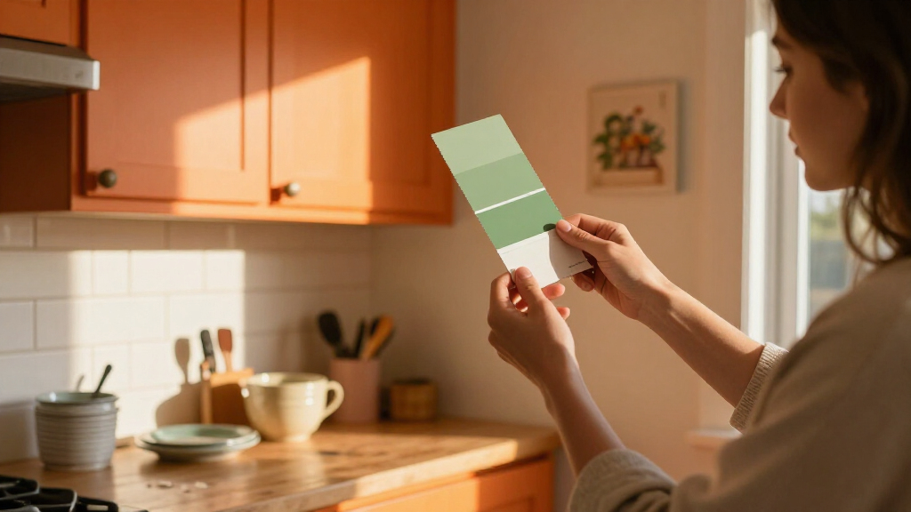
The report does not announce a product launch, policy change or scheduled follow-up; it is design guidance for readers considering a repaint. A practical next step is to test paint samples in the kitchen and view them at different times of day, alongside existing cabinets, counters and flooring. Homeowners considering cabinetry can also compare finishes and account for how visible cooking residue and ordinary wear may be.
Ultimately, the designers’ cautions leave the decision with the homeowner. A small accent, a particular finish or a carefully chosen shade may read differently from a broad application, and the source offers no universal formula for deciding which color will suit a particular household.
Key Questions
Which six kitchen colors does the report caution against?
The designers discuss cool gray, black, bright yellow, stark white, red and lime green. Their concerns differ by color and are opinions, not a universal prohibition.
Why does one designer caution against black cabinets?
Sharon L. Sherman says dust and cooking oils can show on black cabinetry, drawers may get dinged during everyday use, and touch-ups can be difficult. She suggests considering a softly distressed finish for clients who want a dark look.
Are designers saying bright yellow should never be used?
No. Darla Bankston May says bright yellow may work as a small accent, while warning that extensive use can feel loud and overwhelming. That is her design assessment, not a measured rule.
Does the report prove homeowners regret these colors?
No. It collects designers’ recommendations and personal views; it does not provide survey data or research measuring homeowner regret.
Source: rss
Halloween Picks
halloween
As an affiliate, we earn on qualifying purchases.