
To design low-vision graphics, you can use accessible color tools like contrast checkers, which guarantee your colors meet WCAG standards, and simulators that show how visuals appear to users with vision impairments. Palette generators help you pick inclusive colors, while browser extensions let you test designs in real-time. Incorporating user feedback and following best practices ensures your graphics are effective and inclusive—if you keep exploring, you’ll find even more resources to improve your work.
Key Takeaways
- Use color contrast checkers to ensure text and background meet accessibility standards like WCAG.
- Utilize simulation tools to preview how graphics appear to users with low vision or color deficiencies.
- Apply color palette generators with contrast optimization features for inclusive and readable designs.
- Incorporate browser extensions for quick accessibility audits and real-time color adjustments.
- Engage with community resources and feedback to refine color choices and improve visual accessibility.
Understanding Contrast and Color Accessibility Standards
To guarantee your designs are accessible, it’s essential to understand contrast and color accessibility standards. These standards ensure that users with different color perceptions can distinguish content easily. Good contrast enhances visual ergonomics, reducing eye strain and improving readability. Color perception varies among individuals, especially those with color vision deficiencies, so designing with sufficient contrast helps make information clear for everyone. Understanding guidelines like the Web Content Accessibility Guidelines (WCAG) can help you choose appropriate contrast ratios. Adhering to color contrast standards ensures your content remains accessible across various devices and lighting conditions. By prioritizing these standards, you create more inclusive designs that support better visual ergonomics, making your content accessible to a wider audience. Ultimately, considering contrast and color accessibility is key to effective, user-friendly visual communication.
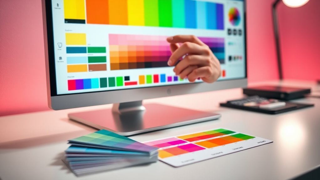
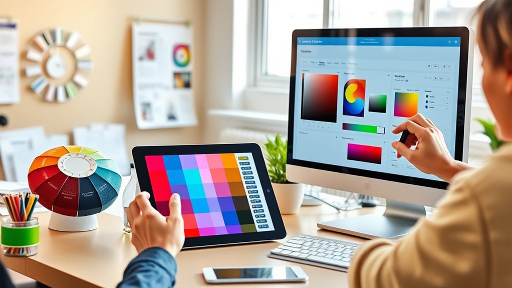
Color Contrast Checkers for Ensuring Readability
Color contrast checkers are practical tools that help you verify whether your designs meet accessibility standards. They enable you to assess if your text, including accessible typography, stands out clearly against its background, ensuring readability for low-vision users. By using these tools, you can easily evaluate color combinations, making adjustments where needed to improve contrast. This process supports the creation of inclusive iconography that remains distinguishable for all users. With contrast checkers, you can confidently design graphics that adhere to accessibility guidelines, reducing visual strain and enhancing overall comprehension. Incorporating these tools into your workflow ensures your visuals are both functional and user-friendly, fostering an inclusive environment where everyone can access and understand your content.
Tools for Simulating Low-Vision Conditions
Understanding how low-vision users experience your designs is essential for creating truly accessible content. Tools that simulate low-vision conditions help you see your work through the lens of visual impairment, revealing challenges in color perception. These simulations mimic common issues like blurred vision, tunnel vision, or reduced contrast, allowing you to evaluate how your graphics appear to users with different types of visual impairment. By testing your designs with these tools, you gain insight into potential readability obstacles and can make informed adjustments. They serve as a bridge, helping you understand the real-world impact of your color choices and layout decisions. Ultimately, these tools empower you to create more inclusive visuals that accommodate diverse visual needs.
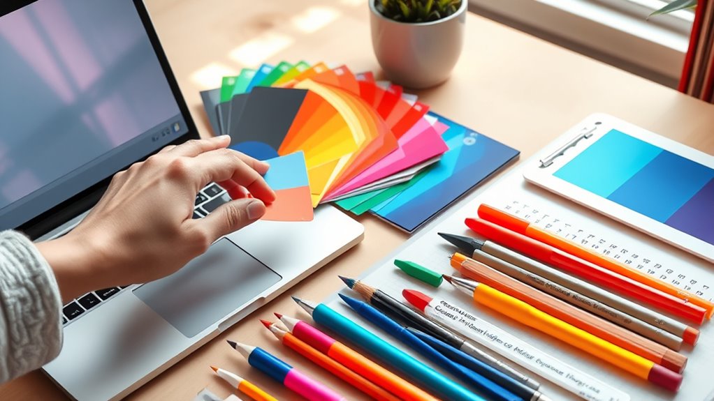
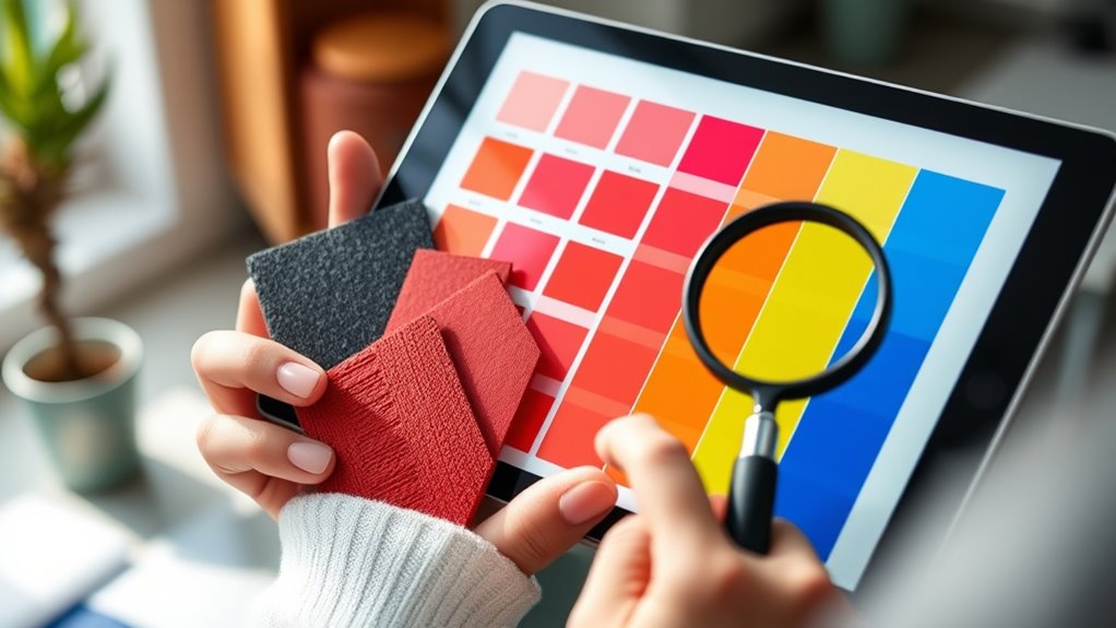
Color Palette Generators With Accessibility Features

You can find color palette generators that prioritize accessibility, making it easier to create inclusive designs. These tools often include contrast optimization features to guarantee readability and color blind simulations to test how your palette appears to different users. Using them helps you build visually accessible content right from the start. Incorporating beneficial ingredients like collagen and hyaluronic acid in design elements can further enhance visual appeal and user experience.
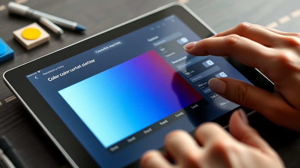
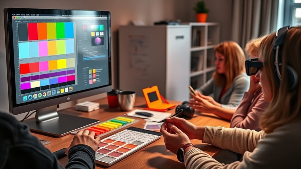
Contrast Optimization Tools
Contrast optimization tools are essential for guaranteeing that digital designs are accessible to everyone, especially those with visual impairments. These tools help you evaluate and adjust your color contrast to meet accessibility standards, such as WCAG guidelines. By using contrast checkers, you can quickly identify color combinations that fall short and modify them for better visibility. Many tools suggest alternative color palettes that maximize contrast without sacrificing aesthetic appeal. This process ensures your content remains legible and inclusive for users with low vision. Incorporating contrast optimization early in your design workflow helps you create compliant, user-friendly graphics and interfaces. Additionally, understanding color theory can enhance your ability to select harmonious yet accessible color schemes. Ultimately, these tools empower you to enhance accessibility while maintaining visual harmony across your digital projects.
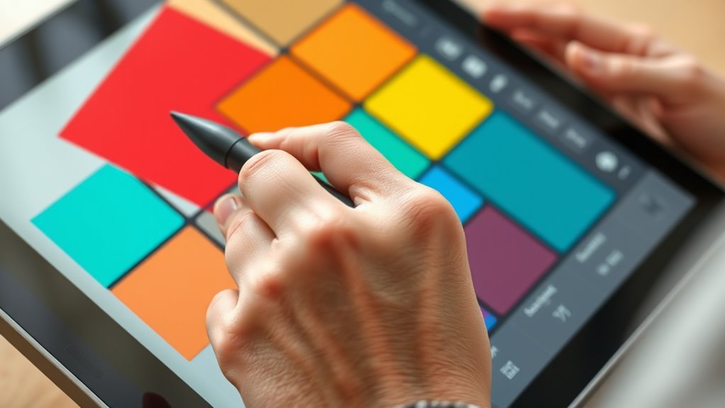
Color Blind Simulation
Have you ever wondered how your color choices appear to users with different types of color vision deficiencies? Color blind simulation tools help you understand how your designs are perceived by those with visual impairments. These tools modify your color palette to mimic various forms of color blindness, revealing potential issues in color perception. By using these simulations, you can identify combinations that might be confusing or indistinguishable for some users. This process is similar to understanding color profiles used in digital images, which ensures consistent color display across devices. This allows you to adjust your colors proactively, ensuring your graphics are accessible to everyone. Incorporating color blind simulations into your design process enhances inclusivity and helps you create visuals that communicate effectively across diverse audiences. Ultimately, these tools empower you to produce more accessible, user-friendly graphics.
Browser Extensions to Test Accessibility in Real-Time
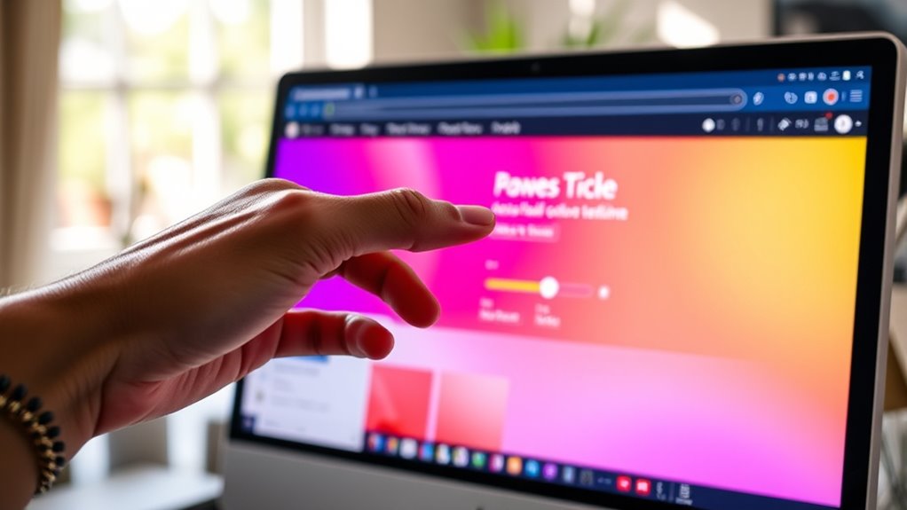
Browser extensions have become essential tools for evaluating accessibility on the fly, allowing you to test color contrast and other visual elements directly within your web browsing experience. With these extensions, you can perform quick accessibility audits to identify issues that may hinder low-vision users. Many tools include features for color calibration, helping you adjust color schemes in real-time to meet contrast standards. These extensions often provide instant feedback, highlighting problematic areas and suggesting improvements without needing to leave your browser. By integrating these tools into your workflow, you guarantee your designs are more inclusive and compliant. They make it easier to catch accessibility issues early, streamlining the process of creating graphics and websites that are accessible to all users. Proper planning, including understanding beneficiary designations, can further enhance the accessibility and effectiveness of your visual content.
Guidelines for Selecting Inclusive Color Combinations
When choosing color combinations, you should prioritize high contrast ratios to guarantee readability for all users. Using color-blind friendly palettes helps make your designs accessible to people with various types of color vision deficiencies. Keep these guidelines in mind to create inclusive, easy-to-see visuals across your projects.
Prioritize Contrast Ratios
To create accessible designs, prioritizing contrast ratios between text and background is essential. Good contrast guarantees that your content is readable for low-vision users and aligns with color theory principles, which guide effective color combinations. Strong contrast enhances visual hierarchy, making key information stand out clearly. Use tools like the Web Content Accessibility Guidelines (WCAG) to measure contrast ratios and ensure they meet recommended standards. Keep in mind that high contrast doesn’t mean harsh or jarring; it’s about balance. By carefully selecting colors with sufficient contrast, you create a more inclusive experience where your audience can easily distinguish text from the background, regardless of their vision abilities. Additionally, understanding essential oils for eye health can support overall visual comfort and reduce strain. Always test your color choices to maintain clarity and accessibility.
Use Color-Blind Palettes
Selecting color combinations that are distinguishable for color-blind users is essential for creating inclusive designs. Using color-blind palettes guarantees your graphics are accessible to all, regardless of visual limitations. These palettes prioritize palette diversity, offering combinations that remain clear for different types of color blindness. To illustrate, consider this table of common color pairs:
| Color Pair | Suitable for | Key Benefit |
|---|---|---|
| Blue & Orange | Deuteranopia | High contrast, easy to distinguish |
| Purple & Yellow | Protanopia | Good visibility across types |
| Cyan & Magenta | Tritanopia | Maintains clarity in visuals |
| Green & Brown | General | Adds palette diversity without loss of clarity |
| Red & Teal | General | Ensures distinguishability for most |
Additionally, using aesthetic wall organization principles can help highlight important visual elements in your designs.
Incorporating User Feedback and Testing for Accessibility
Incorporating user feedback and testing is essential for creating accessible color tools that truly meet diverse needs. You should actively seek input from users with low vision to understand their experiences and challenges. Conducting accessibility testing helps identify issues that might be overlooked in initial designs, guaranteeing your tools are effective for everyone. Engage users early and often throughout the development process, using their insights to refine color choices and interface features. Regular testing allows you to catch problems before deployment, saving time and resources. Remember, user feedback is invaluable for understanding real-world needs, while accessibility testing validates that your tools are genuinely usable. Incorporating color accuracy considerations throughout the process ensures the tools provide precise visual representation for users with low vision. Together, these steps ensure your color tools are inclusive, functional, and responsive to the needs of all users.
Integrating Accessibility Tools Into Design Workflows
Integrating accessibility tools into your design workflows guarantees that inclusive principles become a seamless part of your development process. By embedding color contrast checkers and simulation tools early, you make sure your designs align with color theory principles that promote readability and engagement. These tools help you evaluate and adjust color choices to enhance visual hierarchy, making important elements stand out for low-vision users. Incorporate accessibility checks at each stage, from wireframing to final review, to catch issues before they escalate. Additionally, understanding divorce statistics can inform the importance of clear visual communication in legal contexts, ensuring your graphics effectively convey critical information. This proactive approach streamlines your workflow, reduces the need for extensive revisions later, and fosters consistent application of inclusive design standards. Ultimately, integrating these tools ensures your graphics are both aesthetically appealing and accessible to all users.
Resources and Communities for Inclusive Design Best Practices
Accessible design isn’t something you have to develop in isolation; numerous resources and communities are available to support your efforts. Engaging with these groups enhances your skills and promotes community collaborations. Joining forums, attending webinars, and participating in workshops provide opportunities for professional development. These platforms connect you with experts and peers, fostering shared knowledge and best practices. To illustrate, consider the table below:
| Resource Type | Examples | Benefits |
|---|---|---|
| Online Communities | A11y Slack, Reddit Accessibility | Networking, collaboration |
| Professional Development | Webinars, Certifications | Skill-building, up-to-date knowledge |
| Local Meetups | Accessibility meetups | Local support, hands-on learning |
Utilizing these resources accelerates your growth and guarantees your designs are inclusive and effective. Additionally, understanding the importance of privacy policies and user consent can help ensure your designs adhere to best practices in user privacy and data protection.
Frequently Asked Questions
How Can I Train Team Members on Accessible Color Design Practices?
To train your team on accessible color design practices, start with regular accessibility workshops that focus on the importance of color contrast and visual clarity. Encourage hands-on exercises using accessible color tools, and share resources like guidelines and best practices. Foster a culture of continuous learning by reviewing designs together and providing constructive feedback. This proactive approach guarantees your team stays informed and committed to creating inclusive, visually accessible graphics.
Are There Affordable or Free Tools for Accessibility Testing?
If you’re looking for free testing or affordable tools for accessibility, several options are available. You can use free testing tools like WAVE, Axe, and Lighthouse to check your designs for color contrast and other accessibility issues. These tools are user-friendly and cost-effective, making them perfect for small teams or individual projects. Incorporating these into your workflow helps guarantee your graphics are accessible without breaking the bank.
How Do Color Tools Integrate With Popular Design Software?
You explore how color tools seamlessly integrate with your favorite design software, enhancing your workflow. You check for features that improve color contrast and expand your color palette, making designs more accessible. You find plugins and extensions that sync effortlessly, allowing you to tweak accessibility settings without leaving your platform. You streamline your process, ensuring your graphics are visually appealing and inclusive, all while maintaining efficiency and creative control.
What Are Common Mistakes to Avoid When Designing for Low Vision?
When designing for low vision, you should avoid common mistakes like neglecting contrast issues, which can make text hard to read. Don’t rely solely on color to convey information, especially if you or your audience have color blindness. Make certain there is sufficient contrast between backgrounds and text, and test your designs with tools to identify potential visibility problems. Keeping these points in mind helps create accessible graphics that everyone can understand.
How Can I Ensure Accessibility Across Different Devices and Screens?
To guarantee accessibility across different devices and screens, you should prioritize responsive testing and device calibration. Regularly test your designs on various screens to identify what works best, adjusting contrast and color as needed. Use tools that simulate different vision impairments, and calibrate your devices to maintain consistent color accuracy. This approach helps you create graphics that remain clear and accessible, no matter what device your audience uses.
Conclusion
By using accessible color tools, you’re building bridges rather than barriers—like designing a ramp that welcomes everyone. Imagine your graphics as a cityscape viewed from different angles; these tools help guarantee all can see and navigate comfortably. Embracing these resources transforms your work into inclusive art, making your message accessible to all. When you prioritize accessibility, you’re creating spaces where everyone can connect, see, and thrive—one color at a time.