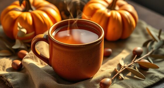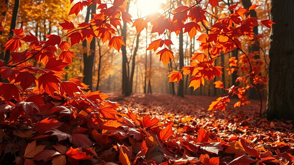

Autumn palettes with terracotta, deep reds, and gold create warm, inviting looks that reflect the season’s natural beauty. These rich hues evoke feelings of comfort, elegance, and timeless charm. Pair deep reds with neutral tones for balance, add gold accents for a touch of luxury, or blend terracotta into casual or formal styles. By exploring these shades, you’ll discover stylish ways to celebrate fall’s enchanting colors—keep going to learn how to incorporate them effortlessly into your wardrobe.
Key Takeaways
- These colors evoke warmth, comfort, and natural elegance, perfectly capturing the essence of autumn’s changing landscape.
- Combining terracotta, deep reds, and gold creates rich, stylish palettes suitable for both casual and formal fashion.
- Deep reds add boldness, while terracotta offers earthy versatility, and gold provides a luxurious, shimmering accent.
- Pairing these shades enhances seasonal outfits with depth, warmth, and a touch of opulence.
- The palette reflects autumn’s natural beauty, inspiring personal style and seasonal aesthetic expression.

Have you ever wondered why autumn palettes enchant so many? It’s because they evoke a sense of warmth, comfort, and timeless beauty that resonates deeply with everyone. The rich hues of terracotta, deep reds, and shimmering golds mirror the changing leaves and create an inviting atmosphere. When you embrace these colors, you’re not just following fall fashion trends; you’re immersing yourself in a season of natural elegance. These shades blend seamlessly into stylish seasonal color pairings that highlight your features and elevate your wardrobe. The deep reds, reminiscent of ripe cherries or crimson foliage, add a bold touch to your outfits, making a statement that’s both powerful and sophisticated. Pair them with neutral tones like beige or charcoal for a balanced look, or combine them with burnt orange and mustard yellow to create a vibrant, layered ensemble. Terracotta, with its warm, earthy tone, offers versatility that works well in both casual and formal settings. You might wear a terracotta sweater with a pair of dark jeans or choose a flowing skirt in this hue paired with a cream blouse. It’s a color that feels organic and grounded, perfect for mixing and matching with other warm shades. Gold, on the other hand, introduces a touch of luxury and brightness, especially in accessories or accents. Think of gold jewelry, shoes, or even subtle metallic details that catch the light and add shimmer to your look. Combining gold with deep reds or terracotta creates a regal effect, perfect for evening outings or special occasions. When you’re exploring fall fashion trends, it’s essential to contemplate how these seasonal color pairings can enhance your personal style. Layering is key—try a deep red scarf over a neutral sweater, or add a gold belt to define your waist. These combinations are not only visually appealing but also practical, allowing you to adapt your outfit to changing weather while staying fashion-forward. Autumn palettes are rooted in nature’s transformation, and by incorporating these colors into your wardrobe, you’re embracing the beauty of the season. Incorporating color psychology can help you select shades that reflect your mood and personality. Whether you prefer bold statements or subtle accents, these shades provide endless options to express your style. So, as fall approaches, think about how terracotta, deep reds, and gold can transform your outfits into a celebration of seasonal charm. With thoughtful styling and an eye for seasonal color pairings, you’ll effortlessly capture the essence of autumn’s enchanting palette.
Frequently Asked Questions
How Do I Incorporate These Colors Into Home Décor?
You can incorporate these warm colors into your home décor by creating DIY wall art with terracotta and deep red accents, adding a cozy touch. Try furniture painting ideas like a statement table or chairs in gold or deep reds to bring richness. Use throw pillows, rugs, or curtains in these hues to tie the space together. Mixing textures and finishes enhances the autumn-inspired vibe, making your home inviting and stylish.
Which Skin Tones Complement Terracotta and Deep Reds Best?
You’ll find that warm skin tones, like golden or olive undertones, best complement terracotta and deep reds, creating beautiful skin tone harmony. If you have a cool undertone, opt for subtle makeup matching to balance the rich hues without overpowering your complexion. These colors enhance natural warmth, making your features pop. For the most flattering look, experiment with shades that highlight your skin’s natural undertone while embracing the autumn palette.
Are These Colors Suitable for Spring or Summer Fashion?
You might notice how these rich, warm tones seem more suited to autumn or winter fashion than spring or summer. While they’re excellent for seasonal color adaptability during cooler months, they often clash with the lighter, pastel shades typical of spring and summer. These colors aren’t the best for seasonal fashion trend compatibility if you’re aiming for fresh, airy looks, but they shine in cozy, layered autumn outfits.
What Color Combinations Work Well With Gold Accents?
You should try pairing gold accents with rich jewel tones like emerald green, deep purple, or sapphire blue for striking color pairing ideas. Neutral shades like cream, beige, or charcoal also work well as accent color suggestions, making the gold pop without overwhelming your look. For a warm, cohesive vibe, combine gold with warm earth tones such as burnt orange or deep reds. These combinations create a sophisticated, balanced appearance perfect for any occasion.
How Can I Adapt This Palette for Outdoor Seasonal Decorations?
Did you know that outdoor autumn decorations boost curb appeal by up to 61%? To adapt this palette, craft DIY wreaths with terracotta, deep reds, and gold accents, adding seasonal lighting for warmth and vibrancy. Use natural elements like leaves, pumpkins, and branches to complement the colors. Incorporate string lights or lanterns to highlight your decorations at night, creating a cozy, inviting atmosphere that celebrates the season beautifully.
Conclusion
Now that you’re embracing autumn’s fiery hues of terracotta, deep reds, and shimmering gold, get ready to turn heads wherever you go. These colors aren’t just shades—they’re your secret weapons for making every outfit pop and lighting up every room like a sunset on steroids. So, go ahead, dive headfirst into this season’s palette and let your style burst into flames of stunning brilliance. Trust me, you won’t just look amazing—you’ll look like autumn itself walked out of a dream!