To balance cool and warm undertones in open-plan spaces, start by choosing a cohesive color palette that blends neutral shades with well-placed accent colors. Incorporate furniture and decor with complementary undertones, and layer lighting to highlight different tones effectively. Use color blocking or accent walls to define zones while maintaining harmony. If you keep exploring, you’ll discover ways to seamlessly integrate these tones for a harmonious, inviting environment.
Key Takeaways
- Use neutral or balanced color palettes combining warm and cool tones for seamless visual flow.
- Implement color blocking to define zones with contrasting undertones while maintaining harmony.
- Incorporate layered lighting to highlight and unify warm and cool areas effectively.
- Select furniture and decor with mixed undertones to create cohesive visual interest across open spaces.
- Add transitional elements like textured accessories or gradual color gradients to soften stark undertone contrasts.
Understanding the Difference Between Cool and Warm Undertones
Understanding the difference between cool and warm undertones is essential when balancing undertones in open-plan spaces. Your focus should start with color temperature—cool tones have blue, green, or violet undertones, while warm tones feature red, orange, or yellow undertones. Recognizing these differences helps you create a harmonious flow throughout your space. Pay attention to undertone contrast, which occurs when cool and warm shades clash or complement each other. High contrast can energize a room, but too much may feel disjointed. By understanding how undertones interact based on color temperature, you can make informed choices that promote visual balance. This awareness allows you to select furniture, walls, and accents that work together seamlessly, avoiding jarring progressions in your open-plan layout. Incorporating color coordination strategies can further enhance the cohesiveness of your design.
Choosing a Cohesive Color Palette for Open Spaces
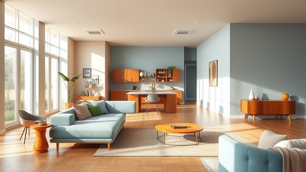
Creating a cohesive color palette for open spaces starts with selecting shades that complement each other and reflect your desired mood. Neutral color schemes work well to create a balanced, versatile foundation, allowing both cool and warm undertones to coexist seamlessly. To add interest, consider accent wall ideas that highlight specific areas or architectural features. For example, a soft taupe or greige wall can serve as a neutral backdrop, while a deeper hue like navy or warm terracotta on an accent wall introduces depth and personality. Keep in mind that choosing colors with similar undertones helps maintain harmony across the space. Incorporating rustic decor elements can further enhance the farmhouse aesthetic and create visual cohesion. With intentional selection, your open plan will feel unified, inviting, and well-coordinated, regardless of the undertones you favor.
Strategies for Integrating Cool and Warm Tones Seamlessly
Once you’ve established a cohesive color palette, the next step is to blend cool and warm tones smoothly throughout your open plan. One effective strategy is color blocking—pair cool shades with warm hues in defined areas to create visual interest and balance. Use accent walls to highlight specific zones, such as a warm-toned wall in the dining area against cooler living room elements. This contrast helps integrate different undertones without clashing. Keep transitions subtle by choosing shades that complement each other, like soft blues with earthy terracottas or muted greens with warm beiges. Avoid abrupt shifts; instead, aim for gradual blending through overlapping tones or accessories. These techniques ensure your space feels harmonious, dynamic, and thoughtfully designed, seamlessly uniting cool and warm undertones across your open plan. Additionally, understanding color harmony principles can help you select combinations that naturally blend and enhance the overall aesthetic.
Furniture and Decor Tips for Achieving Balance
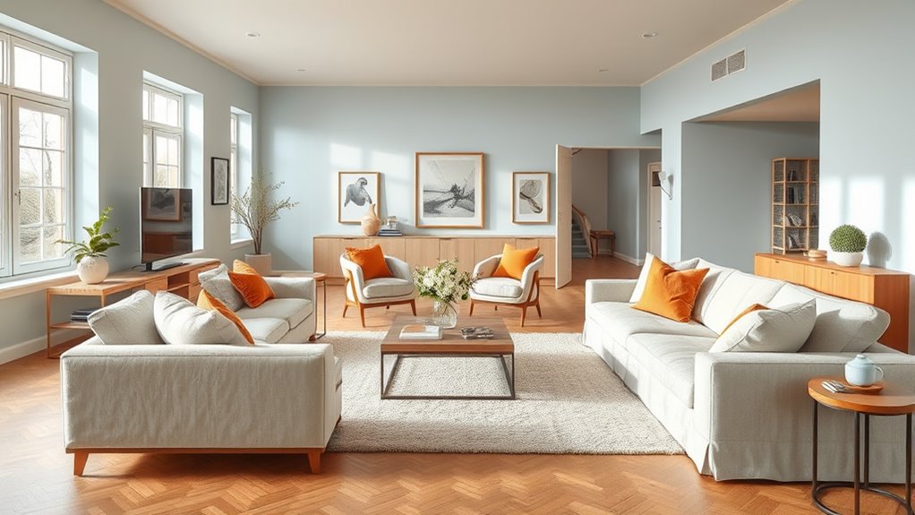
To achieve a balanced look in your open plan, carefully select furniture and decor that complement both cool and warm undertones. Incorporate artificial textiles like faux fur or plush upholstery in neutral shades to add warmth without overwhelming the space. Use vintage accessories, such as distressed vases or retro picture frames, to introduce character and subtle color variations that bridge the undertone gap. Mixing textures and finishes also helps create visual harmony, making the room feel cohesive. Aim for pieces that combine warm woods with cool metals, or soft fabrics with sleek surfaces. Additionally, consider store hours for your favorite retailers to plan your shopping trips effectively. By thoughtfully choosing these elements, you’ll establish a unified environment that celebrates both cool and warm undertones, resulting in a space that feels inviting, balanced, and well-curated.
Lighting Techniques to Enhance Color Harmony

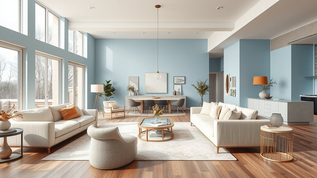
Lighting plays a pivotal role in enhancing color harmony in your open plan, especially when balancing cool and warm undertones. Proper lighting techniques can unify your space through effective color mixing and accent lighting. Use layered lighting to highlight specific areas, creating visual interest and harmony. Incorporate accent lighting to emphasize warm or cool tones, guiding the eye and balancing undertones seamlessly. Adjust color temperature with bulbs that complement your palette, avoiding harsh contrasts. Consider dimmable fixtures to fine-tune ambiance and maintain consistent color flow. Understanding color temperature is essential for choosing lighting that enhances your space’s aesthetic.
Effective layered and accent lighting unifies warm and cool tones for harmonious open-plan spaces.
- Highlight warm accents with amber or soft white light
- Use cool-toned lighting to balance warmer areas
- Mix lighting sources for depth and variation
- Highlight architectural features with accent lighting
- Control brightness for mood and tone adjustments
Practical Examples and Inspiration for Balanced Open-Plan Designs
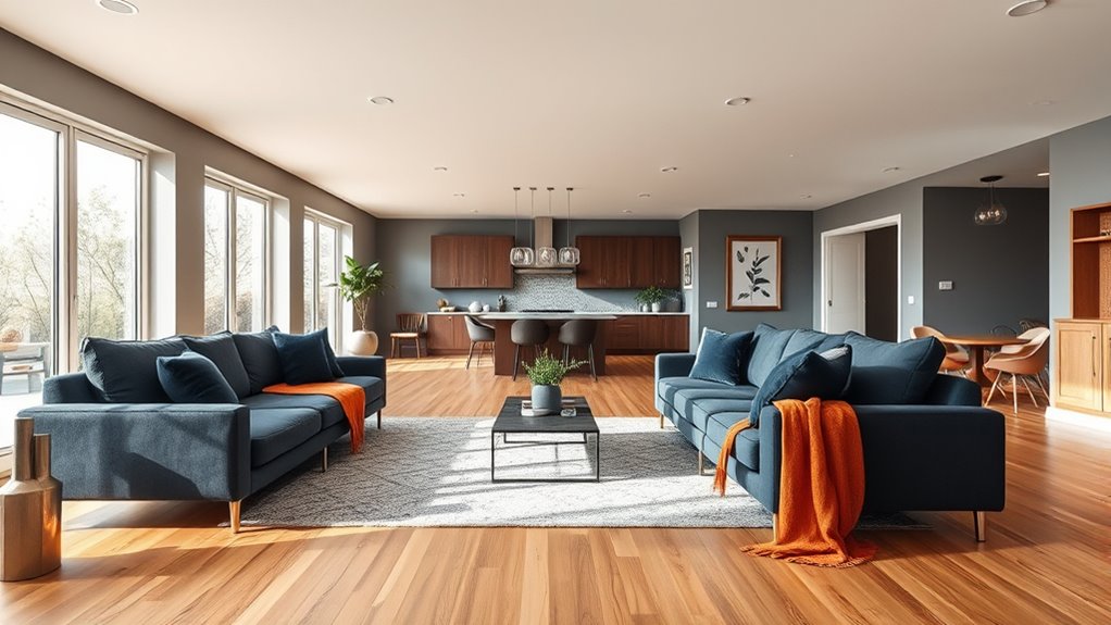
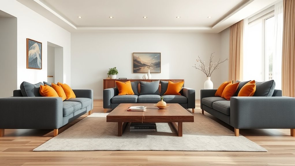
In practical open-plan designs, achieving a balanced look involves selecting furniture, color schemes, and layout arrangements that harmonize cool and warm undertones. One effective strategy is color blocking, where you group similar shades together to create visual interest while maintaining harmony. For example, pair cool-toned blues with warm beige accents or warm terracotta with cool gray elements. Texture mixing also enhances balance; combine sleek, smooth surfaces with cozy, textured fabrics to add depth without overwhelming the space. Incorporate natural materials like wood and woven textiles to create warmth, while metal or glass pieces introduce a cool, modern touch. These techniques help you craft an inviting, cohesive environment that beautifully blends cool and warm undertones in an open-plan setting. Additionally, understanding color harmony techniques can further refine your palette choices for a more polished design.
Frequently Asked Questions
How Can I Test My Home’s Undertones Accurately?
To test your home’s undertones accurately, start with paint swatch matching by selecting a few shades you like. Then, use undertone sensors if available, as they can identify subtle cool or warm hints. Hold the swatches in different lighting conditions, like natural and artificial light, to see how the undertones shift. This helps guarantee you choose colors that complement your open plan and create a cohesive look.
What Are Common Mistakes When Mixing Cool and Warm Colors?
Imagine you’re in a swanky 1920s speakeasy, but the vibe feels off—that’s a color clash waiting to happen. When mixing cool and warm colors, common mistakes include mismatched furnishings that fight for attention or choosing shades that don’t complement each other. You might also underestimate the importance of balance, creating a jarring look. To avoid this, pick harmonious hues and keep a cohesive theme to make your space feel intentional and stylish.
How Do I Adjust Balance in Different Lighting Conditions?
When adjusting for different lighting conditions, you need to observe how natural and artificial lighting affect your space. In natural light, cool tones may appear more vibrant, so warm colors can balance the look. Under artificial lighting, especially warm bulbs, cool tones might soften, while warm shades can become more pronounced. Test your color choices in both settings and tweak as needed to maintain harmony throughout the day.
Can Neutral Tones Help Unify Contrasting Colors Effectively?
Imagine a gentle river blending vibrant, contrasting colors into a calming mosaic. Neutral tones act like that river, seamlessly unifying contrasting colors in your space. They work effectively by softening bold hues and creating a cohesive look, making your open plan feel harmonious. Using neutral tones for walls or furniture can balance cool and warm accents, ensuring your room feels unified, inviting, and visually balanced without overwhelming any particular color.
What Are Budget-Friendly Ways to Update Color Schemes?
If you want to update your color schemes affordably, start with budget-friendly paint options from local stores or online sales. You can also create a DIY accent wall to add visual interest without a full overhaul. These simple, cost-effective ideas let you refresh your space quickly, personalize your home, and make a big impact without breaking the bank. Keep it fun and creative!
Conclusion
By mastering the dance between cool and warm undertones, you create a symphony of harmony in your open plan. Think of your space as a canvas, where every hue and piece of decor plays a essential note. When balanced thoughtfully, your home transforms into a vibrant melody—dynamic yet peaceful, lively yet cozy. Embrace this artistry, and watch your open space become a living masterpiece where colors whisper stories of intentional design.