
To guide safe navigation using color blocking hallway, focus on creating high-contrast, bold color zones that clearly differentiate pathways and areas. Use durable paints with sharp edges, and consider tactile cues for accessibility. Consistent color schemes help users recognize routes quickly, while maintaining vibrant colors ensures visibility over time. Regularly inspect and refresh the paint to keep the cues effective. Keep exploring to discover how choosing the right colors and techniques enhances safety and inclusivity.
Key Takeaways
- Use high-contrast, vibrant colors to clearly delineate pathways and zones for easy visual recognition.
- Apply consistent color schemes throughout hallways to reinforce intuitive navigation and reduce confusion.
- Incorporate tactile cues like textured or raised surface markers at key points for inclusive guidance.
- Ensure proper surface preparation and multiple coats of durable paint for long-lasting, visible color blocks.
- Regularly maintain and update color markings to prevent fading and ensure ongoing safety and clarity.
The Principles Behind Effective Color Coding
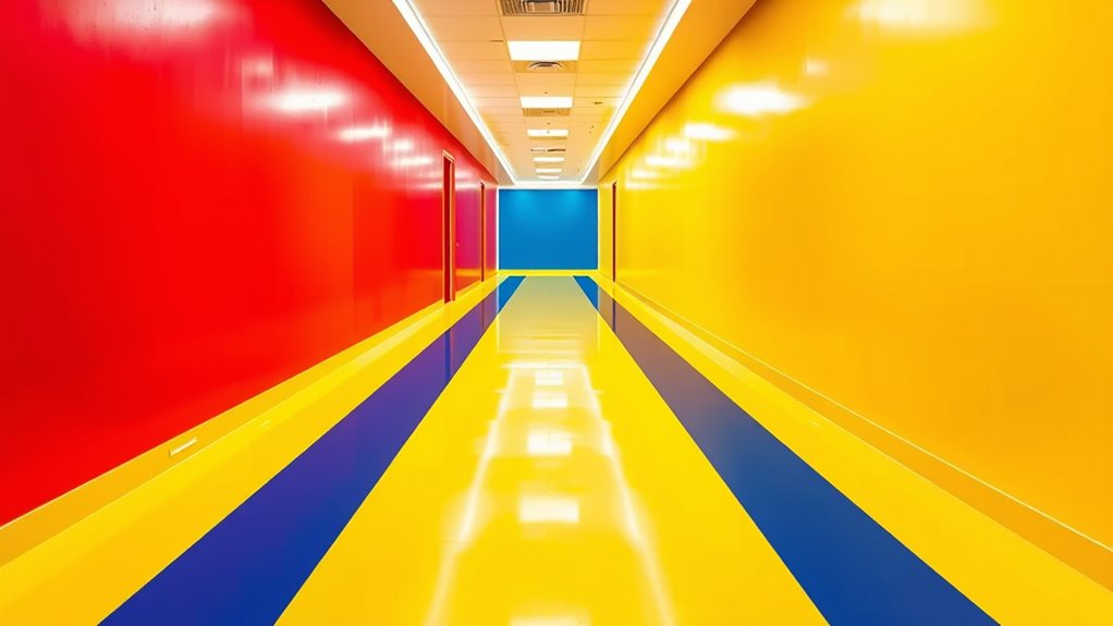
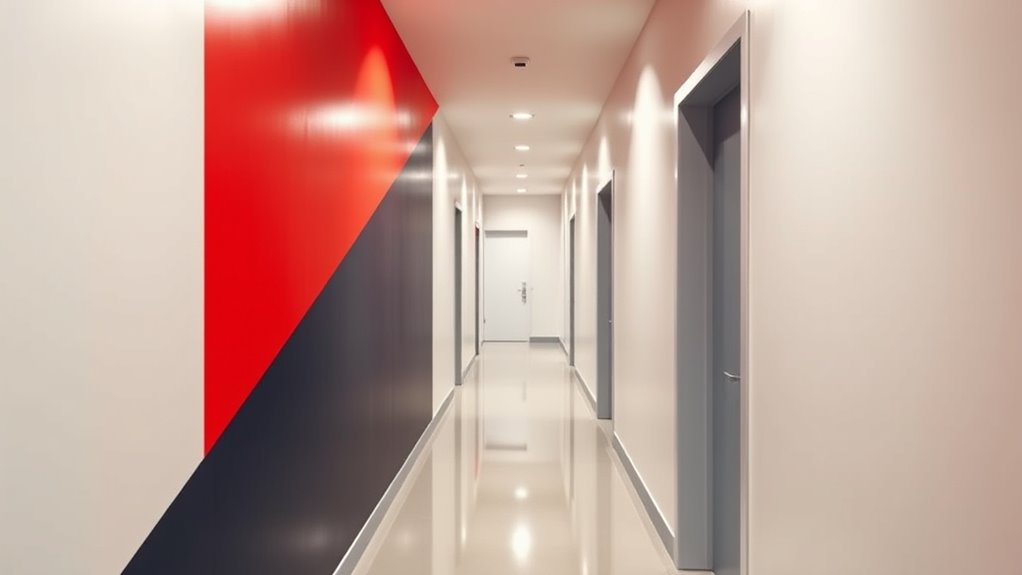
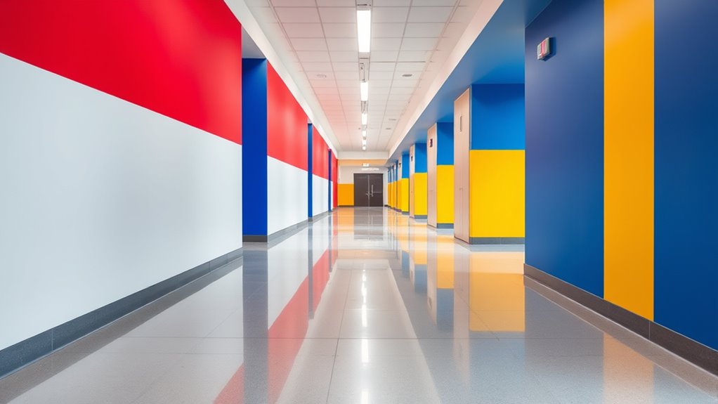
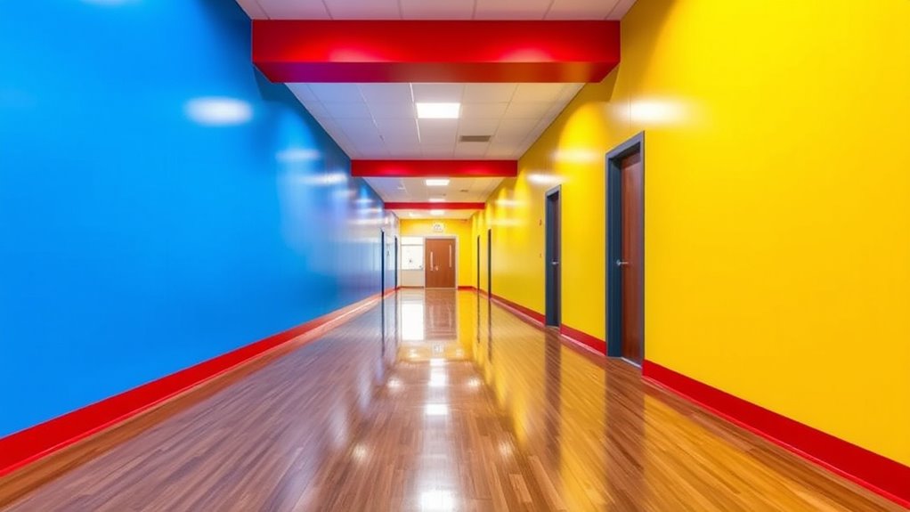
Understanding the principles behind effective color coding is essential for creating functional and intuitive hallways. You need to focus on visual contrast to guarantee that colors stand out clearly, helping individuals distinguish different zones or pathways easily. High contrast between colors enhances visibility, especially in low-light conditions or for those with visual impairments. Additionally, color psychology plays a crucial role in choosing the right hues; warm colors like red and orange can signal caution or alertness, while cool colors like blue and green promote calmness and reassurance. When you combine strong visual contrast with thoughtful color psychology, you create a hallway that is not only easy to navigate but also emotionally supportive, guiding people safely through space with intuitive cues. The contrast ratio directly influences how well different colors are perceived, which is vital for overall image quality and effective communication of spatial cues.
Materials and Techniques for Applying Color Blocks
Selecting the right materials and techniques is essential for applying color blocks effectively in hallways. Start with careful paint selection, choosing durable, low-odor paints that withstand foot traffic and cleaning. Opt for high-quality latex or epoxy paints for longevity and vibrant color retention. When it comes to installation techniques, prepare surfaces thoroughly by cleaning and sanding to ensure proper adhesion. Use painter’s tape to create clean, sharp edges, and consider applying multiple thin coats rather than one thick layer for even coverage. For larger areas, use rollers for efficiency and brushes for edges. If you prefer a more seamless finish, spray painting can be effective, but requires proper equipment and safety precautions. Being aware of conflict resolution skills is also beneficial, as it helps address any issues that arise during the project or with the space afterward. These materials and techniques help guarantee your color blocks stay vibrant and intact over time.
Benefits for Different Types of Public Spaces
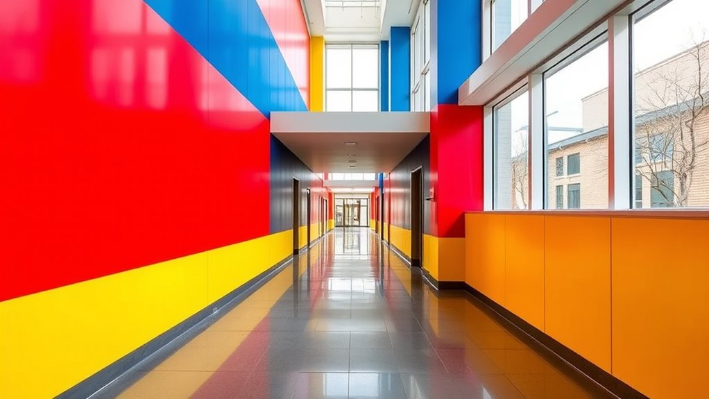
Color blocking in hallways offers versatile benefits across various public spaces, enhancing both aesthetics and functionality. It helps visitors quickly recognize different areas using clear wayfinding signage combined with strategic color choices. For example, hospitals can use calming blues and greens to create a soothing environment, reducing stress for patients and visitors. In schools, vibrant colors can delineate zones, making navigation intuitive for students and staff. Museums benefit from contrasting color blocks that guide visitors through exhibits seamlessly. By applying principles of color psychology, you can influence mood and behavior, making spaces safer and more welcoming. Additionally, understanding color perception can help in selecting appropriate hues that maximize clarity and comfort. Overall, color blocking transforms hallways into intuitive pathways, improving navigation efficiency and creating visually appealing environments tailored to each space’s unique purpose.
Designing for Accessibility and Inclusivity
Designing hallways with accessibility and inclusivity in mind means choosing color blocks that everyone can perceive and interpret easily. You should prioritize high color contrast between the blocks and the background to guarantee visibility for people with visual impairments. Using distinct and consistent color schemes helps users quickly identify safe pathways. Incorporating tactile markers, such as textured surfaces or raised patterns, adds an extra layer of guidance for those with limited vision. These tactile cues can be placed at key points, like intersections or entrances, to confirm correct navigation. By combining clear color contrast with tactile markers, you create an environment that’s welcoming and safe for all users, regardless of their sensory abilities. This approach ensures that your hallways are inclusive and accessible for everyone. Additionally, considering visual perception can help in selecting color combinations that are effective for a broader range of users.
Implementing and Maintaining Color-Blocked Hallways
To effectively implement and maintain color-blocked hallways, you need a clear plan for consistent application and regular upkeep. Start by choosing bold, contrasting colors to ensure strong visual contrast, making navigation easier and safer. Use color psychology to select shades that evoke calmness or alertness, reinforcing safety cues. Consistency is key: apply the same color codes throughout the hallway to avoid confusion. Regularly inspect the paint or decals to prevent fading or damage, which can diminish effectiveness. Training staff and informing users about the color scheme helps reinforce understanding. Keep the hallway clean and well-maintained, ensuring the colors remain vibrant. Additionally, understanding the importance of visual cues can help you design more effective color-blocked pathways. With careful planning, ongoing maintenance, and attention to visual contrast, your color-blocked hallways will effectively guide safe navigation over time.
Frequently Asked Questions
How Do Color Choices Impact Psychological Perception in Hallways?
You might notice that color choices influence your psychological perception by evoking emotional responses and shaping cultural interpretations. Bright colors like yellow can boost your mood, while cool tones like blue promote calmness. Different cultures associate colors uniquely, affecting how you perceive a space. When selecting colors, consider these psychological and cultural factors, as they can make hallways feel welcoming, safe, or even intimidating, depending on your personal and cultural background.
Are There Specific Color Combinations Recommended for Optimal Visibility?
When choosing color combinations for hallways, focus on maximizing contrast sensitivity and color contrast. Bright, complementary colors like yellow and purple or blue and orange improve visibility and help individuals easily distinguish walls from floors or obstacles. Avoid low-contrast palettes, as they can reduce visibility. By selecting high-contrast color pairs, you guarantee safer navigation for everyone, especially those with visual impairments or contrast sensitivity issues.
How Do Lighting Conditions Affect the Effectiveness of Color Blocking?
Your question about lighting’s impact on color blocking’s effectiveness is crucial; poor lighting can turn clear guidance into a confusing maze. Bright, even lighting ensures glare reduction and enhances contrast, making colors pop and guiding navigation seamlessly. Dim or uneven light diminishes contrast, risking safety. You need essential lighting conditions to maximize visibility, as shadows and glare can undermine even the most well-designed color schemes, risking confusion or accidents.
Can Color Blocking Be Integrated With Digital Navigation Aids?
You can definitely integrate color blocking with digital navigation aids like digital signage and augmented reality. By combining visual cues with digital overlays, you help users navigate safely and efficiently. Augmented reality can highlight color-blocked areas in real-time, guiding users step-by-step. Digital signage can reinforce these cues, providing additional context or instructions. This integration creates an intuitive, multi-layered approach to safe navigation, making it easier for everyone to find their way.
What Are the Cost Considerations for Large-Scale Color Coding Projects?
When considering large-scale color coding projects, you need to focus on budget planning and material durability. Costs can add up with extensive paint, tapes, or decals, so you should evaluate the long-term durability of materials to minimize maintenance expenses. Balancing initial investments with the lifespan of materials guarantees you avoid frequent replacements, making your project cost-effective and sustainable over time.
Conclusion
Just as a lighthouse guides ships safely to shore, color blocking in hallways leads visitors with clarity and purpose. When you apply these principles thoughtfully, you create spaces that invite confidence and ease. Remember, like a symphony’s harmony, well-designed color codes harmonize safety with accessibility, ensuring everyone finds their way effortlessly. By embracing these strategies, you turn navigation into a seamless journey—guided by color, driven by care.