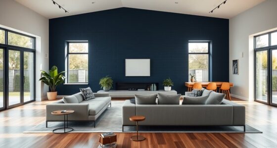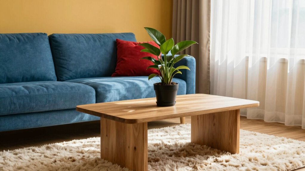

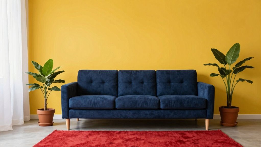
Effective color contrast is essential for making your home more accessible if you have low vision. High-contrast combinations like dark blue and bright yellow enhance visibility and reduce confusion. Pay attention to key areas, like entryways and kitchens, where clear contrasts improve navigation. Choose furniture that stands out from walls and floors, and use layered lighting to optimize clarity. There’s much more to learn about perfecting your space for better visual comfort.
Key Takeaways
- High-contrast color combinations, like dark blue and bright yellow, significantly enhance visibility for individuals with low vision.
- Proper lighting, especially natural light, improves color perception and overall mood in living spaces.
- Clutter-free environments with clear color contrasts aid navigation and reduce visual confusion.
- Textures and patterns can enhance recognition and safety when combined with effective color choices.
- Regularly test color schemes under various lighting to ensure maximum accessibility and visual clarity.
high contrast color kitchen accessories
As an affiliate, we earn on qualifying purchases.
As an affiliate, we earn on qualifying purchases.
Understanding Color Contrast: Why It Matters for Low Vision

When you consider the world around you, color contrast plays an essential role in how easily you can perceive information, especially if you have low vision. Your color perception is directly linked to your visual acuity and contrast sensitivity. When colors stand out against one another, it reduces the cognitive load, making it simpler for you to process visual information. Environmental factors, like lighting and background colors, can greatly affect how you experience contrast. Additionally, effective color combinations can enhance your emotional response, creating a more comfortable and engaging space. Recognizing the importance of visual contrast can help you make better choices in designing your home to improve clarity and safety. Being aware of indoor air quality factors, such as dust and microplastics, can also influence your overall comfort and health in your environment. For example, air quality can impact your comfort level, especially for individuals with respiratory sensitivities or allergies. Considering how lighting conditions interact with color contrast is also crucial, as proper lighting can significantly improve visibility for those with low vision. Incorporating contrast awareness into your design can further enhance visual clarity and accessibility.
How to Choose Color Combinations for Better Visibility
Choosing the right color combinations can greatly enhance visibility, especially for those with low vision. Start by understanding color psychology; certain colors evoke different feelings and perceptions. For example, high-contrast combinations, like dark blue with bright yellow, can be easier to see. Follow accessibility guidelines to guarantee that your choices meet standards for visibility and inclusivity. Consider using muted backgrounds with vibrant foreground colors to help key elements stand out. Remember that textures can also play a role in visibility, so pairing colors with varied textures can enhance recognition. Additionally, incorporating color contrast guidelines can help ensure your color choices are effective and compliant. To further improve visibility, consider testing your color schemes in different lighting conditions, which can reveal how well your choices perform throughout the day. This thoughtful approach will create a more accessible and inviting space for everyone, especially when understanding home appliance and air system design considerations that prioritize visibility and ease of use. Incorporating knowledge about recycled materials in gardening can also inspire eco-friendly ways to enhance your garden’s visual contrast naturally. Exploring lighting solutions can further optimize how these colors are perceived in your home.
Key Areas for Maximum Impact in Your Home
When you think about making your home more accessible, focus on high-contrast entryways and clear kitchen spaces. These areas can greatly enhance visibility and safety. By prioritizing these spots, you’ll create a more welcoming environment for everyone. Incorporating clutter-free spaces can also reduce visual confusion and make navigation even easier. Using color contrast in key areas can further improve overall visibility and assist those with low vision.
High-Contrast Entryways
Entryways serve as the first impression of your home, making high-contrast designs essential for enhancing visibility and accessibility. By choosing the right color palettes and entryway designs, you can create a welcoming space that’s easy to navigate. Incorporating these high-contrast choices helps guarantee your entryway is not only stylish but also functional for everyone. Additionally, understanding visual accessibility principles can further improve the safety and usability of your home’s entry points. Regular maintenance of home safety features, such as lighting and clearly marked pathways, also plays a crucial role in supporting these accessibility strategies. Applying simple, effective systems can make ongoing maintenance more manageable and ensure your home remains accessible over time, especially when considering design fundamentals that promote safe movement.
Clear Kitchen Spaces
Creating clear kitchen spaces is essential for both functionality and safety, especially for those with low vision. Start by prioritizing kitchen organization—keep countertops free of clutter and designate specific areas for frequently used items. Use labeled containers for easy identification, and consider color-coding them to enhance visibility. Incorporate smart home tips such as automated lighting or voice-controlled devices to further improve accessibility and ease of use. Make sure appliances are easily accessible and distinctly visible. Position larger items, like mixers or blenders, on shelves within reach, ensuring they contrast well with the background. For added safety, use non-slip mats and avoid shiny surfaces that can cause glare. An organized layout with high-contrast elements can significantly improve visual contrast and safety. Applying principles of color contrast in your design can make a noticeable difference in how well items stand out. Utilizing contrast principles can help optimize the overall visibility of key items and safety features. By improving appliance visibility and maintaining an organized kitchen, you’ll create a space that’s not only efficient but also welcoming for everyone, particularly those with low vision.
Choosing Accessible Furniture With Color Contrast

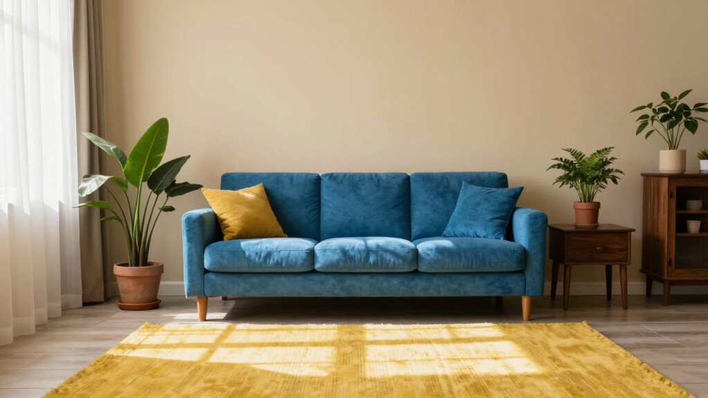
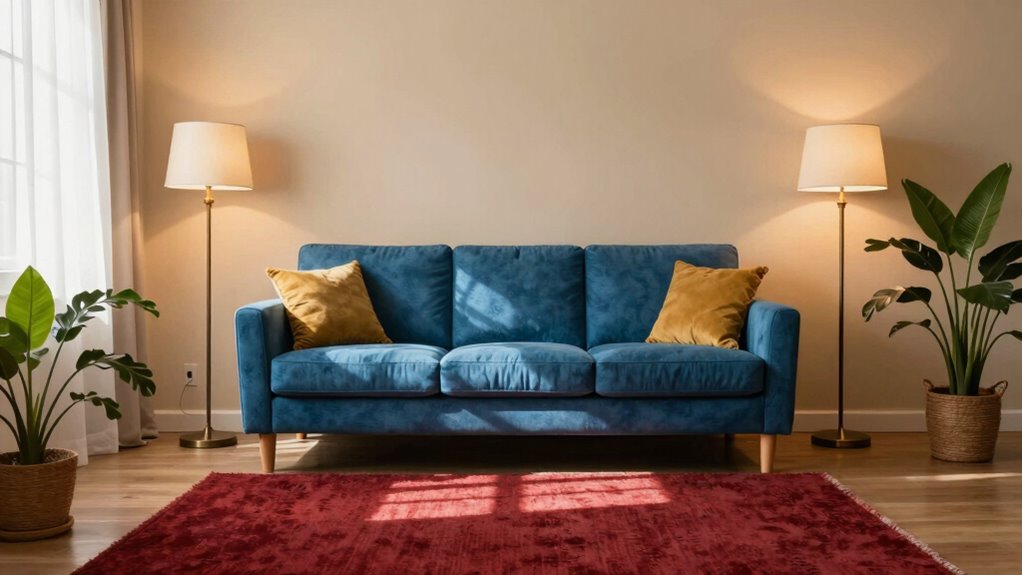
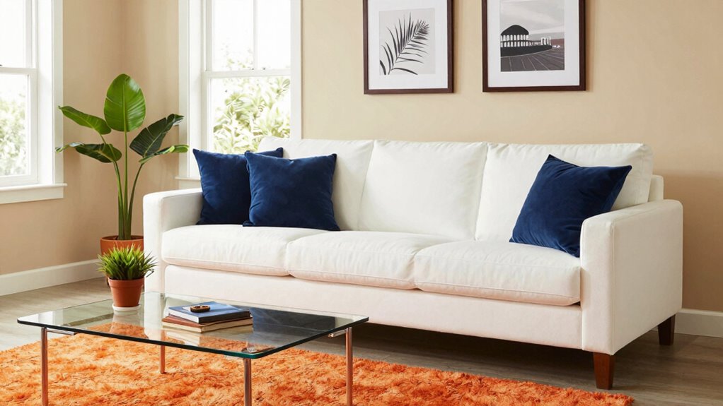
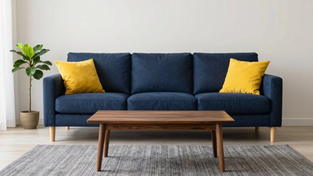
Choosing accessible furniture with color contrast is essential for enhancing visibility and safety in your living space. Start by selecting furniture materials that stand out against your walls and flooring. For instance, if you have light walls, opt for darker furniture to create a striking contrast. Texture variations also play a key role; choose fabrics with different textures to help you identify pieces through touch. A soft sofa in a bold color or a sleek table with a matte finish can be beneficial. Additionally, consider using patterns that are easy to distinguish, as they can aid in navigation. Incorporating color contrast principles into your furniture choices can further improve overall safety and ease of use. Being mindful of visual accessibility can help you make smarter decisions for your space. For example, choosing furniture with high color contrast can significantly reduce confusion and improve overall safety. When selecting furniture, paying attention to design contrast can make a substantial difference in how easily items are perceived and used. Understanding visual cues can also help you create a more intuitive environment. By thoughtfully choosing your furniture, you’ll create a welcoming environment that’s easier to navigate for everyone.
How to Use Lighting for Better Color Contrast?
Using the right lighting can considerably enhance color contrast in your space. You’ll want to take advantage of natural light, incorporate layered lighting techniques, and consider the color temperature of your bulbs. These elements combined can make a noticeable difference in how colors are perceived, improving accessibility for those with low vision.
Natural Light Benefits
While many people overlook the impact of natural light, it plays an essential role in enhancing color contrast for those with low vision. Daylight exposure improves visual clarity and boosts mood, contributing to overall health benefits. Proper window placement allows for ideal color perception and can adapt to seasonal changes. Here’s how natural light makes a difference:
| Feature | Benefits | Tips |
|---|---|---|
| Natural Light | Enhances color contrast | Use large windows |
| Health Benefits | Improves mood | Maximize daylight exposure |
| Energy Efficiency | Reduces reliance on artificial light | Consider glare reduction strategies |
Utilizing natural light isn’t just about aesthetics; it’s a crucial tool for better living.
Layered Lighting Techniques
Layered lighting techniques can greatly enhance color contrast, making spaces more accessible for individuals with low vision. By combining different light sources, you create a dynamic environment that improves visibility. Start with ambient lighting to provide overall illumination, ensuring the space feels welcoming and bright. Then, add task lighting focused on specific areas, like reading nooks or kitchen counters, to boost contrast where it’s needed most. Accent lighting can highlight textures and colors, drawing attention to important features. Adjust the intensity of each layer to achieve the right ambient brightness, ensuring no area feels too dim or harsh. With these strategies, you’ll create a well-lit space that supports ease of movement and enhances color perception.
Color Temperature Considerations
Effective lighting not only involves layering but also considers color temperature, which plays an essential role in enhancing color contrast. Using the right color temperature can make a significant difference in how you perceive spaces. Warm tones, like those from incandescent bulbs, create a cozy atmosphere but might soften contrasts. On the other hand, cool tones, such as those produced by LED lights, provide sharper contrasts, making it easier to distinguish between colors and textures. Aim for balanced ambient light that combines both warm and cool tones to optimize visibility. This thoughtful approach to color temperature can improve your environment, making it more comfortable and functional, especially for those with low vision.
Common Mistakes in Color Contrast and How to Fix Them
When designing for low vision, many people overlook the importance of sufficient color contrast, which can greatly impact readability. Common mistakes include using a color palette that lacks contrast ratios, leading to visual fatigue. If you’re considering color harmony, remember that high contrast is essential for accessibility. Texture usage and pattern selection can enhance visibility, but don’t overdo it; simplicity often works best. Many forget to account for color blindness, which can further complicate design choices. Incorporating visual aids and adaptive tools can also help bridge gaps in accessibility. To fix these issues, choose colors that stand out against each other and guarantee they work well together, creating a more inclusive environment for everyone.
Resources for Creating an Accessible Home With Color Contrast
Creating an accessible home with color contrast can greatly enhance comfort and safety for those with low vision. Start by exploring color palettes that align with accessibility guidelines. Use contrast tools to determine effective combinations, ensuring that essential features stand out. Familiarize yourself with color theory to create harmonizing yet distinct spaces. Consider incorporating visual aids, such as labels or textures, to further enhance navigation. Utilize design resources that specialize in low vision adaptations, offering practical tips on selecting home materials that provide both safety and style. By implementing these strategies, you can create a welcoming environment that prioritizes accessibility while ensuring aesthetic appeal, ultimately making daily activities easier and more enjoyable.
Frequently Asked Questions
How Does Color Contrast Affect Mood and Ambiance in a Room?
Color contrast greatly affects mood and ambiance in a room. When you use high-contrast colors, it can energize the space, invoking feelings of excitement and alertness. On the other hand, softer contrasts often create a calming atmosphere, promoting relaxation. Understanding color psychology helps you choose hues that align with your desired emotional responses. By thoughtfully selecting contrasting colors, you can transform how you feel in a room, enhancing your overall experience.
Can I Use Patterns Alongside Color Contrast for Low Vision?
Absolutely, you can use patterns alongside color contrast for low vision! In fact, about 80% of what you perceive comes from visual contrast. When you combine strong patterns with high contrast colors, it enhances pattern visibility, making it easier to distinguish shapes and textures. Just be mindful of texture impact; smoother textures can sometimes blend with patterns. Balancing both can create a visually engaging and functional space that’s easy to navigate.
What Color Combinations Are Least Effective for Visibility?
Some color combinations are less effective for visibility, especially for those with color blindness. For instance, red and green or blue and purple can create visibility challenges, as they may appear similar to people with certain types of color blindness. Avoiding these pairings helps guarantee that your design remains clear and accessible. Instead, use high-contrast combinations like black and yellow or blue and white to enhance visibility for everyone.
How Often Should I Reassess My Home’s Color Contrast?
You should reassess your home’s color contrast every few months, because who wouldn’t want to enjoy a constantly changing color palette? Lighting effects can dramatically alter how colors appear, so keeping an eye on shifts is key. As seasons change, natural light varies, and what worked yesterday might not work today. So, don’t hesitate—refresh your space regularly to guarantee it remains functional and visually appealing for everyone in your home.
Are There Apps to Help With Choosing Color Contrasts?
Yes, there are several apps to help you choose color contrasts effectively. Accessibility apps like Color Blind Pal and ColorSnap can guide your color selection, ensuring they’re suitable for everyone. These color selection tools often simulate how colors appear to individuals with different types of vision impairments, allowing you to make informed choices. By using these apps, you’ll enhance your home’s visual accessibility and create a more welcoming space for everyone.
Conclusion
Incorporating color contrast in your home isn’t just a design choice; it’s a game-changer for enhancing visibility and comfort. Research shows that high contrast can greatly improve navigation for those with low vision. So, as you rethink your space, remember that simple tweaks can lead to meaningful differences. By embracing thoughtful color combinations and lighting, you’re not just decorating—you’re creating an environment that truly supports everyone’s needs. Don’t underestimate the power of contrast in your home!