
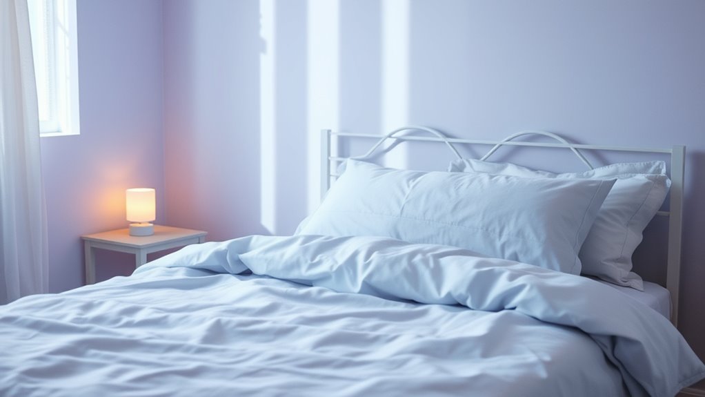
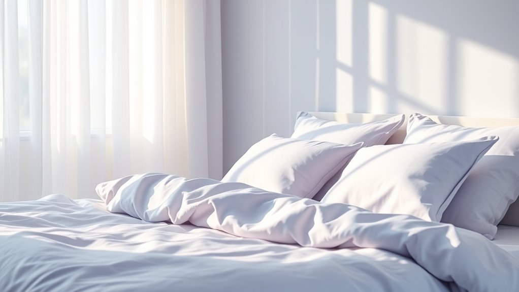
To encourage restful sleep, opt for soft, calm shades like light blue, green, and pastel hues, which promote relaxation and reduce stress. Avoid bright, stimulating colors such as red or vibrant yellow that can increase alertness. Use neutral tones and natural lighting to create a tranquil environment. Understanding the psychological and cultural effects behind these colors can help you design a space that naturally fosters better sleep—explore further for more helpful tips.
Key Takeaways
- Use soft, muted shades like pastels, neutrals, and gentle blues to promote relaxation and reduce stimulation before sleep.
- Avoid bright, energetic colors such as reds, yellows, and neon hues that can increase alertness and disrupt sleep.
- Incorporate calming greens and lavender tones, which evoke nature-inspired tranquility and lower heart rates.
- Apply color psychology principles by selecting hues associated with calmness, stability, and serenity to influence mood positively.
- Enhance sleep environments with natural lighting and subtle decor accents that reinforce restful, soothing color schemes.
The Impact of Blue Tones on Sleep Quality
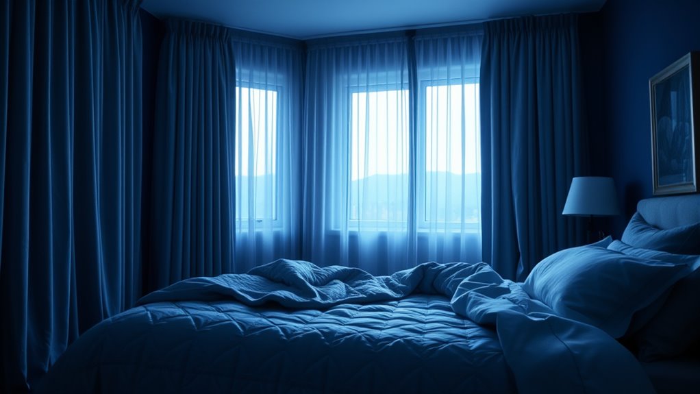
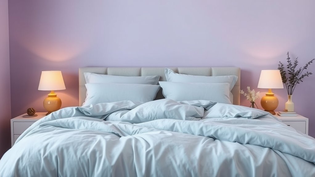
Research shows that blue tones can considerably improve sleep quality by promoting relaxation and calming the mind. The psychological effects of blue often include reducing stress and anxiety, making it easier to unwind at night. You might notice that blue hues in your bedroom create a tranquil atmosphere, helping you fall asleep faster. Additionally, the cultural symbolism of blue as a color of calmness and stability reinforces its soothing qualities. Many cultures associate blue with serenity and peace, which can subconsciously influence your mood and behavior. By incorporating blue shades into your sleeping environment, you harness these psychological and cultural benefits, creating a space conducive to restful sleep. The calming influence of blue makes it an ideal choice for fostering a peaceful bedtime routine.
Green Shades and Their Calming Effects
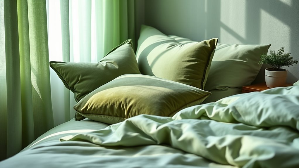
Green shades evoke a sense of nature-inspired relaxation that can instantly soothe your mind. By creating a calming visual environment, these colors help reduce stress and promote tranquility. Incorporating green into your space can bring a peaceful, invigorating vibe that enhances overall well-being. Additionally, the presence of leafy greens like spinach and kale has been linked to improved cognitive performance, supporting mental clarity and emotional balance.
Nature-Inspired Relaxation
Because green shades are abundant in nature, they naturally evoke feelings of calm and renewal. Incorporating green into your space helps create a soothing environment that promotes relaxation. You can enhance this effect by:
- Using flower patterns with leafy or botanical designs to reinforce natural serenity.
- Maximizing natural light, which complements green tones and boosts your mood.
- Choosing soft, muted green shades for walls or bedding to foster tranquility.
- Including plants to bring a touch of nature indoors and deepen the calming ambiance.
- Paying attention to color temperature adjustments, which can optimize the visual comfort of green shades and enhance their relaxing qualities.
These elements work together to craft a peaceful setting that encourages restful sleep. Green shades linked to nature create an environment where your mind can unwind, making it easier to drift off peacefully.
Soothing Visual Environment
The calming influence of green shades extends beyond natural elements to the visual environment you create indoors. Using green in your space promotes color therapy, which can help reduce stress and foster relaxation. Green shades provide visual comfort, making your bedroom more soothing and conducive to sleep. Soft, muted greens mimic natural surroundings, calming your mind after a busy day. Incorporating these hues into wall colors, bedding, or decor helps establish a peaceful atmosphere. Green’s connection to nature reinforces feelings of safety and tranquility, essential for restful sleep. By choosing the right green shades, you create a soothing visual environment that encourages relaxation and minimizes agitation, supporting your overall sleep quality.
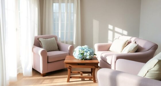
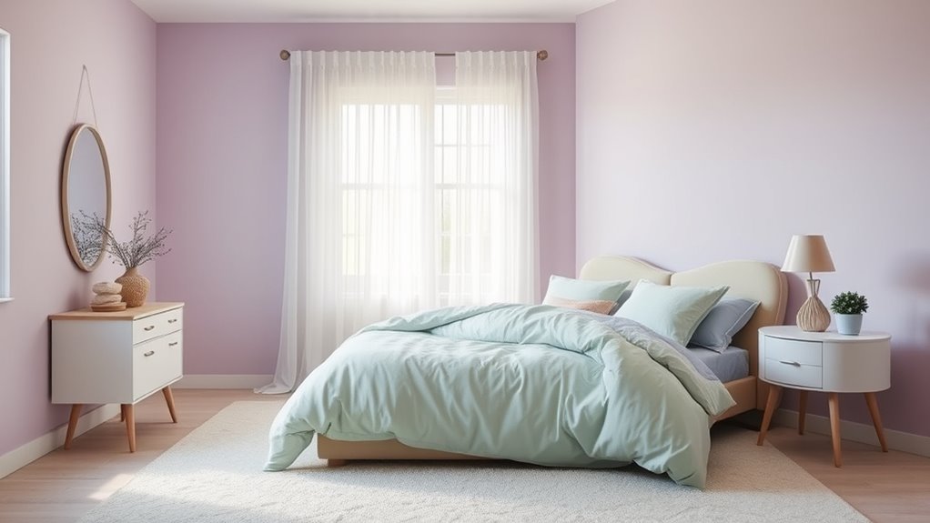
Soft Neutrals for a Restful Atmosphere
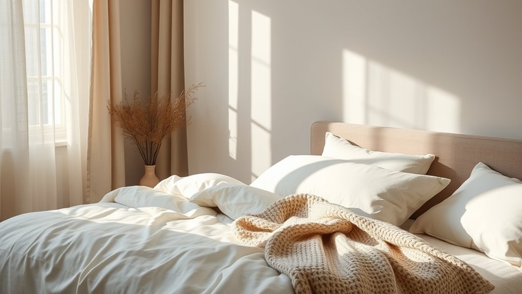
Soft neutrals create a calm and inviting space, setting the perfect tone for relaxation. Incorporating gentle color palettes and calming room accents enhances this peaceful atmosphere. The benefits of neutral tones lie in their ability to soothe your mind and promote restful sleep. Additionally, understanding symbolism in dream interpretation can help you create an environment that fosters positive subconscious messages, further supporting restful nights.
Gentle Color Palettes
Gentle color palettes, composed of soft neutrals, create a calming and inviting atmosphere in any space. These shades promote effective color therapy by soothing your mind and supporting mood regulation. To fully enjoy their benefits, consider:
- Choosing muted tones like beige, taupe, or soft gray to foster tranquility.
- Using these shades on walls or bedding to reduce visual noise and stress.
- Incorporating natural textures to enhance the sense of serenity.
- Pairing neutrals with subtle accent colors for depth without disrupting relaxation.
- Opting for holistic sleep strategies that align with the calming environment to further support restful nights.
These gentle hues help establish a restful environment, encouraging sleep and relaxation. By consciously selecting soft neutrals, you can harness the calming power of color therapy, making your space a sanctuary for unwinding and restoring your mood.
Calming Room Accents
Adding calming room accents in soft neutrals can instantly transform your space into a peaceful retreat. An accent wall in gentle beige or warm taupe creates a subtle focal point that promotes relaxation. Pair this with decorative pillows in muted tones like blush or creamy white to enhance the soothing atmosphere. These accents add texture and depth without overwhelming the senses, helping your mind unwind. Keep the overall palette light and harmonious, avoiding bold or jarring colors. Incorporating soft neutrals through an accent wall and carefully chosen pillows creates a balanced environment conducive to rest. Additionally, choosing calming color schemes can further reinforce the tranquil mood of your bedroom, making it more inviting and restful, encouraging a peaceful night’s sleep.
Neutral Tones Benefits
Neutral tones create a calming environment because they subtly influence your mood and promote relaxation. The benefits of neutral colors extend beyond aesthetics, grounded in neutral color psychology, which emphasizes their soothing effects. Using soft neutrals can help reduce stress and create a restful atmosphere. To maximize these benefits, consider:
- Choosing shades like beige, taupe, or light gray for walls and bedding.
- Incorporating natural textures to enhance the calming vibe.
- Limiting bold accents to maintain a tranquil space.
- Using neutral-toned lighting to deepen relaxation.
- Integrating unique and wicked planters to add subtle greenery and natural elements that complement the calming environment.
These strategies harness the neutral tones benefits, helping you unwind and prepare for restful sleep. Embracing soft neutrals fosters a peaceful environment, essential for quality rest and overall well-being.
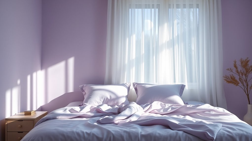
How Lavender and Pastel Hues Promote Relaxation
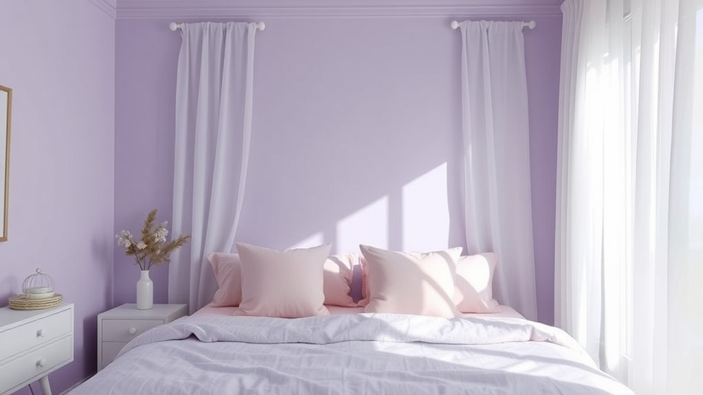
Ever wonder why lavender and pastel hues are often used in spaces designed for relaxation? These gentle shades evoke calmness through their flower symbolism, representing tranquility and serenity. Using color therapy techniques, you can enhance relaxation by incorporating lavender’s soothing qualities, which are linked to the calming essence of lavender flowers. Pastel hues, such as soft pinks, blues, and greens, create a peaceful atmosphere that reduces stress and promotes restful sleep. These colors help lower your heart rate and ease anxiety, making it easier to unwind. Additionally, understanding the psychological effects of colors can help you select shades that optimize relaxation. By choosing lavender and pastel shades for your bedroom or relaxation areas, you harness their natural ability to foster a serene environment, encouraging your mind and body to relax and prepare for sleep.
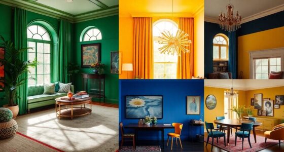
Colors to Avoid Before Bedtime
While lavender and pastel hues promote relaxation, some colors can have the opposite effect if used before bedtime. Bright colors and energetic hues tend to stimulate your mind and make it harder to wind down. To guarantee a restful night, avoid:
Bright and energetic colors can hinder relaxation; choose soft, muted shades to promote better sleep.
- Bright reds, which can increase heart rate and agitation.
- Vibrant oranges, known for raising energy levels.
- Neon yellows, which can cause nervousness and restlessness.
- Bold blues and greens, especially when overly saturated, as they may feel stimulating rather than calming.
Additionally, color psychology shows that certain hues can influence the nervous system and disrupt sleep patterns.
Staying away from these colors helps prevent your brain from staying alert when you want to relax. Opt for muted or softer shades instead, creating an environment that signals your body it’s time to wind down.
Combining Shades for a Harmonious Sleep Environment
Combining shades effectively can create a calming and balanced sleep environment that signals your body it’s time to relax. Use complementary color schemes to bring harmony to your space, such as soft blues paired with gentle oranges or muted greens with warm pinks. These combinations promote tranquility without overwhelming your senses. Consider accent wall ideas to add depth and visual interest while maintaining a restful atmosphere. A subtle, darker shade on one wall can anchor the room, while lighter shades on other walls keep things airy and serene. Keep your palette cohesive by sticking to muted, soothing tones that blend seamlessly. This approach helps your brain associate your bedroom with peace, making it easier to unwind and prepare for restful sleep. Incorporating rustic decor elements can also enhance the farmhouse charm and reinforce a cozy, restful environment.
Tips for Selecting Sleep-Enhancing Colors in Your Bedroom
Selecting the right colors for your bedroom can markedly influence your sleep quality. To optimize your sleep environment through color therapy, consider these tips:
Choosing calming colors in your bedroom can significantly enhance restful sleep.
- Choose soft, muted shades like pastels or neutrals that promote relaxation.
- Avoid bright, stimulating colors such as reds or yellows that can interfere with sleep.
- Use calming hues like blues and greens, which are known to lower stress levels.
- Incorporate natural lighting to enhance the calming effect and reinforce your color choices.
- Be mindful of color psychology principles, which explain how specific shades can influence mood and relaxation.
The Science Behind Color Choices and Restorative Sleep
Understanding how colors influence your sleep involves exploring the science of how our brains respond to different wavelengths of light. When you see certain colors, your brain processes their color symbolism and triggers specific psychological effects. For example, soft blues and greens are associated with calmness and tranquility, making them ideal for promoting restful sleep. Conversely, brighter or warmer shades like reds and oranges can stimulate alertness, disrupting your rest. Research shows that these responses are linked to how our brains interpret light signals, impacting melatonin production—the hormone responsible for sleep regulation. By choosing sleep-friendly shades based on this scientific understanding, you can create an environment that naturally encourages relaxation and restorative sleep. Your color choices directly influence your sleep quality through these underlying psychological and physiological effects.
Frequently Asked Questions
How Does Color Temperature Affect Sleep Beyond Just Shade Selection?
Color temperature influences sleep by affecting light intensity and ambient lighting in your environment. Cooler temperatures, like blue or white light, increase alertness, making it harder to fall asleep. Warmer tones, such as yellow or red, promote relaxation. You should dim ambient lighting and reduce blue light exposure before bed, creating a calm atmosphere that signals your body it’s time to wind down, helping you fall asleep more easily.
Can Personal Color Preferences Influence Sleep Quality?
Imagine creating a cozy sleep environment customized just for you, where personal color preferences paint your space in calming hues. Your favorite shades can profoundly influence your sleep quality by making you feel more relaxed and at ease. When you choose colors that resonate with you, it’s easier to unwind and drift into restful sleep. So, your personal preferences play a crucial role in shaping a peaceful, restorative sleep environment.
Are There Cultural Differences in Color Associations and Sleep?
You might find that cultural differences in color associations influence sleep habits. Cultural color symbolism shapes sleep rituals across cultures, with some colors linked to calmness and relaxation, while others signify alertness or mourning. For example, in certain cultures, blue promotes tranquility, whereas red may disrupt sleep. Recognizing these cultural nuances can help you create a sleep environment that aligns with your background, enhancing your sleep quality naturally.
How Long Does It Take for Color Changes to Impact Sleep Patterns?
Like a painter blending new shades, your color adaptation influences your sleep cycle gradually. Typically, it takes about one to two weeks for changes in your environment’s colors to markedly impact your sleep patterns. Consistent use of calming hues can help sync your internal clock, creating a more restful sleep. Patience is key; your body needs time to adjust to these visual cues, ultimately fostering better sleep quality over time.
Do Sleep-Tracking Devices Measure Effects of Color on Sleep Quality?
Sleep-tracking devices typically don’t measure the effects of color therapy on your sleep quality directly. Instead, they track metrics like duration, restfulness, and light stages, which can reflect improvements in your sleep environment. While color psychology influences your sleep environment by creating calming atmospheres, these devices help you see how changes in your surroundings, including shades, might improve overall sleep quality indirectly.
Conclusion
By choosing calming colors for your bedroom, you set the stage for restful nights—like a gentle moon guiding you through darkness. Your space becomes a sanctuary where each shade whispers tranquility, inviting peaceful dreams to bloom. When you surround yourself with soothing hues, you craft an environment that nurtures your sleep, transforming your bedroom into a haven of serenity. Ultimately, the right colors become the silent guardians of your restorative sleep journey.