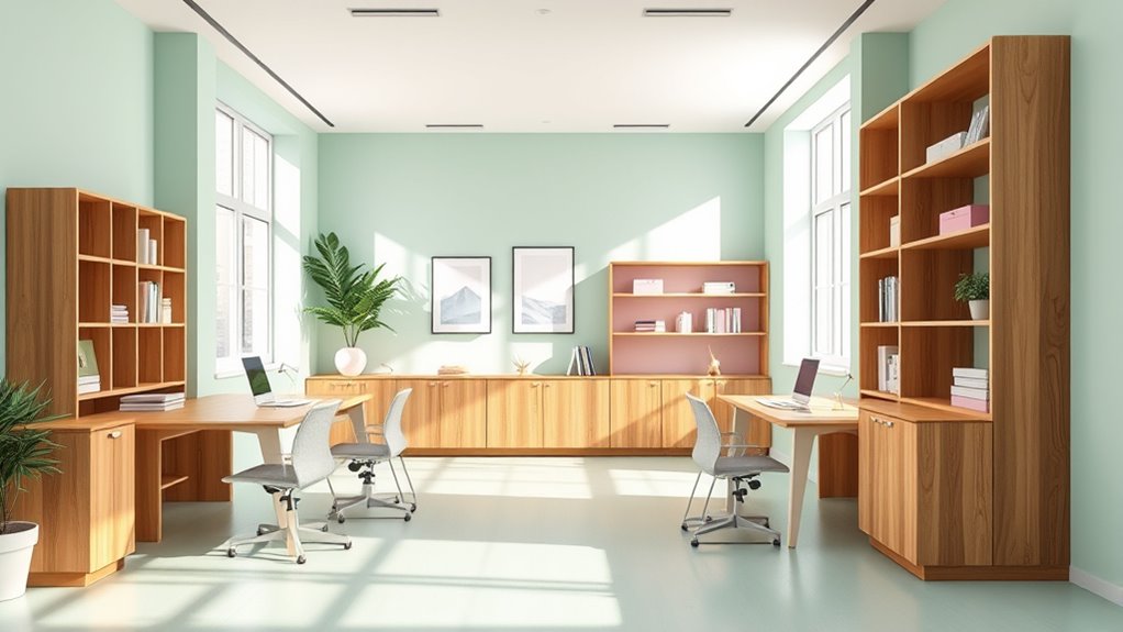

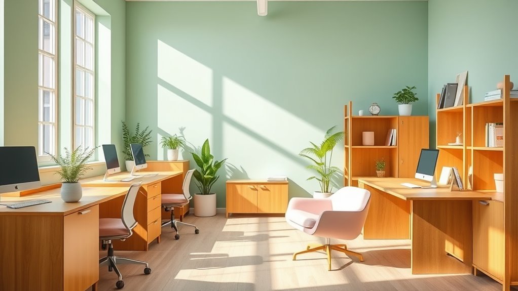
Pairing pastels with wood tones creates a calming office environment that promotes focus and reduces stress. Use soft pastel shades like blue, pink, or lavender alongside warm wood finishes such as honey or cherry to add warmth and comfort. Balance these elements with cozy lighting and textured accessories to enhance relaxation. Combining these colors and materials results in a harmonious space that boosts well-being. To explore effective pairing tips, learn more about designing tranquil office spaces.
Key Takeaways
- Choose light pastel shades like mint, blush, or lavender to complement light wood tones such as maple or birch for a bright, airy feel.
- Use darker wood finishes like walnut or mahogany with muted pastels to create a sophisticated, calming contrast.
- Incorporate pastel-colored accessories and furniture, such as cushions or chairs, to soften natural wood elements and enhance comfort.
- Balance pronounced grain textures with smooth pastel walls or decor for visual interest without overwhelming the space.
- Layer warm-toned lighting with pastel and wood accents to foster a cozy, inviting office atmosphere.
Understanding the Benefits of Pastel Colors in Office Spaces
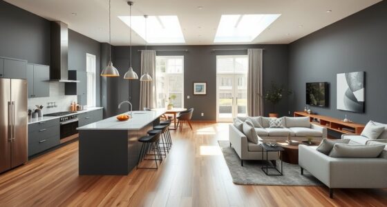
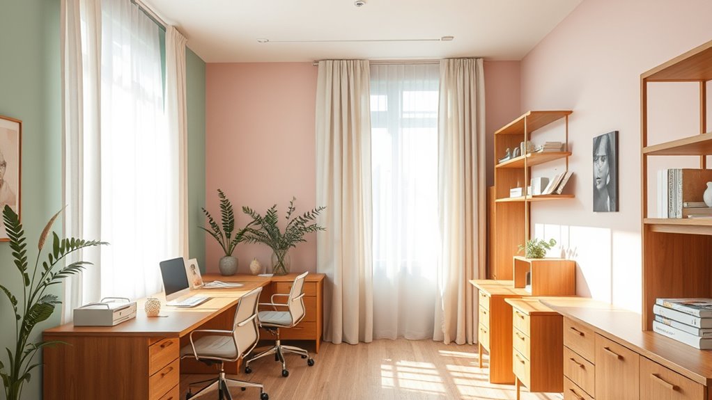
Pastel colors have become popular choices for office spaces because they create a soothing and inviting atmosphere. These hues leverage color psychology to reduce stress, boost focus, and foster a calm environment, making workdays more comfortable. When you incorporate pastels, you’re not just enhancing aesthetics—you’re improving furniture ergonomics by encouraging a relaxed posture and reducing visual fatigue. Light, soft shades help minimize distractions and make small spaces feel more open. This mental clarity fosters productivity and creativity. Additionally, pastels can complement various furniture styles, creating a harmonious workspace. When thoughtfully integrated, these colors promote well-being, helping you feel more relaxed and motivated throughout your workday. Incorporating calming colors can also enhance the overall ambiance of your office, contributing to a more balanced environment. Overall, pastels serve as a practical and attractive choice for cultivating a balanced office atmosphere.
Selecting the Right Wood Tones to Complement Pastels
Choosing the right wood tones can make a big difference in creating a calming office. Consider warm or cool hues to match your pastel palette, and decide between light or dark woods for the desired atmosphere. Pay attention to grain and texture choices to add visual interest without overwhelming the space. Incorporating wooden accents can enhance the rustic charm and authenticity of the decor.
Warm vs. Cool Hues
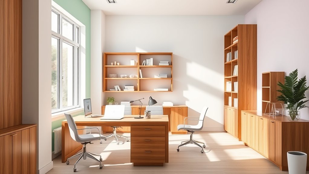
When selecting wood tones to pair with pastel colors, it’s essential to contemplate whether warm or cool hues will create the desired atmosphere. Warm wood tones, like honey or cherry, bring coziness and complement pastel shades with a welcoming feel. They work well in offices with warm-toned office lighting, enhancing comfort and productivity. Conversely, cool wood tones, such as ash or gray-stained wood, evoke calmness and balance, perfect for spaces with cooler lighting. These tones pair nicely with soft pastels, creating a serene environment. Consider your ergonomic furniture choices, as warm tones can make a space feel more inviting, while cool tones foster tranquility. Matching the wood hue to your lighting and furniture style guarantees your office remains both functional and soothing. Additionally, choosing the right self watering plant pots can contribute to a low-maintenance and lush office environment, complementing your decor choices.
Light vs. Dark Woods
Light woods, such as maple or birch, brighten up a space and create an airy, fresh feel that pairs beautifully with soft pastels. These tones evoke artistic interpretations of simplicity and purity, making your office feel open and inviting. Culturally, light woods often symbolize clarity and new beginnings, aligning well with calming aesthetics. Dark woods, like walnut or mahogany, bring depth and sophistication, offering a striking contrast to pastel hues. They can ground a space, adding warmth and a sense of stability. Depending on your intent, choosing between light and dark woods influences the room’s mood and visual harmony. Light woods emphasize brightness and openness, while dark woods evoke richness and calm. Your choice ultimately shapes the atmosphere, balancing visual appeal with emotional comfort. Tanning practices and choosing the right wood tones can both significantly influence the overall ambiance of a space.
Grain and Texture Choices
The grain and texture of wood play a significant role in how pastels come to life in your office space. Choosing the right wood grain patterns can create visual interest and influence the room’s mood. For a calming atmosphere, consider smooth, fine grain textures that offer subtlety and harmony. On the other hand, bold, pronounced grain patterns add dynamic texture contrast, energizing the space without overwhelming it. Incorporating architectural solutions can further enhance the overall design aesthetic. Here are three ways to enhance your office with wood textures: 1. Opt for sleek, uniform grain patterns for a soft, cohesive look. 2. Use textured wood with pronounced grain to add depth and tactile appeal. 3. Balance contrasting textures to achieve visual harmony and calmness. Selecting the right texture contrast elevates your pastel palette, making your office both soothing and inviting.
Combining Pastel Hues With Different Types of Wood Finishes
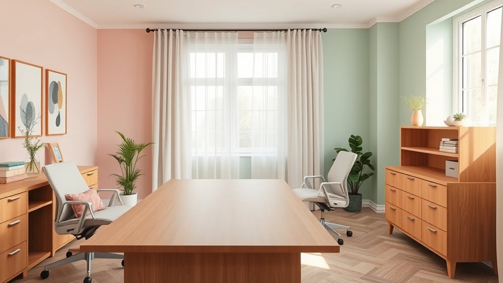
Soft pastel shades work beautifully with light oak finishes, creating a fresh and airy feel. For a more grounded look, muted pastel tones pair well with dark walnut. Choosing the right combination can instantly influence the calming atmosphere of your office space. Incorporating diversification strategies in your interior design can help create a balanced and harmonious environment.
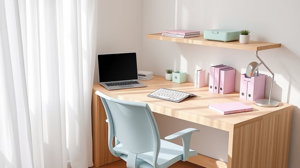
Soft Pastels With Light Oak
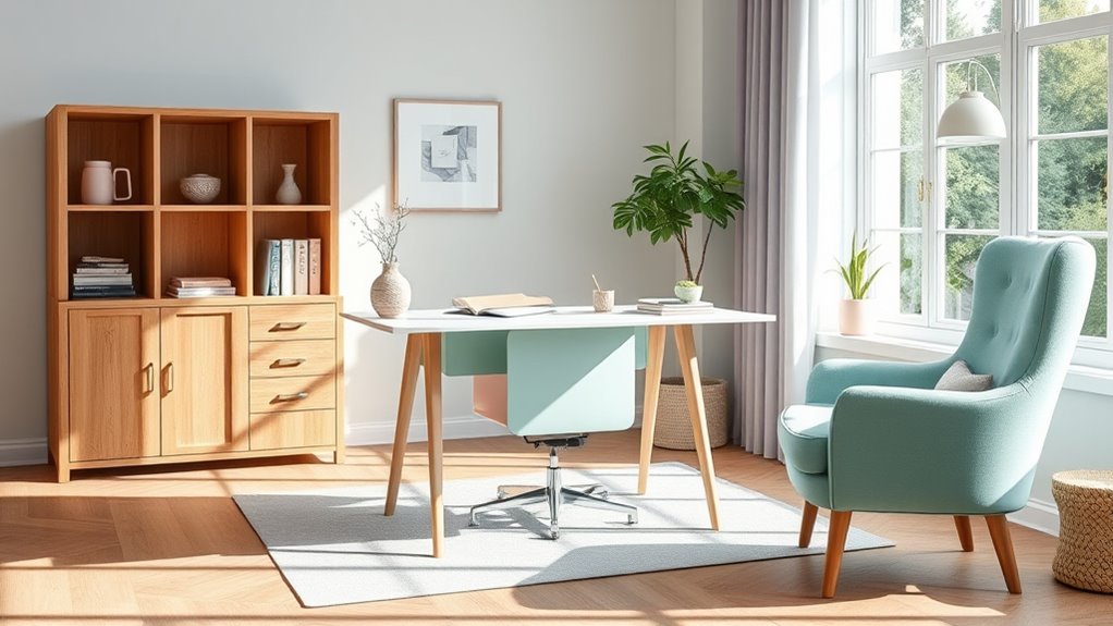
Pairing pastel hues with light oak creates a serene and inviting office environment. Soft pastels, like gentle blues, pinks, and greens, promote calmness through their soothing color psychology, helping reduce stress. When choosing paint application, opt for matte or eggshell finishes to enhance the subtlety of the pastels and maintain a natural look. Light oak’s warm tones complement these hues beautifully, adding warmth without overpowering the delicate palette. This combination fosters focus and relaxation, making your workspace more inviting. Consider these emotional impacts:
- Instills tranquility, easing the workday tension.
- Inspires clarity and creativity through gentle colors.
- Creates a welcoming atmosphere that promotes well-being.
- Incorporating natural elements like wood finishes enhances a calming environment.
Together, soft pastels and light oak balance aesthetic appeal with emotional comfort, perfect for a calming office.
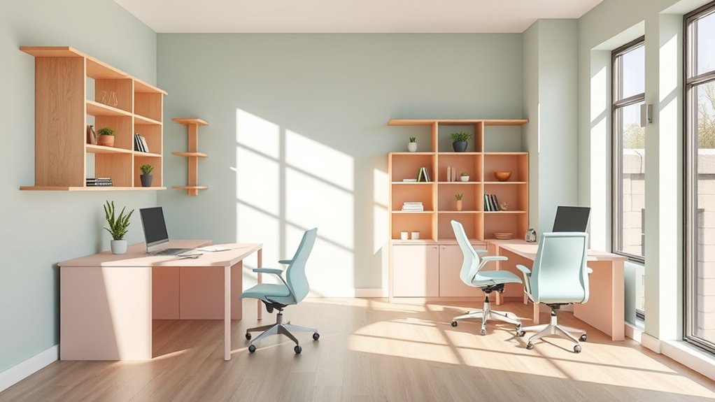
Muted Tones With Dark Walnut
Building on the calming effect of pastels and light oak, combining muted tones with dark walnut offers a sophisticated alternative that enhances your office’s ambiance. The deep, rich hue of walnut creates a striking color contrast when paired with soft pastel accents, adding depth and elegance. This contrast helps define different zones within your workspace, making it both functional and visually appealing. Dark walnut’s material durability ensures your furniture and fixtures withstand daily use, maintaining their beauty over time. The muted tones soften the overall look, preventing the dark finish from feeling overwhelming. Together, these elements create a balanced environment that promotes focus and relaxation, making your office a serene yet stylish space.
Incorporating Pastels and Wood Tones Through Furniture and Decor
To create a calming office environment, incorporate pastel hues and wood tones through your furniture and decor choices. Select desks, chairs, and storage with natural wood finishes to ground the space. Enhance the soothing vibe with wall art featuring soft pastel colors that complement the wood tones. Use lighting fixtures that emit warm, gentle light to foster relaxation. Consider adding a pastel-colored sofa or accent chairs to invite comfort. Here are three ways to evoke emotion: 1. Hang inspiring wall art with subtle pastel shades to boost creativity. 2. Choose warm-toned lighting fixtures to create a cozy ambiance. 3. Incorporate pastel-colored accessories, like cushions or vases, to add softness. Additionally, layering textures and colors can further enhance the cozy, inviting atmosphere.
Balancing Color and Material for a Harmonious Workspace
Achieving harmony in your workspace requires carefully balancing color and material choices so that they complement rather than compete with each other. Understanding color psychology helps you select pastels that evoke calmness, while considering material durability ensures your furniture withstands daily use. To create a cohesive environment, match softer hues with sturdy, natural materials like wood or metal. Use the table below to guide your choices:
| Color Palette | Material Choice | Purpose |
|---|---|---|
| Soft Blue | Oak or Walnut | Calm, professional setting |
| Pastel Green | Metal or Glass | Invigorating, contemporary touch |
| Light Pink | Upholstered Fabric | Comfort and warmth |
| Lavender | Hardwoods | Serenity and sophistication |
Incorporating essential oils into your workspace can further enhance the calming atmosphere and promote well-being.
Balancing these elements results in a harmonious, inviting workspace that promotes productivity and well-being.
Tips for Maintaining a Calm and Organized Office Environment
Keeping your office calm and organized starts with establishing simple routines that promote clarity and focus. Consistency helps reduce stress and creates a serene environment. Consider these tips:
A calm, organized office begins with simple routines that foster clarity and reduce stress.
- Use ergonomic accessories to support comfort, preventing fatigue and distraction.
- Optimize lighting solutions by blending natural light with soft, adjustable fixtures to reduce eye strain and enhance tranquility.
- Keep surfaces clutter-free by designating storage spaces, so everything has its place and your workspace stays tidy.
Real-Life Examples of Pastel and Wood Tone Office Designs
Many modern offices successfully incorporate pastel hues and wood tones to create soothing, inviting workspaces. These designs exemplify office color psychology, promoting calm and focus. For example, a tech startup uses soft mint walls paired with light oak desks, fostering productivity and relaxation. Ergonomic furniture choices, like adjustable chairs in pastel shades, enhance comfort without disrupting the aesthetic. Here’s a quick overview:
| Office Type | Key Design Features | Benefits |
|---|---|---|
| Creative Studio | Pastel blue walls, walnut accents | Inspires creativity and tranquility |
| Law Firm | Pale pinks, ash wood furniture | Eases tension, improves focus |
| Wellness Center | Soft lavender, bamboo textures | Promotes relaxation and mindfulness |
| Co-Working Space | Mint green furniture, light oak floors | Encourages collaboration and calm |
| Corporate Office | Beige pastels, maple wood elements | Boosts office color psychology, morale |
Modern office design also benefits from integrating climate control solutions like heat pumps, which can improve indoor comfort and energy efficiency, creating an environment conducive to productivity and well-being.
Frequently Asked Questions
How Do Lighting Conditions Affect Pastel and Wood Color Harmony?
Lighting conditions greatly impact how pastel and wood tones look together. Soft lighting creates a warm, inviting ambiance that enhances subtle pastel shades and highlights the natural warmth of wood. Bright, cool lighting can increase color contrast, making pastels appear more vibrant and wood tones sharper. You should consider your desired ambiance and adjust lighting to balance color contrast, ensuring a calming and harmonious office environment.
Can These Color Schemes Influence Employee Productivity and Mood?
Color psychology shows that soft pastels and warm wood tones can boost your mood and productivity by creating a calming environment. These hues reduce stress and promote focus. Acoustic considerations also matter; natural materials like wood help absorb sound, minimizing distractions. By thoughtfully combining these colors and sound-absorbing elements, you can design an office that enhances well-being and efficiency, making your workspace more inviting and conducive to work.
Are There Specific Office Environments Best Suited for Pastels and Wood Tones?
Considering the current question, you’ll find that pastel and wood tone pairings work well in corporate settings and creative spaces. These hues foster a friendly, relaxing, and refined environment, perfect for productivity and peace. You should choose spaces where serenity and sophistication shine—think open offices, brainstorming hubs, or tranquil meeting rooms—where soft shades and warm wood accents set a calm, cohesive tone that encourages collaboration and comfort.
What Are Common Mistakes to Avoid When Pairing Pastels With Wood?
When pairing pastels with wood, avoid common mistakes like creating a color clash by choosing shades that don’t complement each other. Be cautious of overusing pastels, which can make the space feel too subdued or washed out. Balance is key—use wood tones to ground the pastels and add warmth. Stay mindful of these pitfalls to create a harmonious, calming office environment that feels inviting and well-coordinated.
How Do Seasonal Changes Impact Pastel and Wood Tone Office Design?
Think of your office like a garden that changes with the seasons—your pastel and wood tones should adapt too. Seasonal color shifts can make your space feel refreshed or cozy, so consider warmer pastels and richer wood textures in winter. During spring, lighter pastels and airy textures boost energy. Adjust material contrasts to reflect these changes, creating a harmonious environment that evolves with the seasons and keeps your workspace welcoming year-round.
Conclusion
By pairing soft pastels with warm wood tones, you create a calming, inviting workspace that boosts your mood and productivity. When you balance color and material thoughtfully, your office becomes a sanctuary of serenity and focus. Isn’t it worth designing a space that not only looks beautiful but also supports your well-being? Embrace these combinations, and watch your office transform into a peaceful retreat you’ll love to spend time in.