Spring palettes burst with vibrant pastels and bright hues that perfectly reflect the season’s renewal and natural beauty. Think soft pinks, lavender, and blush reminiscent of cherry blossoms, paired with lively yellows and greens inspired by blooming flowers and fresh leaves. These colors can energize your wardrobe and home decor, creating a cheerful and fresh look. Keep exploring to discover how to blend these shades beautifully and embrace the season’s lively spirit more fully.
Key Takeaways
- Spring color palettes blend soft pastels like pinks, lavenders, and blush with vibrant yellows, greens, and oranges.
- Pastels evoke a gentle, fresh feel, while bright shades add energy and liveliness to seasonal styling.
- Colors inspired by blooming flowers and lush foliage reflect the natural vibrancy of spring.
- Combining pastels and brights creates harmonious contrasts suitable for fashion and interior decor.
- Incorporating these seasonal hues enhances aesthetic appeal and celebrates spring’s renewal and vitality.
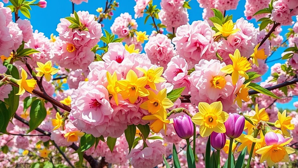
Have you ever noticed how the colors around you change with the seasons? As winter gives way to spring, the world bursts into a vibrant display of new life and energy. This transformation isn’t just visual; it influences everything from fashion choices to interior decor. Spring’s color palette is all about freshness, renewal, and the cheerful spirit of the season. You can draw inspiration directly from nature’s palette, which is filled with flower-inspired hues that effortlessly evoke the essence of spring. Think soft pinks, delicate lavenders, sunny yellows, and lively greens—these shades reflect the blooming flowers and lush foliage that define this time of year. Incorporating these colors into your wardrobe or home creates a seamless connection with the season’s natural beauty.
Embrace spring’s vibrant, flower-inspired hues to energize your style and home with nature’s fresh palette.
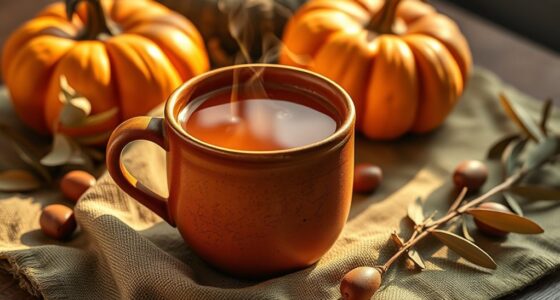
When you embrace spring’s bright and pastel hues, you’re essentially blending into nature’s palette. These colors aren’t just random; they’re carefully curated by the environment to mirror the blossoming world around you. Flower-inspired hues serve as a perfect guide because they capture the spirit of growth and vibrancy. Soft pinks and blush tones mimic cherry blossoms, while gentle blues resemble the clear spring sky. Bright yellows and oranges echo daffodils and tulips, radiating warmth and optimism. Light greens reflect fresh leaves and new grass, adding a sense of vitality and renewal. By choosing these shades, you’re not only celebrating the season but also aligning your style with the lively energy of spring. Additionally, understanding the Refrigeration Cycle helps in designing efficient climate control systems that can also influence interior comfort and decor choices.
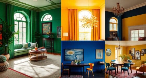
Spring’s color palette encourages you to experiment with contrasts and combinations. Pair pastel pinks with vibrant greens for a playful yet sophisticated look, or mix sunny yellows with soft lavenders to create a cheerful, harmonious vibe. These colors work beautifully in clothing, accessories, and home decor, helping you embrace the season’s lively spirit. You’ll find that flower-inspired hues bring a sense of freshness and positivity, making everything feel more alive and inspired. Whether you’re updating your wardrobe or revitalizing your living space, incorporating colors from nature’s palette gives you a natural, effortless way to celebrate spring’s arrival.
Frequently Asked Questions
How Do I Incorporate Spring Pastels Into My Home Decor?
You can incorporate spring pastels into your home decor by adding colorful wall accents like soft pinks, gentle blues, or mint greens to brighten up your space. Use pastel kitchen accessories such as dishes, towels, or small appliances to create a fresh, inviting look. Mix and match these elements to keep your decor lively and cohesive, instantly bringing a touch of spring’s cheerful energy into your home.
Are Spring Brights Suitable for All Skin Tones?
Spring brights can work with many skin tones if you use color contrast techniques. For warmer skin tones, opt for coral, peach, or bright yellows that complement your warmth. If you have cooler skin tones, try jewel tones like turquoise or fuchsia for a striking contrast. Adjust the intensity and pairing of colors to suit your skin tone, making sure you feel confident and vibrant.
What Accessories Best Complement Pastel Outfits?
You should choose statement accessories and jewelry pairing that highlight your pastel outfits. Opt for delicate gold or silver pieces to add elegance, or go bold with colorful statement earrings or chunky necklaces for a fun pop. Light scarves or floral hair accessories also work well. These accessories elevate your look, making your pastel ensemble stand out while keeping it balanced and fresh.
How Can I Transition My Wardrobe From Winter to Spring Colors?
Think of your wardrobe as a canvas waiting for spring’s burst of color. Simply layer lighter pieces over winter staples and add vibrant accessories for a fresh look. Use color blocking to merge pastel shades with brighter hues, creating a seamless shift. Swap heavy fabrics for breezier ones, and introduce spring-inspired patterns. With these steps, you’ll effortlessly evolve your wardrobe from winter’s muted tones to spring’s lively palette.
Which Colors Are Trending for Spring 2024?
For spring 2024, vibrant coral, fresh mint, and lively sunflower yellow are trending, aligning with color psychology to boost energy and optimism. Incorporate these hues into your wardrobe, considering seasonal color analysis to find shades that flatter your skin tone. These colors evoke renewal and joy, making them perfect choices for spring. Embrace these trends to refresh your style and feel confident throughout the season.
Conclusion
As you embrace spring’s pastel and bright hues, you might notice how they effortlessly complement the blooming flowers and clear blue skies around you. It’s like nature and fashion are in perfect sync, reminding you that seasonal palettes aren’t just trends—they’re reflections of the world’s vibrant awakening. So, as you choose your colors this season, keep in mind how seamlessly they align with the season’s natural beauty, making everything feel just a little more alive.