
To create transitional fall palettes inspired by nature’s shift, blend warm earth tones like browns and terracottas with muted greens and olive hues. Add sunset-inspired oranges and corals for warmth and vibrancy, then deepen the mood with burgundy, plum, and cool blues or slate grays. Incorporate natural textures and accents like moss or wood to evoke autumn’s changing landscape. Keep exploring to discover how these colors can transform your decor and style seamlessly.
Key Takeaways
- Incorporate warm earth tones like browns, rust, and beige to reflect seasonal foliage and harvest themes.
- Use muted greens, olive hues, and natural greens such as moss and eucalyptus for a calming, nature-inspired palette.
- Add sunset-inspired oranges, corals, and gold accents to evoke the fiery glow of dusk during fall.
- Combine deep burgundy, plum, and cool blues or slate grays to create sophisticated, cozy atmospheres.
- Blend these palettes to achieve a balanced, tranquil mood that captures the transitional beauty of fall’s natural shift.
Warm Earth Tones: Browns and Terracottas

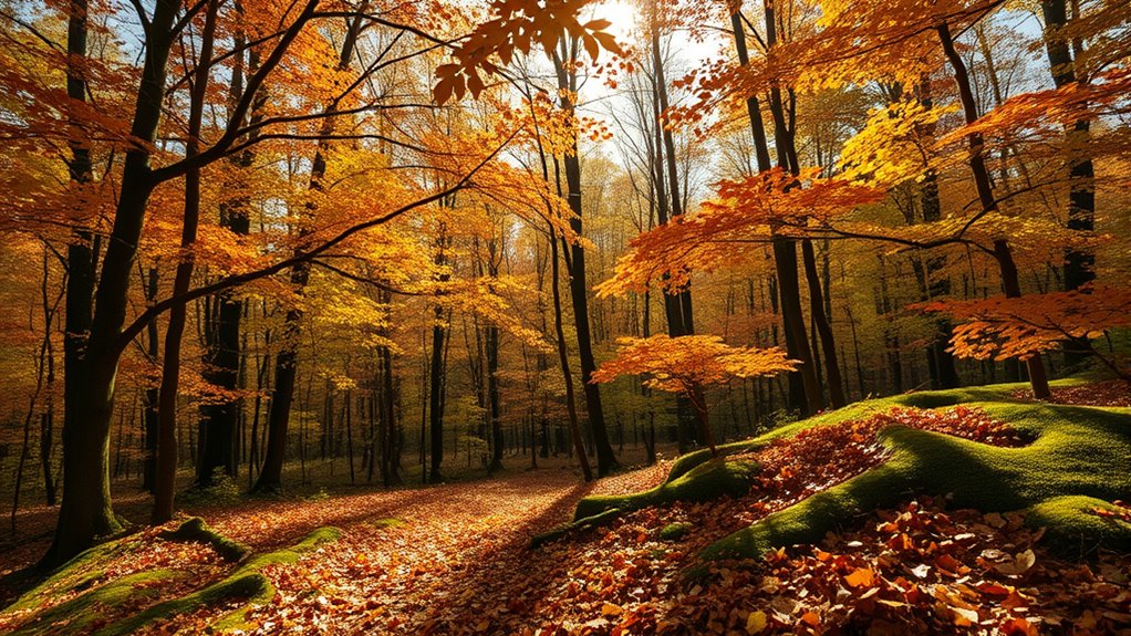
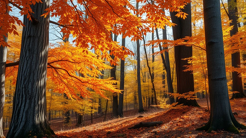
Warm earth tones like browns and terracottas offer a cozy, grounding feel perfect for fall. These hues mirror the vibrant fall foliage, capturing the essence of changing leaves and bringing warmth into your space. During harvest festivals, you’ll notice these colors everywhere, from decorated pumpkins to rustic table settings. Incorporating browns and terracottas creates a welcoming atmosphere that celebrates the season’s natural beauty. They pair well with textured materials like wood and woven fabrics, enhancing the earthy vibe. Whether you’re decorating for a cozy night in or preparing for outdoor festivities, these tones provide a versatile palette that connects you with autumn’s rich landscape. Embrace these warm shades to evoke a sense of comfort and seasonal shift. Adding natural materials, such as reclaimed wood or stone accents, can further enhance the farmhouse aesthetic and create a harmonious fall-inspired space.
Muted Greens and Olive Hues
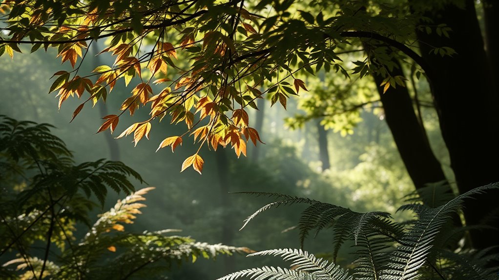
Muted greens and olive hues provide a natural foundation for fall palettes that feel both grounded and sophisticated. You can easily incorporate these earthy tones as versatile accents or main features in your decor. Their nature-inspired shades create seamless combinations with warm earth tones and other seasonal hues. Incorporating essential oils with calming or invigorating scents can enhance the cozy atmosphere of your space during this transitional season.
Earthy Tone Foundations
Earthy tones like muted greens and olive hues form a solid foundation for shifting fall palettes, reflecting the changing landscape around you. These colors evoke seasonal color psychology, promoting calmness and groundedness during changeover. They also highlight sustainable dye sources, such as plant-based and natural mineral dyes, making your palette eco-friendly. Incorporating these hues creates a versatile base that pairs well with richer autumn shades. Use the following ideas to inspire your color choices:
| Idea | Description | Example Use |
|---|---|---|
| Muted Green | Calm, natural, versatile | Wall paint, accessories |
| Olive Hues | Earthy, sophisticated | Textiles, furniture |
| Sustainable Dyes | Eco-conscious, rich in history | Fabric, accent pieces |
| Seasonal Psychology | Promotes stability and tranquility | Overall palette |
| Grounding Effect | Connects indoors with nature | Decor and accents |
Additionally, embracing cultural narratives in design can deepen the connection to nature’s shifts, as seen in traditional dyes and motifs.
Versatile Fall Accents
Muted greens and olive hues serve as flexible fall accents that seamlessly blend with richer autumn shades. These colors add depth and sophistication to your decor, creating a calming yet vibrant atmosphere. You can incorporate them into fall floral arrangements with eucalyptus, succulents, and moss accents. For outdoor seasonal decor, think about olive-toned wreaths, lanterns with olive accents, or greenery draped over porch railings. These hues work well as subtle backdrops or statement pieces, complementing warm oranges, deep reds, and golden yellows. Imagine a table centerpiece featuring olive-colored foliage mixed with burnt orange blooms or a cozy outdoor nook decorated with muted green pillows and throws. Incorporating unique and wicked planters can elevate your display and bring a creative touch to your seasonal decor. These versatile accents effortlessly enhance your fall aesthetic without overpowering your overall color scheme.
Nature-Inspired Combinations
Incorporating natural elements into your fall decor can elevate your seasonal aesthetic with a fresh, organic feel. Muted greens and olive hues reflect the subtle beauty of fall foliage and seasonal shifts. These colors evoke the quiet strength of leaves that shift from vibrant to subdued, creating a calming atmosphere. You can mix olive drapes with moss accents or pair sage pillows with caramel accents. This palette seamlessly blends outdoor inspiration with indoor comfort, emphasizing harmony. Use the table below to guide your color combinations:
| Green Shade | Accent Color | Best Use |
|---|---|---|
| Muted Olive | Warm Brown | Throw pillows |
| Sage | Cream | Wall decor |
| Forest Green | Rust | Tableware & linens |
| Moss | Beige | Upholstery accents |
These combinations foster a sense of unity during seasonal transitions. Additionally, selecting self watering plant pots can help maintain the lushness of your indoor greenery, ensuring your natural-inspired decor remains vibrant throughout the season.
Sunset-inspired Oranges and Corals
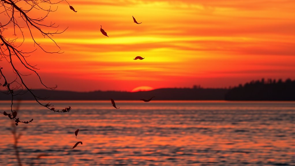
As the days grow shorter and the air turns crisper, sunset-inspired oranges and corals emerge as vibrant choices for fall palettes. These warm hues evoke the last rays of sunlight and the fiery glow of dusk. You can use color blocking techniques to combine bold coral with muted amber or fiery tangerine for striking contrasts. Seasonal color forecasting highlights these shades as key trends, perfect for updating your wardrobe or home decor. Picture:
- A burnt-orange sky streaked with soft coral clouds
- A cozy sweater in deep tangerine paired with caramel accessories
- Coral accents against earthy browns and warm grays
- Sunset-inspired gradients blending orange and pinks
- Vibrant corals in floral arrangements or textiles
These colors capture the energy of fall’s transition, making your style feel both fresh and seasonally appropriate. Color trends continue to influence seasonal palettes, ensuring these vibrant hues stay in vogue throughout the season.
Deep Burgundy and Plum Shades

Deep burgundy and plum shades bring rich, warm tones that instantly evoke cozy fall evenings. When paired thoughtfully, they create striking color combinations that enhance your space’s atmosphere. These hues set a mood of elegance and comfort, perfect for changeover seasonal decor. Incorporating color harmony techniques can further elevate the aesthetic appeal of your palette.
Rich, Warm Tones
Rich, warm tones like deep burgundy and plum bring a sense of sophistication and coziness to your fall wardrobe. These hues evoke feelings of comfort and confidence, aligning perfectly with seasonal color trends. In color psychology, they symbolize passion, elegance, and warmth, making them ideal for transitional outfits. Imagine wrapping yourself in a velvety plum sweater or a deep burgundy coat that commands attention. These shades create a rich tapestry that enhances your overall look. Visualize:
- A plush burgundy scarf against a crisp autumn sky
- Plum-colored leather boots stepping through fallen leaves
- Deep wine-red accessories adding a touch of luxury
- A cozy sweater in warm maroon hues
- A sophisticated plum blazer elevating your style
These tones make your wardrobe both timeless and trendy, embodying the essence of fall’s shifting palette. Incorporating Preppy Dog Names can also inspire you to select accessories or details that add a touch of elegance to your seasonal wardrobe.
Complementary Color Pairing
Pairing deep burgundy with plum creates a striking and harmonious contrast that enhances your fall wardrobe. This complementary color pairing leverages the color wheel fundamentals, where these shades sit opposite each other, creating visual balance. When considering seasonal color psychology, both colors evoke richness, sophistication, and warmth, perfect for fall’s transitional mood. Deep burgundy symbolizes depth and stability, while plum adds a touch of mystery and elegance. When combined, they offer a bold yet refined look, ideal for layering or statement pieces. This pairing not only draws attention but also aligns with the natural shift in autumn’s palette, echoing the changing leaves. By understanding color wheel fundamentals, you can confidently incorporate these shades to elevate your seasonal style with intentionality and vibrancy. Additionally, understanding color psychology can help you choose hues that resonate emotionally and reflect the natural transition of the season.
Mood and Atmosphere
The combination of deep burgundy and plum shades creates a compelling mood that exudes sophistication and warmth. This palette evokes a seasonal emotional impact, making you feel cozy yet elegant as autumn progresses. The color psychology nuances influence your perception, fostering feelings of comfort, introspection, and subtle luxury. Visualize:
- Soft candlelight flickering against dark velvet curtains
- Crisp leaves falling, painted in rich wine and purple hues
- Warm drinks steaming in ornate glassware
- Elegant, layered textiles in deep reds and purples
- Quiet moments of reflection amid twilight skies
Together, these shades set an atmosphere of refined serenity, perfectly capturing the transitional spirit of fall’s changing landscape. They deepen emotional resonance, enriching your environment with a sense of quiet sophistication. Considering support hours for entertainment venues can help you plan your visits during optimal times of day.
Soft Neutrals and Creamy Tones

Soft neutrals and creamy tones create a calming foundation for your shifting fall palette. These shades are rooted in seasonal color psychology, promoting a sense of stability and comfort as nature transitions. Using a neutral palette layering approach, you can easily build depth and dimension without overwhelming your space. Soft beige, warm taupe, and ivory serve as versatile bases that complement the changing landscape. These tones allow you to highlight richer hues later on, making your overall design more cohesive. Plus, their understated elegance creates a soothing atmosphere perfect for fall’s reflective mood. Incorporating these gentle shades guarantees your palette feels harmonious and adaptable, seamlessly blending the quiet beauty of seasonal change with your personal style.
Vibrant Accents: Mustard and Gold
Vibrant accents like mustard and gold instantly bring warmth and energy to a fall palette. These bold hues are perfect for color blocking, creating striking contrasts that capture the season’s essence. As you shift through seasonal shifts, mustard and gold serve as eye-catching focal points. Imagine a cozy sweater with gold embroidery, a mustard scarf paired with deep browns, or a gold-toned accessory adding sparkle to muted tones. These lively accents evoke harvest themes and the changing leaves, energizing your wardrobe or decor. Incorporate mustard and gold through:
- Statement jewelry
- Accent pillows or throws
- Bold, color-blocked clothing pieces
- Decorative vases or candleholders
- Autumn-inspired artwork
Their vibrancy amplifies the richness of fall, seamlessly blending warmth with seasonal transition.
Cool Blues and Slate Grays

As the leaves shift to muted tones, incorporating cool blues and slate grays can add a sophisticated and calming touch to your fall palette. These colors evoke seasonal color psychology focused on tranquility and reflection, perfect for transitional periods. To create a balanced look, use color pairing techniques that combine the cool tones with warmer accents like soft browns or muted oranges, enhancing depth and visual interest. Cool blues serve as a versatile base, bringing serenity, while slate grays add a modern, understated elegance. Together, they evoke the quiet, introspective mood of fall’s changing landscape. Whether in décor, fashion, or design, these shades help you craft a refined, cohesive look that seamlessly captures the season’s subtle shift.
Rustic Reds and Cranberry Hues
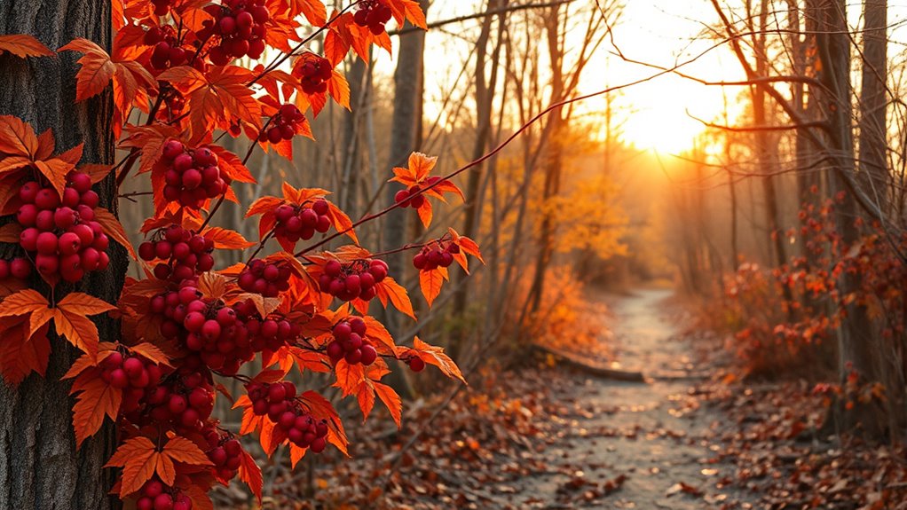
Rustic reds and cranberry hues bring warmth and richness to your fall palette, evoking cozy gatherings and harvest traditions. These deep, vibrant tones mirror the vivid fall foliage and the bounty of harvest festivals. They inspire scenes of ripe pumpkins, crimson leaves, and crackling fires. With this palette, you can imagine:
- Apples and cranberries piled high at farmers’ markets
- Burnished leaves falling in a gentle cascade
- Warm, inviting textiles in deep reds and burgundies
- Lanterns casting a soft glow during evening festivals
- Rustic tables adorned with seasonal gourds and berries
These hues perfectly capture the essence of autumn’s progression, making your space feel inviting and rooted in nature’s seasonal shift. They create a visual connection to the harvest season’s warmth and celebration.
Nature-Inspired Accents and Textures
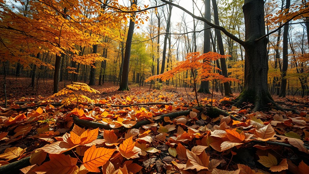
Bringing nature indoors during fall means incorporating organic accents and textured elements that evoke the season’s natural beauty. You can do this by adding botanical patterns to your textiles, such as leaf motifs or floral designs, which bring a touch of the outdoors inside. Textured fabrics like woven throws, plush velvet pillows, and linen curtains add depth and tactile interest, creating a cozy, inviting atmosphere. These accents not only reflect the changing landscape but also enhance your space with a layered, organic feel. Mixing patterns and textures inspired by nature helps shift your decor seamlessly into fall, making your home feel both stylish and connected to the season’s natural shift. Embrace these elements to create a warm, textured environment that celebrates autumn’s beauty.
Frequently Asked Questions
How Can I Incorporate Transitional Fall Palettes Into Contemporary Home Decor?
To incorporate transitional fall palettes into your contemporary home decor, start by adding fall-inspired accents like warm throw pillows, cozy rugs, and decorative vases in earthy tones. Use contemporary color schemes with muted oranges, deep browns, and soft greens to create a seamless blend. Mix these elements thoughtfully to evoke fall’s warmth while maintaining a sleek, modern look. This approach guarantees your space feels inviting and seasonally stylish.
Are These Color Trends Suitable for Outdoor Landscaping and Garden Design?
You’ll be amazed how these color trends transform your outdoor space! Yes, they’re perfect for landscaping and garden design, creating a stunning, harmonious look. Incorporate drought-resistant plant choices and implement soil erosion prevention strategies, blending vibrant fall hues with practicality. These palettes elevate your garden’s beauty while maintaining resilience. So, go ahead—make your outdoor area a breathtaking, nature-inspired masterpiece that thrives through seasons!
Which Colors Pair Best for a Balanced Autumn-Inspired Wardrobe?
For a balanced autumn-inspired wardrobe, you should consider colors like warm oranges, deep reds, earthy browns, and muted greens. These shades work well for fall fashion layering, allowing you to mix and match effortlessly. Pair these with rich autumn accessory choices like amber jewelry or cozy scarves to add depth. This combination creates a harmonious look, keeping you stylish and seasonally appropriate as you embrace the beauty of fall.
How Do These Palettes Influence Mood and Emotional Well-Being?
Imagine wearing warm, earthy tones during a stressful day; these colors can boost emotional resilience and promote mood regulation. Colors inspired by nature’s shift, like deep reds and muted oranges, create calming and grounding effects. They help you feel more centered and balanced, especially in challenging times. By choosing such palettes, you harness their natural influence to enhance emotional well-being, making it easier to navigate daily stresses with confidence and calm.
Can These Colors Be Used Effectively in Seasonal Event or Wedding Decorations?
You can definitely use these autumn color symbolism in seasonal decorating tips for events or weddings. These colors evoke warmth, coziness, and natural beauty, making them perfect for fall celebrations. Incorporate rich oranges, deep reds, and earthy browns to create an inviting atmosphere. These palettes enhance the seasonal vibe and add emotional depth, helping guests feel connected to autumn’s charm. Use natural elements and thoughtful color placement for a stunning, cohesive look.
Conclusion
As you embrace these transitional fall palettes, remember that 68% of people find nature-inspired colors more soothing and inspiring. Incorporating warm browns, muted greens, and sunset oranges can create a cozy, inviting atmosphere that mirrors the changing season. Don’t hesitate to add vibrant accents like mustard or gold for a pop of energy. With these colors, you’ll effortlessly capture fall’s essence, making your space feel both fresh and rooted in nature’s beautiful shift.