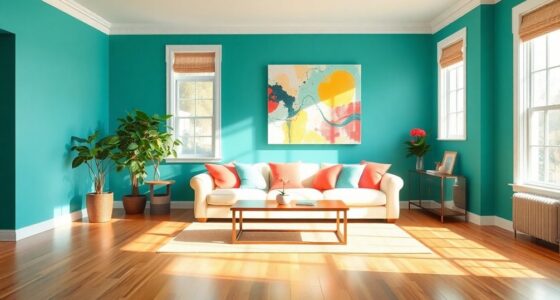
Choosing colors without considering their psychological effects can unintentionally add stress to your space. Bright reds or bold oranges, if overdone, can create agitation, while dark hues may feel oppressive. Overlooking how natural light influences color perception or mismatching shades with furniture can also disrupt the calming atmosphere you’re after. To avoid this stress-inducing mistake, understanding how colors interact with space and light is essential. Keep exploring to discover how to create a truly peaceful environment.
Key Takeaways
- Choosing overly bold or bright colors without considering their impact on mood can increase stress.
- Ignoring natural light effects may cause colors to appear harsh or oppressive, disrupting calm.
- Clashing or poorly coordinated colors with furniture can create visual discomfort and tension.
- Relying solely on personal preference without considering psychological effects may lead to an unsettling environment.
- Using dark, muted tones excessively can make spaces feel oppressive rather than relaxing.
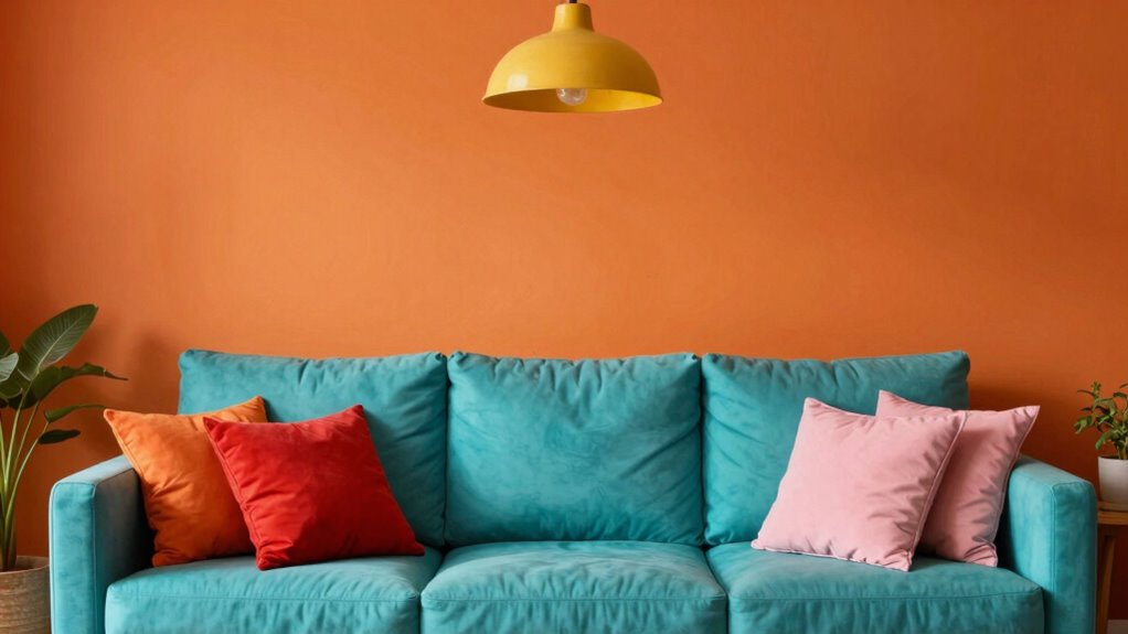
Have you ever chosen a paint color for your decor only to realize it clashes with your furniture or makes the room feel off? It’s a common mistake that can unintentionally turn a space into a source of stress rather than comfort. One of the biggest pitfalls is ignoring the principles of color psychology and how hues influence mood. When you pick a color without taking into account its psychological impact, you might end up creating an environment that feels tense or overwhelming instead of relaxing.
Color psychology plays a vital role in how your space affects your emotions. Bright reds or bold oranges might seem lively or energetic, but they can also increase feelings of agitation if overused. Conversely, muted tones like grays or certain blues might evoke calmness, but if they’re too dark or dull, they can make your room feel dreary or oppressive. You need to think about how each color influences mood and choose shades that promote the atmosphere you want to foster. For example, if you aim for a tranquil retreat, soft blues or gentle greens can be effective. But if you want a space that energizes you, vibrant yellows or lively reds can work—if used thoughtfully.
Colors influence mood—choose tranquil blues or energizing reds carefully to create the perfect atmosphere.
Another mistake is relying solely on personal preference without thinking about how a color’s mood influence interacts with your space. Just because you love a particular shade doesn’t mean it’s appropriate for every room or mood you want to cultivate. When you overlook this, you risk creating a setting that’s inconsistent with your intentions, leading to subtle feelings of discomfort or stress. It’s essential to visualize how the color will interact with natural light, furniture, and accessories. A color that looks fantastic in a swatch might feel too intense or dull once applied on your walls, especially if it clashes with other elements or doesn’t complement the room’s overall mood. Considering biodiversity and natural elements in your color choices—like incorporating plant-inspired hues—can further enhance your environment’s calming effects. Additionally, understanding the role of natural light and its interaction with color can help you select shades that remain balanced and harmonious throughout the day. Recognizing the importance of color harmony in decorating can prevent mismatched combinations that disrupt your intended atmosphere. Being aware of the psychological effects of color can help you make more thoughtful choices that support your well-being. Avoiding the decor color mistake of neglecting mood influence ultimately leads to a more balanced, stress-free environment where you feel truly at ease.
As an affiliate, we earn on qualifying purchases.
Frequently Asked Questions
How Do Color Choices Affect Mental Health?
Color choices directly influence your mental health through their psychological impact and cultural associations. Bright, warm colors can energize and uplift you, while cool, muted tones promote relaxation. However, choosing colors without considering their cultural meanings might cause unintended stress or discomfort. Being mindful of both psychological effects and cultural associations helps you create a space that fosters calm and well-being, rather than adding unnecessary stress through poor color choices.
Can Small Color Changes Make a Big Difference?
Yes, small color changes can make a big difference. By applying principles of color psychology, you can enhance your mood and create a more calming environment. For example, adding soft blues or greens promotes relaxation and reduces stress, while brighter colors might energize you. These subtle adjustments can considerably impact your overall mental well-being and help you feel more at ease in your space.
What Are Safe Color Combinations for Relaxation?
For safe color combinations that promote relaxation, focus on soft, muted shades based on color psychology. Use calming blues and gentle greens, which enhance mood and reduce stress. Pair these with neutral tones like beige or light gray to create a balanced, tranquil environment. Avoid overly bright or contrasting colors, as they can increase stress. These combinations foster mood enhancement, making your space a peaceful retreat rather than a source of tension.
How to Fix a Stressful Color Scheme Quickly?
To fix a stressful color scheme quickly, start by adding calming colors like soft blues or gentle greens, which are proven through color psychology to promote relaxation. Use accessories like cushions, throws, or artwork to introduce mood enhancement without overhauling the entire space. Incorporate natural light and reduce clutter to further decrease stress. This simple update can transform your environment into a more peaceful, calming haven almost instantly.
Are Neutral Colors Always the Best for Calm?
Neutral colors often symbolize serenity, but they’re not always the best for mood enhancement. You might find that cultural perceptions influence how calming a color feels—what’s soothing in one culture could feel bland or dull in another. To create a truly calming space, consider adding subtle accents or warm tones that resonate with your personal or cultural sense of peace. Balance neutral shades with soft textures and natural light for maximum tranquility.
Conclusion
Avoiding color mistakes in your decor isn’t just about aesthetics; it’s about creating a sanctuary that soothes rather than stresses. Remember, choosing the wrong hues can turn your peaceful haven into a battleground of chaos. So, trust your instincts, keep things simple, and don’t be afraid to experiment. After all, your home should be a castle of calm—so pick your colors wisely and let your space be a renaissance of relaxation, not a war zone.