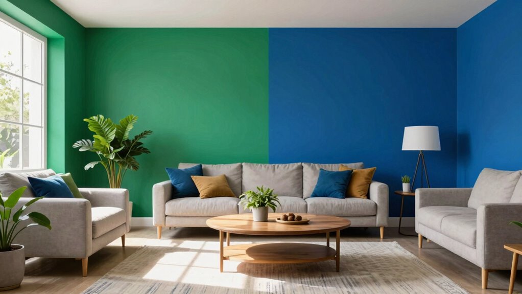

To use deep colors smartly without darkening your space, balance them with light and neutral tones like white, beige, or soft gray, especially on trim or accessories. Add strategic lighting — layered warm lights can soften deep hues and highlight their richness. Incorporate metallic accents or textured fabrics to reflect light and add interest. Keep larger areas light-colored, and use deep shades as accents in smaller spaces. Curious how to master this balance? Keep exploring for more tips.

Get decor and gifts delivered free with Prime
- Fast, free delivery on millions of items
- Prime Video, Amazon Music and more included
- Member-only deals all year
Key Takeaways
- Pair deep colors with light or neutral tones to create contrast and prevent a room from feeling dark.
- Use layered warm lighting and natural light to enhance brightness and highlight deep hues.
- Apply deep shades strategically on accent walls or accessories to avoid overwhelming small spaces.
- Incorporate reflective accents like metallics and plush textures to add depth and light reflection.
- Consider room size and utilize balanced color placement to maintain an open, inviting atmosphere.
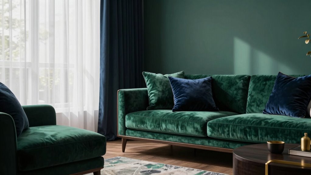
Have you ever wondered how deep, rich colors transform a space into something truly mesmerizing? It’s all about how you use those colors and the effects they create. Deep hues, like navy, emerald, or burgundy, can add sophistication and warmth, but if not handled carefully, they might make a room feel smaller or darker. To avoid that, understanding color psychology and smart color pairing becomes essential. Color psychology reveals that certain shades evoke specific moods—deep blues promote calm, while dark greens can feel grounding. When you pick the right deep color for your space, you’re influencing how it feels, making it welcoming rather than oppressive.
Deep, rich colors can transform your space into a warm, sophisticated haven when used thoughtfully.
The key is to balance these intense shades with lighter, complementary colors. For example, pairing a deep navy wall with crisp white trim instantly lifts the room’s brightness and creates a clean, fresh contrast. This approach not only prevents the space from feeling too enclosed but also highlights the richness of the deep color. You can also consider soft neutrals like beige or warm grays to warm up a room painted in dark hues, giving it depth without overwhelming the senses. The goal is to create a visual balance that lets the deep colors shine without making the space appear smaller.
Another smart strategy involves using color pairing to your advantage. Combining deep colors with metallic accents, such as gold or brass, can add a touch of luxury and reflect light in a way that brightens the room. Textured materials, like velvet cushions or a plush rug in lighter shades, also help break up the darkness and add visual interest. Remember, the placement of these elements matters. Position lighter pieces near windows or light sources so they reflect natural light and bounce it around the room, making the space brighter and more open. Recognizing the importance of lighting in interior design helps enhance the impact of deep colors. Additionally, understanding how the psychology of color influences mood can guide your choices to create a space that feels both inviting and balanced. Incorporating color contrast techniques further emphasizes the depth and richness of the hues while maintaining an open feel. Paying attention to the visual weight of different colors ensures that the space remains harmonious and well-balanced.
Being mindful of color psychology can also help you choose hues that support the atmosphere you want to create, whether it’s relaxation, energy, or tranquility. You should also consider the size of your room. For smaller spaces, focus on using deep colors on a single accent wall or in accessories rather than painting entire rooms. This technique keeps the room cozy without overwhelming it. In larger rooms, you can confidently use deep shades more broadly, knowing that they won’t visually shrink the space. Lighting plays a crucial role too; layered lighting with warm bulbs can soften dark hues, creating a cozy ambiance and preventing the space from feeling too heavy.
Ultimately, using deep colors cleverly involves understanding their psychological impact and how they interact with other elements in your space. When you combine thoughtful color pairing with strategic placement and lighting, you can enjoy the richness of deep hues without sacrificing brightness or openness. It’s about creating a balanced, inviting environment where deep colors elevate your space, not diminish it.
white trim paint for deep wall colors
As an affiliate, we earn on qualifying purchases.
As an affiliate, we earn on qualifying purchases.
Frequently Asked Questions
Can Deep Colors Make a Small Room Feel Larger?
Yes, deep colors can make a small room feel larger if you use color psychology wisely. Opt for shades like navy or emerald that add depth without overwhelming the space. Historically, bold hues have been trendy, but balancing them with lighter accents or strategic lighting prevents darkening. This approach creates visual interest and a sense of openness, making your small room feel more expansive and inviting rather than confined or gloomy.
What Lighting Options Best Complement Deep Wall Colors?
You should choose accent lighting and maximize natural illumination to complement deep wall colors. Accent lighting highlights the richness of dark hues without overpowering the space, creating depth and interest. Use warm LED lights or spotlights to accentuate features, while large windows or sheer curtains allow natural light to brighten the room during the day. Together, these options enhance deep colors while maintaining a balanced, inviting atmosphere.
Are There Specific Color Combinations That Work Well With Deep Tones?
Think of your walls as a canvas waiting for harmony to unfold. You’ll find that deep tones shine brightest when paired with lighter hues like soft creams or muted pastels, creating a delicate dance of contrast. Opt for color pairing that emphasizes hue harmony—such as navy with blush or plum with warm beige. These combinations balance depth and brightness, making your space feel cozy yet vibrant, without feeling overwhelmed by darkness.
How Do Deep Colors Affect Room Temperature Perception?
Deep colors can influence how you perceive room temperature, often making a space feel warmer or cooler based on their psychological effects. Warm deep hues like reds and browns evoke coziness and comfort, making a room seem warmer. Conversely, cool deep shades like navy or forest green can create a calming, invigorating feel, which might make the space seem cooler. Understanding color psychology helps you choose shades that align with your desired ambiance.
Can Deep Colors Be Used Effectively in Minimalist Interior Design?
You can absolutely use deep colors effectively in minimalist design, and they might even make your space feel like a luxurious retreat! With thoughtful application, deep hues evoke powerful emotions through color psychology, adding depth and sophistication. Remember that cultural interpretations influence how these shades are perceived; for example, navy might symbolize trust or stability. Keep it simple, focus on quality, and let rich colors transform your minimalist space into a striking yet serene haven.
Conclusion
By thoughtfully balancing deep colors with lighter shades and clever lighting, you can create a space that feels both vibrant and inviting. Think of it like a painter blending bold strokes with delicate washes—each element working together to enhance the overall harmony. Don’t be afraid to experiment and trust your instincts. With these tips, you’ll master the art of using deep hues without darkening your space, turning it into a truly stylish sanctuary that feels just right.
Fall Picks
fall essentials
As an affiliate, we earn on qualifying purchases.