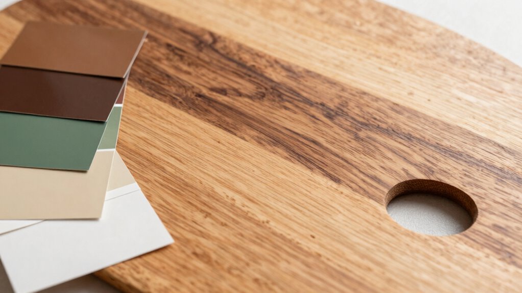

To make mixed wood tones and paint colors work together, focus on creating balance through texture and color. Use natural textures that mimic finishes like matte or satin to unify different surfaces. Choose a dominant color or wood tone as your foundation, then introduce complementary shades and bold hues thoughtfully across the space. Incorporate accessories that feature multiple shades from your palette to establish visual flow and harmony. Keep experimenting with these tips to discover how a cohesive, stylish environment comes together smoothly.

Get decor and gifts delivered free — and shop member deals
- Fast, free delivery on millions of items
- Access to Prime Big Deal Days deals on October 6–7
- Prime Video, Amazon Music and more included
Key Takeaways
- Use natural textures like matte or satin finishes to create visual harmony between wood and painted surfaces.
- Balance bold hues with neutral or subdued wood tones to prevent visual overload.
- Choose a dominant color or wood tone to anchor the overall design and guide color choices.
- Incorporate accessories with multiple shades from the palette to establish a cohesive flow.
- Apply color theory and match textures to enhance harmony and create a thoughtfully curated space.
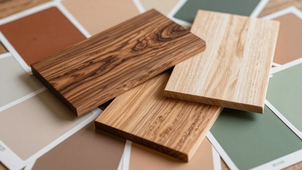
Mixing different wood tones and paint colors can create a stunning, cohesive look in your space, but it requires a bit of planning. The key is understanding how to match natural textures and balance bold hues so everything feels intentional rather than chaotic. When you incorporate matching natural textures, you create a sense of harmony that ties the various elements together. For example, if you have a rustic wooden dining table with a rough, matte finish, complement it with painted surfaces that mimic similar textures—think matte or satin paints rather than high-gloss finishes. This consistency in texture ensures that your mix of wood tones and colors feels deliberate and visually appealing. Additionally, considering natural textures can help you select materials that enhance the overall aesthetic and create a unified look. Using a variety of complementary colors across different elements can further unify your design and make the space feel cohesive. Balancing bold hues is equally vital. If you’re working with vibrant paint colors, neutral or subdued wood tones can serve as a calming anchor. Conversely, if your wood surfaces are rich and dark, adding pops of bright, bold paint can energize the space without overwhelming it. The trick is to distribute these bold hues thoughtfully—perhaps through accent walls, throw pillows, or artwork—so they enhance rather than dominate the room. When you achieve this balance, your space feels lively but not chaotic, sophisticated but inviting. To make mixed wood tones and paint colors work seamlessly, start by selecting a unifying element. You might choose a dominant color or wood tone that sets the tone for the entire room. From there, bring in other shades and textures that complement this foundation. For instance, if your main wood tone is a warm honey oak, consider painting walls in a soft beige or warm gray that highlights the warmth without clashing. If you want to incorporate bold hues, pick shades that are adjacent on the color wheel or have similar undertones, ensuring they blend naturally. It’s also helpful to create visual connections across different elements in the room. Use accessories like rugs, curtains, or decorative objects that contain multiple shades pulled from your palette. This creates a cohesive flow, making the mixing of wood tones and paint colors feel intentional and balanced. Paying attention to matching natural textures can help you achieve this harmony and add depth to your design. Incorporating color theory principles can further refine your choices and create a more harmonious environment. When you pay attention to matching natural textures and balancing bold hues, your space will radiate a thoughtfully curated charm that’s both stylish and comfortable.
As an affiliate, we earn on qualifying purchases.
Frequently Asked Questions
How Do I Choose the Right Wood Tones for My Space?
Choose the right wood tones by considering the desired contrast in your space. If you want a more cohesive look, stick with natural wood or stained finishes that complement each other. For contrast, mix lighter and darker tones to add visual interest. Think about the existing paint colors and overall style. Balancing wood tone contrast guarantees your space feels intentional and harmonious, whether you opt for natural or stained woods.
Can I Mix Different Paint Finishes With Wood Tones?
Think of your space as a symphony—mixing different paint finishes is like blending melodies. You can pair glossy with matte finishes, creating contrast, just as warm and cool wood tones add depth. However, keep harmony in mind: too many contrasting finishes may sound off. Aim for a balance, letting the finishes complement each other, much like instruments in harmony, ensuring your space feels cohesive and inviting.
What Tools Are Best for Testing Color Combinations?
You should use a color wheel and sample swatches to test color combinations effectively. The color wheel helps you see complementary and harmonious hues, guiding your choices. Sample swatches allow you to visualize how paint colors look next to different wood tones under your lighting. By comparing these swatches side-by-side, you can confidently select combinations that work well together, ensuring your space feels cohesive and balanced.
How Do Lighting Conditions Affect Color and Wood Tone Choices?
Did you know that lighting can change how colors appear by up to 30%? Natural light highlights the true tones of wood and paint, making warm or cool hues more vibrant. Conversely, artificial lighting, especially fluorescent or LED, can cast a different hue, dulling or intensifying colors. When choosing wood and paint, consider your lighting conditions to guarantee your color choices look great both during the day and at night.
Should I Consider Furniture Styles When Coordinating Wood and Paint?
Yes, you should consider furniture styles when coordinating wood and paint. Your furniture’s design style influences the overall aesthetic, creating a cohesive look. For example, modern furniture pairs well with sleek, neutral paint, while traditional styles complement richer wood tones and classic colors. Matching furniture styles with your paint and wood tones guarantees design cohesion, making your space feel harmonious and thoughtfully curated.
Conclusion
By blending different wood tones and paint colors thoughtfully, you create a space that feels cohesive and inviting. Remember, a little planning goes a long way—don’t be afraid to experiment and trust your instincts. When you find the right balance, your room will come together beautifully, proving that variety truly is the spice of life. So, take the plunge and turn your vision into reality—you’ll be glad you did!
Evergreen bestsellers Picks
bestsellers
As an affiliate, we earn on qualifying purchases.