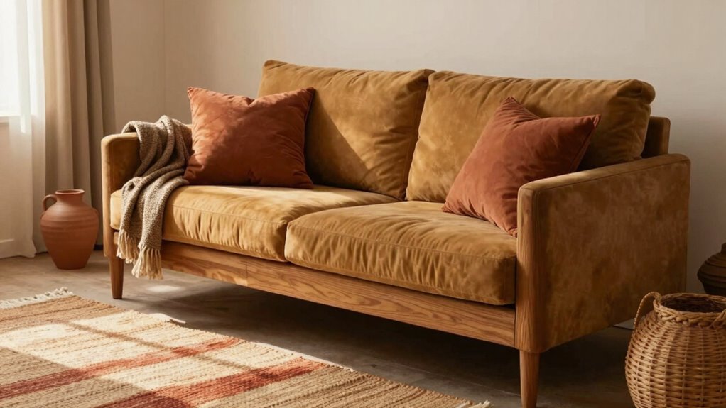
Gentle contrast in age-friendly interiors helps you see boundaries, stairs, and furniture…
Browsing Category
Color Schemes
75 posts
How to Pair Earth Tones With Cleaner, Modern Accents
Inevitably, blending earth tones with modern accents creates a stylish, eco-conscious space—discover how these elements harmonize for a stunning home.
The Decor Color Mistake That Can Add Stress Instead of Calm
Keenly understanding color effects is crucial, as the wrong choices can turn your peaceful space into a stressful environment—discover how to avoid this mistake.
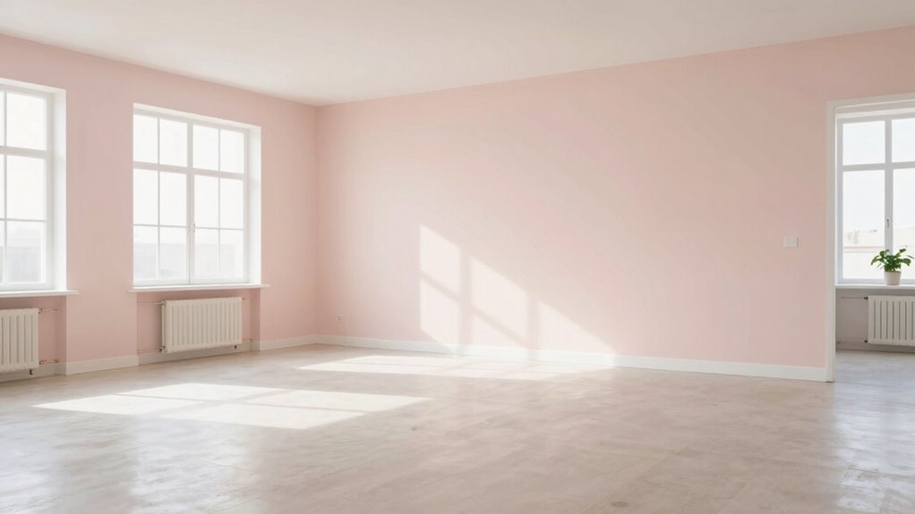
How to Use Paint to Make Small Rooms Feel More Open
To make small rooms feel more open, choose light, neutral colors like…
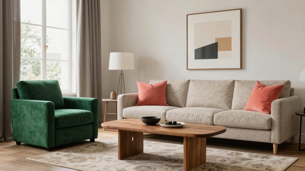
Why Layered Color Usually Feels Better Than Perfect Matching
Layered colors feel better than perfect matching because they add depth, personality,…
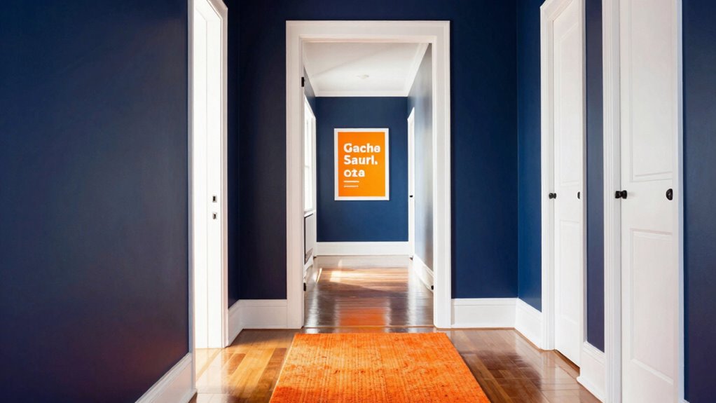
The Color Contrast Rule That Makes a Home Easier to Navigate
Making your home more accessible with the color contrast rule can transform how you navigate—discover the key details you need to know.
How to Build a Wellness-Focused Palette That Still Feels Stylish
Navigating the art of blending calming neutrals with stylish accents can transform your space into a wellness-inspired oasis that still feels chic and inviting.
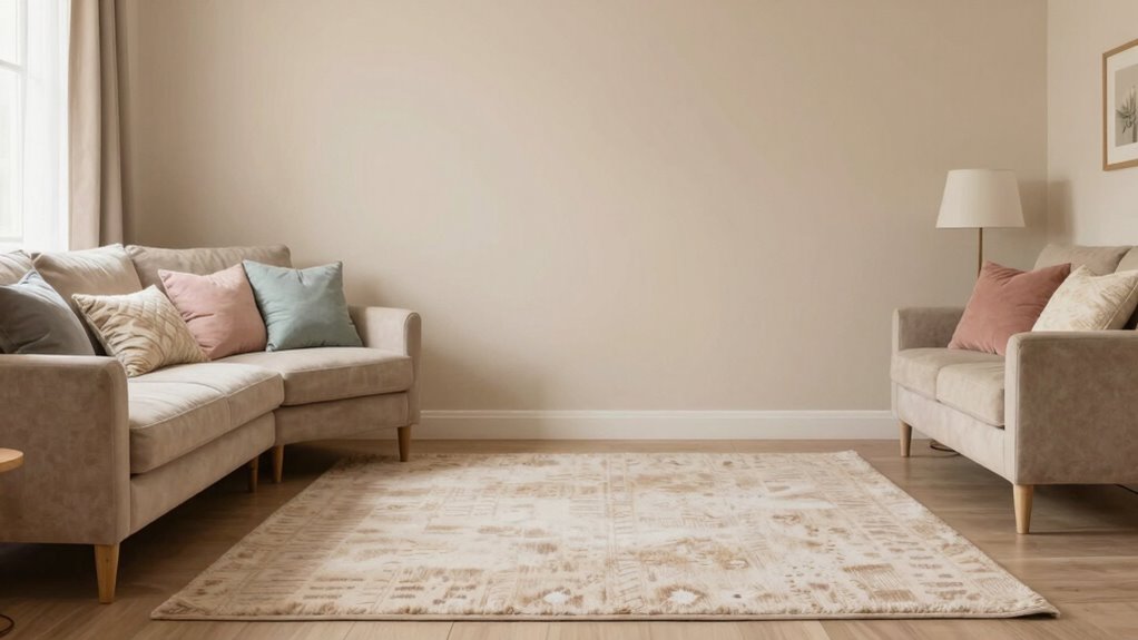
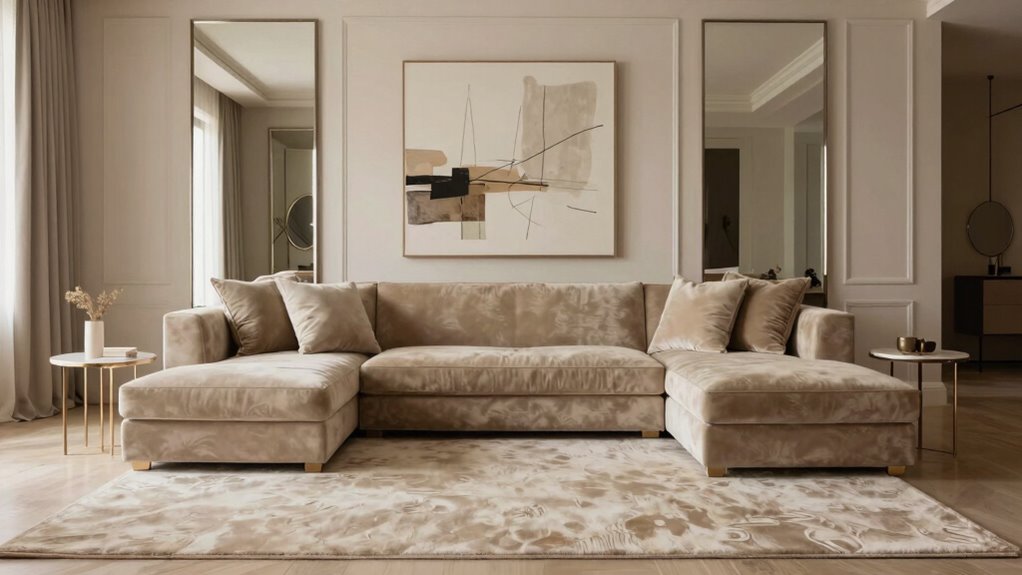
The Easiest Way to Make a Neutral Room Feel More Expensive
Perk up your neutral space effortlessly with subtle design tricks that elevate style—discover the secrets to making it look more expensive.
How to Use Bold Color Without Letting a Room Feel Loud
Getting the balance right with bold colors can transform your space—discover how to create harmony without overwhelming your room.
Why Warm, Grounded Colors Still Work So Well at Home
Keen to understand why warm, grounded colors remain popular at home? Discover how they create a cozy, inviting atmosphere that truly feels like yours.