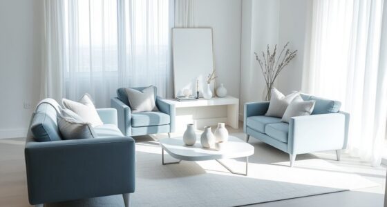

You should always plan texture and color together because they work hand in hand to create a cohesive and inviting space. When combined thoughtfully, they set the mood, highlight features, and prevent your design from feeling chaotic or disconnected. Texture adds depth, while color influences perception and atmosphere. Balancing these elements guarantees your space feels balanced and vibrant. Keep exploring to discover how mastering this integration can transform your designs effortlessly.

Get decor and gifts delivered free with Prime
- Fast, free delivery on millions of items
- Prime Video, Amazon Music and more included
- Member-only deals all year
Key Takeaways
- Planning texture and color together creates visual harmony and prevents a chaotic or disjointed appearance.
- Coordinated textures and colors guide the mood and ambiance of a space effectively.
- Combining contrasting textures with appropriate colors emphasizes features and adds depth.
- Integrated planning enhances aesthetic balance and ensures elements complement rather than compete.
- Considering both together influences perception, making spaces more engaging and cohesive.

Have you ever wondered how to create a space that feels both harmonious and visually interesting? The key lies in planning texture and color together. When you approach your design with intentionality, you can balance material contrast and achieve visual harmony. Material contrast isn’t about clashing but about pairing different textures and finishes that complement each other. For instance, combining smooth, glossy surfaces with rough, matte textures creates a tactile experience that keeps the eye engaged without overwhelming the senses. If you choose a sleek marble countertop, balancing it with rustic wooden cabinets can generate a pleasing material contrast, adding depth and character to your space.
Color, like texture, plays an essential role in setting the mood and tone of your environment. When you plan color alongside texture, you’re guiding the way your space feels. Bold hues paired with subtle textures can create a dynamic, energetic ambiance, while soft, muted tones combined with plush fabrics evoke calm and serenity. But to maintain everything feeling cohesive, you need to think about how textures influence color perception. A bright color on a rough, textured surface might feel more subdued or grounded, whereas the same color on a smooth, glossy surface could appear more vibrant. This interplay is where visual harmony comes into play—by thoughtfully aligning your color palette with the textures you choose, you ensure that each element complements the others rather than competing for attention.
Planning texture and color together also helps prevent the risk of your space feeling disjointed or chaotic. Without coordination, contrasting materials or colors might clash, creating visual tension rather than interest. When you take the time to consider how different textures will respond to your chosen colors, you create a balanced look that’s both lively and cohesive. For example, pairing a vibrant, patterned fabric with a neutral-colored wall and a matte finish on furniture ensures the color pops without overwhelming the senses. This careful coordination enhances the overall harmony of the space. Recognizing the influence of color perception can further refine your design choices, ensuring every element works harmoniously. Additionally, understanding how texture impacts color perception can help you make more deliberate decisions that reinforce your desired atmosphere. Incorporating material contrast thoughtfully allows you to emphasize specific features and create focal points that draw the eye naturally around your space. Moreover, considering the lighting conditions in your environment will further influence how textures and colors appear, making it an essential aspect of your overall planning. Paying attention to the scale and proportion of textures can also significantly impact the overall balance, ensuring that no single element overwhelms the others.
Ultimately, your goal is to craft a space that feels intentional and well-balanced. When you plan texture and color simultaneously, you’re directing the visual flow, creating a layered environment that invites exploration. It’s not about avoiding contrast but about managing it thoughtfully—using material contrast to add interest and visual harmony to unify the design. When you master this approach, your space transforms into a harmonious, captivating environment that reflects your personality and style with precision and grace.
texture and color coordination home decor
As an affiliate, we earn on qualifying purchases.
As an affiliate, we earn on qualifying purchases.
Frequently Asked Questions
How Does Lighting Affect Texture and Color Perception?
Lighting dramatically influences how you perceive texture and color, as it interacts with your environment. Different lighting techniques can enhance or diminish colors based on color psychology, affecting mood and ambiance. For example, warm lights make textures appear softer and colors more inviting, while cool lighting emphasizes sharpness and clarity. By understanding these effects, you can choose lighting that complements your color palette and highlights textures effectively in any space.
Can Texture and Color Choices Impact Room Acoustics?
Yes, your texture and color choices can impact room acoustics. Rough textures like heavy fabrics or textured wall coverings enhance sound absorption, reducing echoes. Softer, darker colors create visual harmony and can make a space feel quieter. Conversely, smooth surfaces and bright colors may reflect sound, increasing noise levels. By carefully selecting textures and colors, you control sound absorption and establish a balanced, harmonious atmosphere in your room.
What Are the Best Tools for Planning Texture and Color?
You should use digital design tools like Adobe Color, Canva, or SketchUp to plan texture and color effectively. These tools help you guarantee palette harmony and assess material compatibility, allowing you to visualize how different textures and hues work together. By experimenting with options digitally, you can refine your selections, create cohesive designs, and avoid mismatched textures or clashing colors, making your space both beautiful and functional.
How Do Seasonal Changes Influence Texture and Color Decisions?
Seasonal changes influence your texture and color choices by shifting your focus to seasonal palettes and textile adaptations. You adapt to colder months by choosing warmer textures like wool and velvet, and richer, deeper colors. In warmer seasons, you opt for lighter fabrics like linen and cotton, and brighter hues. These seasonal shifts help you stay comfortable and stylish, aligning your textures and colors with nature’s evolving palette throughout the year.
Are There Cultural Considerations in Combining Textures and Colors?
Yes, cultural considerations matter when combining textures and colors. You should recognize that cultural symbolism influences color choices, as certain hues hold specific meanings. Regional preferences also guide texture combinations, reflecting local traditions and aesthetics. By understanding these cultural nuances, you can create designs that resonate authentically with your audience, ensuring your choices respect cultural significance and enhance the overall harmony of your work.
Conclusion
Just as a painter chooses their colors with care, you must plan texture and color together to craft a harmonious space. When you consider their interplay, you’re not just decorating—you’re creating a symphony of senses that speaks to the soul. Remember, like the timeless dance of light and shadow, the magic lies in their balance. Embrace this harmony, and your space will tell a story as rich and layered as a classic masterpiece.
Halloween Picks
halloween
As an affiliate, we earn on qualifying purchases.